15+ Inspiring Landing Page Examples for Products That Convert
October 19, 2024

Introduction
Landing pages: your secret weapon for boosting product sales. Forget generic web pages – landing pages are all about conversion. Imagine them as your dedicated sales team, working round-the-clock to turn curious visitors into happy customers. A well-designed product landing page showcases your product's value, captivates with visuals, and guides visitors towards that all-important "Buy Now" button.
Key Elements of Effective Product Landing Pages

Want visitors clicking that "Buy Now" button? Understanding what makes them tick is key. Let's break it down:
1. Value Proposition That Clicks: Instantly tell visitors what your product does and why they need it. Keep it concise, impactful, and relatable.
2. Headlines That Hook, Subheadings That Guide: Capture attention immediately with a headline that speaks directly to your audience's needs or desires. Subheadings break up the text and guide readers through the page.
3. Visuals That Tell a Story: High-quality images and videos can make or break a visitor's decision. Showcase your product in action with lifestyle shots, product demos, and explainer videos to boost engagement.
4. Social Proof That Builds Trust: People trust recommendations. Include real customer testimonials, reviews, or case studies to demonstrate your product's value and build credibility.
5. Call to Action That Pops: Your call to action (CTA) should be impossible to miss. Use clear, actionable language like "Shop Now," "Get Started," or "Claim Your Discount" on eye-catching buttons.
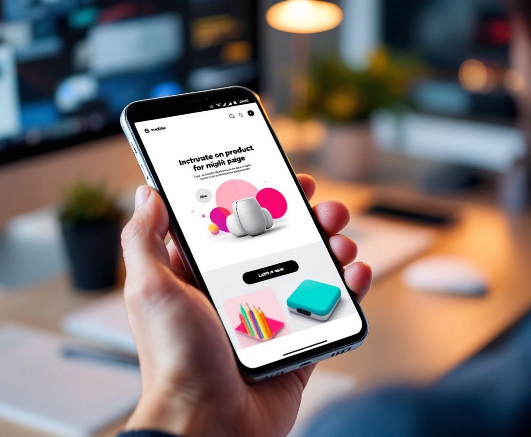
6. Mobile-First Design for On-the-Go Shoppers: Most people browse on their phones. Ensure your landing page is responsive and provides a smooth experience across devices.
By focusing on these elements, your product landing pages will convert visitors into loyal customers.
Case Study: Tech Gadget Landing Page
Let's see these principles in action. Imagine a landing page for noise-canceling headphones designed for productivity. The headline? "Escape Distractions, Unleash Focus." It immediately addresses the audience's pain point (distractions) and desired outcome (focus).
The page then uses high-quality images of people working peacefully in busy environments, wearing the headphones. A short video demonstrates the noise-canceling technology, further emphasizing the benefits. Scrolling down, visitors see testimonials from professionals who praise the headphones for boosting their productivity. A clear call to action – "Order Yours Now & Hear the Difference" – is prominently displayed with a contrasting button color that pops.
This landing page effectively uses visuals, compelling copy, social proof, and a strong call to action to guide visitors towards a purchase. This focused approach is what makes landing pages so successful.
Optimizing for Conversion

Creating beautiful landing pages is just the start. The real magic happens when you optimize them for conversions. Think of it as fine-tuning an engine for peak performance. How do we do that? By understanding your audience and using data to make smart decisions.
1. A/B Testing: Your Conversion Secret Weapon: Don't guess what works best. A/B testing allows you to compare different versions of your landing page elements. Test headlines, images, button colors, and even CTA wording to see what resonates with your audience. Tools like Google Optimize make A/B testing easy and insightful.
2. Streamlined Forms for Easy Conversions: Make it easy for people to convert. Ask for only essential information in your forms. A name and email address are often enough for lead capture. Less friction equals more conversions.
3. Urgency and Scarcity: The Power of FOMO: Limited-time offers, low stock indicators, and exclusive deals create a sense of urgency, prompting visitors to act quickly. Use these elements strategically to drive conversions.
4. Live Chat Support for Instant Answers: Having live chat on your landing page can significantly boost conversions. It provides instant answers to visitor questions, building trust and confidence.
5. Page Speed Optimization: Don't Make Them Wait: Slow-loading pages kill conversions. Ensure your landing page loads quickly on all devices. Tools like Google PageSpeed Insights can help identify and fix any issues impacting your page speed.
Mobile-First Design Considerations
Remember the importance of a seamless user experience? It's critical for mobile devices. With more people shopping on their smartphones, your product landing pages must be mobile-friendly.
Start with a responsive design that automatically adjusts to different screen sizes. This ensures your visuals are sharp, text is readable, and navigation is effortless on any screen. Avoid tiny buttons that are difficult to tap and keep forms short and sweet for users on the go.
Consider a single-column layout for mobile. It simplifies scrolling and keeps visitors focused. Speed is also key. Mobile users are often impatient, so optimize images and minimize code to ensure your page loads quickly. A slow mobile page can turn potential customers away.
Testing and Iteration

You've built beautiful, mobile-optimized product landing pages and you're ready to launch. Congratulations! But the work isn't over. The most successful landing pages are those that are constantly tested and improved.
Think of it like tending a garden. You wouldn't just plant seeds and walk away, hoping for the best, right? You'd water them, provide sunlight, and make adjustments. The same goes for your landing pages.
A/B testing is crucial. It allows you to compare different versions of your landing page elements to see what your audience responds to best. Try testing headlines, images, button colors, and even your CTA wording. Small changes can make a big difference.
Don't stop there. Monitor your landing page analytics. Are people leaving at a specific point? Is one product landing page outperforming others? This data is invaluable for guiding your optimization efforts.
Speaking of making things easy, how about streamlining your customer journey even further? Imagine creating custom, shoppable links that lead customers directly to pre-filled carts with discounts automatically applied. That's where tools like Checkout Links come in. Interested? Click here to see how Checkout Links can boost sales and create a seamless shopping experience.
 Checkout Links


