The Ultimate Guide to Shopify Landing Pages: Drive Sales and Conversions
October 19, 2024
What is a Shopify Landing Page?
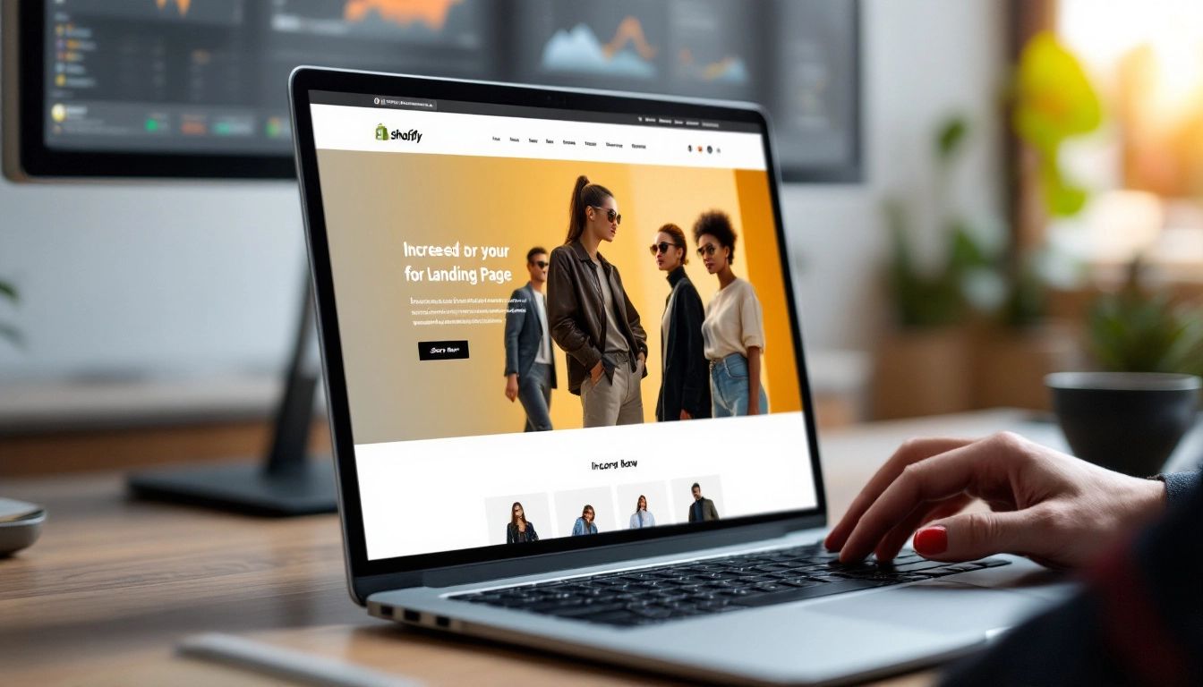
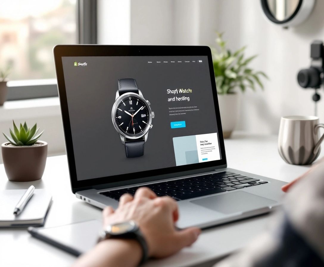
A Shopify landing page is a dedicated page on your Shopify store designed with a single focus: turning visitors into customers. Unlike your regular product pages, a Shopify landing page removes distractions and presents a single, clear call to action. This could be anything from completing a purchase to subscribing to your email list.
Think of it as a curated shop window display, carefully designed to showcase a specific item or promotion. Its only job is to grab attention and encourage a particular action.
Why are landing pages important for e-commerce? Simply put, they get results. A well-designed Shopify landing page can drastically increase your conversion rates. By minimizing distractions and presenting a clear value proposition, you make it more likely that visitors will take the action you want them to.
Key Elements of an Effective Shopify Landing Page
So, you're ready to turn visitors into loyal customers with a Shopify landing page? That's fantastic! Now, let's break down the essential elements you'll need for success.
1. A Clearly Defined Goal: Before you even consider design, figure out the one thing you want visitors to do. Buy a specific product? Sign up for your newsletter? This laser focus will guide every other aspect of your Shopify landing page's design.
2. An Attention-Grabbing Headline: Your headline is the first impression. Make it a strong one! Use powerful verbs, speak directly to your audience's problems, and clearly state the value you offer. For example, use "Ditch Dry Skin – Get 20% Off Our New Moisturizer!" instead of just "New Moisturizer Available".
3. Persuasive Copy That Converts: Keep your copy concise and focused on the benefits. Don't just list features – explain why those features are important to your audience. Write in a conversational, engaging tone and remember: focus on them, not you.
4. Striking Visuals: High-quality images and videos can make or break a landing page. Show off your product in action, create an emotional connection with lifestyle shots, and use visuals that match your brand identity.
5. A Strong Call to Action: Your CTA should be clear, concise, and impossible to miss. Use action-oriented language like "Shop Now", "Get My Discount", or "Claim Your Free Trial". Don't be afraid to use contrasting colors or strategic placement to make it stand out.
6. Social Proof for Trust: Include customer testimonials, reviews, and social media mentions to build credibility and trust. People trust recommendations from others, so let your happy customers speak for you!
7. Mobile-First Design Is Essential: With more people shopping on their phones, your Shopify landing page needs to be smooth and easy to use on any device. A responsive design ensures your page looks great and works perfectly on desktops, tablets, and smartphones.
Best Practices for Designing Shopify Landing Pages
You've got the key elements down, now let's explore some best practices to make your Shopify landing page a conversion powerhouse. These tips go beyond the basics, helping you build a page that truly performs.
1. Keep it Clean and Uncluttered: Minimalism is key. A cluttered page with too many distractions will drive your visitors away. Stick to a clean layout, easy-to-read fonts, and plenty of white space to give your content room to breathe.
2. Above the Fold is Valuable Space: Make your first impression count. Ensure your headline, an eye-catching image or video, and a glimpse of your value proposition are all visible without scrolling. This ensures visitors immediately understand what you offer.
3. Tell a Story With Your Visuals: Don't just show your product – bring it to life. Use high-quality images and videos that showcase your product's benefits, tell a story, or create an emotional connection with your audience.
4. Create Urgency Without Being Aggressive: Limited-time offers, low stock warnings, and countdown timers can be effective, but don't overdo it. The goal is to create a sense of urgency without coming across as gimmicky or pushing away potential customers.
5. A/B Testing is Your Best Friend: Don't rely on guesswork. A/B test different headlines, images, copy, and even button colors to see what works best for your audience. Continuously testing and refining your Shopify landing page is essential for getting the most conversions.
6. Don't Forget Thank You Pages: The customer journey doesn't end at the conversion. Use a thank you page to show your appreciation, give additional information, or offer an incentive to encourage further engagement.
Tools and Apps for Creating Shopify Landing Pages
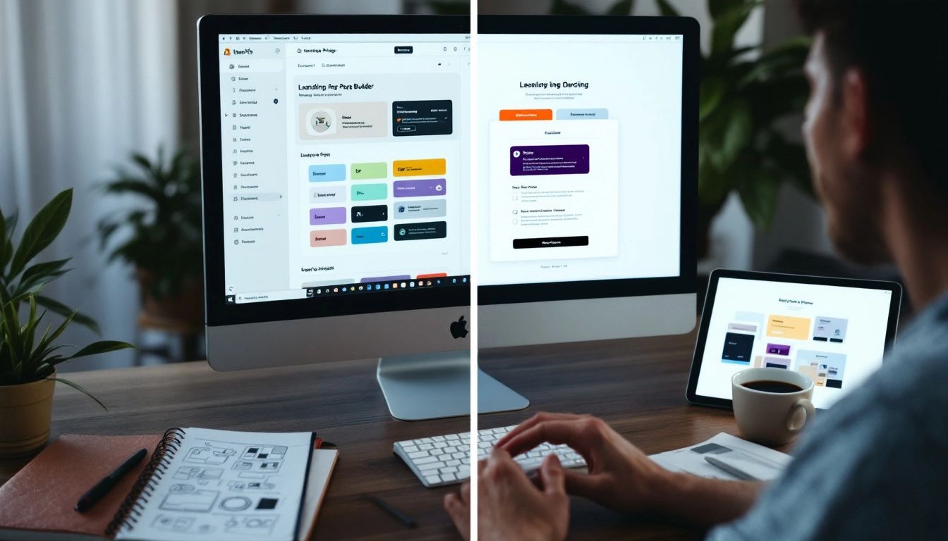
Ready to put these best practices into action? You don't need to be a coding expert to create amazing Shopify landing page experiences. There are many great tools and apps available to simplify the process, whether you prefer drag-and-drop ease or want more control over customization.
Here are some popular options:
-
Shopify's Built-in Page Editor: A great starting point for beginners, Shopify's built-in page editor allows you to create basic landing pages using templates and drag-and-drop functionality. It's user-friendly and blends seamlessly with your store's design.
-
PageFly Landing Page Builder: This popular app offers advanced customization without requiring any coding knowledge. With a library of pre-designed templates and a drag-and-drop interface, you can easily build high-converting landing pages.
-
Shogun Landing Page Builder: Another favorite among Shopify sellers, Shogun offers a user-friendly interface and powerful features. Enjoy A/B testing, mobile optimization, and integrations with email marketing platforms.
-
GemPages Landing Page Builder: If design flexibility is important to you, GemPages won't disappoint. This app allows for extensive customization and offers a wide range of design elements to create unique Shopify landing page experiences.
-
Checkout Links: This app makes it easy to create custom, shoppable links. Send customers directly to pre-filled carts with discounts already applied. It makes the checkout process smoother, potentially increasing your conversion rates.
These are just a few examples, and the best option for you will depend on your budget, technical skills, and specific needs. Try out different options to find the perfect fit for your business.
Examples of Successful Shopify Landing Pages
Let's move from theory to practice and look at some real-world examples of Shopify landing pages that are achieving excellent conversions. By understanding what makes them work, you can find inspiration and practical insights for your own Shopify landing page strategy.
1. Example: Fashion Brand Launching a New Collection
-
Brand: Imagine a trendy clothing brand called "Bohemian Blues" launching their new spring collection.
-
Landing Page Objective: Generate pre-orders for the new collection and capture leads for email marketing.
-
Key Elements:
- Headline: "Welcome Spring in Style with Bohemian Blues"
- Visuals: High-quality lifestyle shots of models wearing the new collection, showcasing how versatile and stylish the clothing is.
- Copy: Short, descriptive blurbs that highlight the unique selling points of the collection (e.g., "Ethically sourced fabrics," "Effortless style for the modern bohemian").
- Call to Action: "Pre-Order Now and Get 15% Off + Free Shipping" prominently displayed above the fold. A secondary CTA further down the page encourages visitors to sign up for email updates for exclusive offers and style inspiration.
Why It Works: This Shopify landing page example effectively captures the brand's aesthetic and target audience. The headline is appealing, the visuals are aspirational, and the copy creates a desire for the product. The clear and enticing CTAs encourage both immediate action and long-term engagement.
2. Example: Ecommerce Store Running a Flash Sale
-
Store: Let's say you run an online store called "Tech Haven" specializing in tech gadgets.
-
Landing Page Objective: Increase sales during a limited-time flash sale event.
-
Key Elements:
- Headline: "Tech Haven Flash Sale: 48 Hours Only – Up to 70% Off!"
- Visuals: Eye-catching product photography with discounts clearly displayed. A countdown timer adds a sense of urgency.
- Copy: Benefit-driven descriptions that emphasize the value of the deals. Use phrases like "Score amazing savings," "Upgrade your tech for less," and "Don't miss out!"
- Call to Action: "Shop the Flash Sale Now" button strategically placed throughout the page, leading directly to discounted product categories.
Why It Works: This landing page gets straight to the point with a strong sense of urgency. The headline instantly grabs attention, the limited-time offer creates a fear of missing out, and the visually prominent discounts are hard to resist.
3. Example: Shopify Store Using a "Checkout Link" Landing Page
-
Store: Imagine a Shopify store called "Cozy Home Goods" selling home décor and lifestyle products.
-
Landing Page Objective: Promote a curated Valentine's Day gift bundle and streamline the checkout process.
-
Key Elements: This store utilizes the power of "Checkout Links" (a Shopify app mentioned earlier) to create a seamless purchase experience.
- Headline: "Surprise Your Valentine with the Gift of Cozy"
- Visuals: A beautifully styled image featuring the Valentine's Day bundle items in a cozy home setting.
- Copy: Speaks to emotions and highlights the benefits of giving a thoughtful, curated gift.
- Call to Action: A single "Checkout Link" button that, when clicked, automatically adds the pre-selected bundle to the shopper's cart with any applicable discounts already included. This eliminates extra steps in the checkout process, minimizing friction and potentially boosting conversions.
Why It Works: This approach combines a visually pleasing Shopify landing page experience with a smooth and easy checkout process. By using Checkout Links, the store removes obstacles to purchasing, making it simple for customers to say "yes" to the curated bundle.
Measuring and Optimizing Landing Page Performance

Building a beautiful Shopify landing page is just the first step. To truly maximize its potential, you need to track its performance and continuously improve it based on data. Think of it like fine-tuning a race car for maximum speed!
Tracking Key Metrics
Start by monitoring these essential metrics within your Shopify analytics dashboard:
- Conversion Rate: This is the most important one! It tells you what percentage of visitors are completing your desired action (e.g., making a purchase, signing up).
- Traffic Source: Understanding where your traffic comes from (e.g., social media, email marketing) helps you identify what's working and effectively allocate your marketing budget.
- Bounce Rate: A high bounce rate (people leaving after viewing only one page) could indicate that your Shopify landing page isn't engaging or relevant to the traffic you're driving.
- Time on Page: Longer visit times generally suggest that visitors are finding your content interesting and valuable.
A/B Testing: Your Optimization Powerhouse
Don't rely on intuition. A/B testing involves creating two versions of your Shopify landing page with small variations (e.g., different headlines, images, or button colors) and showing them to separate groups of visitors. By analyzing which version performs better, you gain valuable insights into what resonates with your audience.
Continuous Improvement is Key
Landing page optimization is an ongoing process. Regularly check your metrics, analyze user behavior, and be willing to experiment with different elements. Even minor adjustments can lead to significant increases in your conversion rates.
For example, let's say you discover that visitors who click on a "Checkout Link" from your landing page have a much higher conversion rate than those who go through the traditional checkout. This valuable insight might encourage you to prioritize "Checkout Links" in your Shopify landing page strategy.
Curious to see how "Checkout Links" can simplify the shopping experience and improve your conversions? Learn more about this powerful Shopify app and start creating seamless checkout experiences for your customers today. [Link to Checkout Links website/app store listing]
 Checkout Links
