Ecommerce Checkout Optimization: Boost Conversions Today
April 30, 2025

The Hidden Cost of Checkout Friction
Let's face it: a complicated checkout process can negatively impact your sales. A frustrating checkout experience isn't just inconvenient for customers; it directly affects your revenue. Every abandoned cart represents a lost sale, and these losses add up quickly. This section explores the significant impact of abandonment rates and the true cost of checkout friction.
One of the main reasons for cart abandonment is friction – those small hurdles that create a frustrating online shopping experience. These friction points can include unexpected shipping costs, complex forms, and limited payment options. For instance, requiring customers to create an account just to make a purchase can be enough to drive them to a competitor.
The impact of these seemingly minor issues can be significant. Studies show that many online shoppers abandon their carts because of a difficult checkout process. Even small improvements to the user experience can result in a substantial increase in conversions and revenue. Optimizing your ecommerce checkout isn't just about aesthetics; it's about removing obstacles that prevent customers from completing their purchases.
Research from the Baymard Institute shows that 65% of ecommerce sites have "mediocre" or worse checkout usability, often due to too many form fields. While best practices recommend only eight fields, the average checkout requires 15-20 inputs. This contributes to a 70.19% global cart abandonment rate. Data indicates that micro-conversion tracking – monitoring steps like the transition from shipping to billing information – helps identify friction points. For example, a high drop-off rate between these stages often indicates problems with unexpected costs or form complexity, highlighting the need for continuous optimization based on detailed user behavior data. Learn more about the impact of checkout friction and how to optimize your checkout process: Learn more about checkout optimization here.
Identifying the Friction Points
How can you identify the specific friction points that are causing customers to leave your site? Analyzing user behavior data is an effective approach. By tracking how users interact with your checkout, you can identify areas where they struggle. Here are some key methods:
-
Micro-conversion tracking: This involves monitoring the completion rates of each step in the checkout process, allowing you to pinpoint where users are abandoning their carts. This provides valuable insights into specific areas needing improvement.
-
Exit surveys: These short surveys, presented to users abandoning their carts, offer valuable qualitative data on their reasons for not completing the purchase.
-
User testing: Observing real users interacting with your checkout process can uncover usability issues that data analysis alone might miss.
By identifying and addressing these friction points, you can create a smoother, more user-friendly checkout experience. This results in higher conversion rates, increased revenue, a better return on investment (ROI), and a stronger bottom line for your business. Ultimately, optimizing your ecommerce checkout is an investment in your business's future.
The Psychology That Drives Checkout Decisions

Optimizing your ecommerce checkout process requires a deep understanding of customer psychology. It's not just about the technical aspects; it's about understanding how shoppers think and feel as they navigate the checkout. Even small details can significantly influence whether they complete a purchase.
Cognitive Load and Decision Paralysis
Cognitive load refers to the mental effort required to process information. A cluttered checkout page with excessive fields, distractions, or complex instructions increases cognitive load. This can overwhelm shoppers and lead to decision paralysis, causing them to abandon their carts. For instance, offering too many shipping options can hinder decision-making. Simplifying the checkout flow reduces cognitive load and facilitates a smoother purchase process.
Progress indicators also play a vital role in checkout optimization. These visual cues show shoppers their progress, reducing anxiety and fostering a sense of accomplishment. This encourages them to complete the purchase. It's like a roadmap – knowing where you are and how far you have to go keeps you motivated.
Trust, Anxiety, and Abandonment
Trust is crucial in ecommerce. Customers are naturally hesitant to share sensitive information. Trust signals like security badges, clear privacy policies, and recognizable payment options, such as those offered by Stripe, build confidence and reduce anxiety. These signals are similar to seeing a security guard at a store entrance – they promote a sense of safety.
Conversely, anxiety triggers can deter even the most eager shopper. Unexpected costs, complicated forms, or data security concerns can create anxiety and lead to cart abandonment. Baymard Institute's research shows how seemingly small issues like unexpected shipping costs significantly contribute to cart abandonment. Addressing these psychological barriers is essential for checkout optimization.
Practical Strategies for Optimization
Here are some practical ways to improve the psychology of your checkout:
- Minimize form fields: Request only essential information and utilize auto-fill functionality.
- Offer guest checkout: Don't force customers to create an account.
- Display clear security badges: Reassure customers about data safety.
- Be upfront about all costs: Avoid surprising customers with hidden fees at the end.
- Offer multiple payment options: Cater to diverse preferences.
- Use progress indicators: Guide customers through the checkout process.
By understanding and addressing the psychological factors influencing checkout decisions, you can create a more user-friendly experience. Using tools like Checkout Links, a Shopify app, can further streamline the process. These shoppable links simplify cart recovery and enhance email marketing campaigns. This approach leads to higher conversion rates and increased sales. Remember, checkout optimization is not just technical; it's about creating a positive and reassuring experience.
Single-Page vs. Multi-Page: The Checkout Debate Solved
The classic ecommerce question: single-page checkout or multi-page checkout? Picking the right one can dramatically impact your conversion rates. This section explores the key differences between the two, helping you decide what’s best for your business.
Understanding the Core Differences
Single-page checkouts (SPCs) display every checkout step on a single page. This lets customers finish their purchase without reloading the page, which can create a smoother experience, especially on mobile. However, if not designed well, a long single page can feel overwhelming.
Multi-page checkouts (MPCs) separate the process into distinct steps across multiple pages. This offers a more organized experience, breaking complex information into digestible chunks. But, if not optimized, the extra steps can increase friction.
Factors Influencing Your Choice
Several things should influence your choice between SPCs and MPCs. Product complexity is a major factor. An SPC works well for simple products, making purchasing quick and easy. For complex products requiring lots of customization or add-ons, an MPC offers a more structured approach.
Customer demographics also matter. Younger, tech-savvy customers may prefer the streamlined SPC experience. Older customers might appreciate the clarity of an MPC. Device usage is key, too. SPCs generally perform better on mobile due to faster loading and easier navigation.
You might find this helpful: 12 Tips to Optimize Shopify One-Page Checkout 2024. It offers valuable advice for maximizing the effectiveness of single-page checkouts on the Shopify platform.
Performance Data and Industry Trends
Analyzing checkout performance reveals interesting industry trends. The data chart below compares average conversion rates for SPCs and MPCs across different product categories.
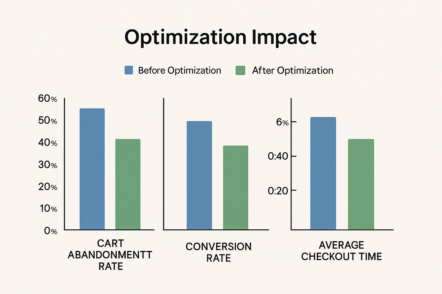
SPCs tend to outperform MPCs for less complex, lower-priced items like apparel and electronics, often boosting conversion rates by 5-10%. For higher-priced, more complex products like furniture and luxury goods, MPCs often do slightly better, sometimes exceeding SPC conversion rates by 2-3%. This suggests that customers buying these items need more information and reassurance. Furniture purchases, for instance, often involve customizations and delivery choices that benefit from the MPC structure.
Let's explore a specific case study. In 2025, White Stuff, a UK retailer, increased conversion rates by 37% and average order value by 26% after switching from a three-page to a single-page checkout. The change also doubled mobile checkout speed and simplified the user journey. Learn more about checkout optimization here. White Stuff used A/B testing to validate the single-page approach, emphasizing the importance of iterative testing.
To help you further understand the key differences between the two types of checkout experiences, here's a detailed comparison table:
Single-Page vs. Multi-Page Checkout Comparison
A side-by-side comparison of the benefits and drawbacks of single-page and multi-page checkout approaches for different business types.
| Feature | Single-Page Checkout | Multi-Page Checkout | Best For |
|---|---|---|---|
| Page Loads | Fewer | More | |
| Appearance | Can be overwhelming if lengthy | More organized | |
| Mobile Optimization | Generally better | Can be challenging | Mobile-first businesses |
| Product Complexity | Better for simple products | Better for complex products | Businesses with varying product complexities |
| Customer Demographics | Preferred by younger, tech-savvy audiences | Preferred by older demographics | Businesses targeting specific age groups |
| Information Presentation | Concise, all at once | Broken down into smaller steps | |
| Customization | More challenging to implement complex customization | Easier to present customization options step-by-step | Businesses offering product customization |
This table highlights the contrasting features of SPCs and MPCs, helping businesses align their checkout process with their products and target audience.
Implementing Your Chosen Approach
Whichever approach you choose, optimization is crucial. For SPCs, focus on clear organization and concise information to avoid overwhelming customers. Use visual cues and progress indicators. For MPCs, minimize steps and ensure smooth transitions between pages. Optimize page load speeds. Both approaches benefit from clear calls to action, trust signals, and offering various payment options.
Building High-Converting Checkout Experiences
What separates a successful checkout from an abandoned cart? The answer lies in crafting a high-converting checkout experience. This involves strategically implementing key elements to guide customers seamlessly toward completing their purchase. It's not just about adding features; it's about understanding their contribution to a smooth and enjoyable experience.
Essential Components of a High-Converting Checkout
Several key components play a vital role in optimizing your ecommerce checkout process:
-
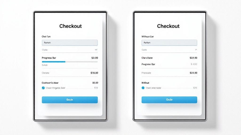
Progress Indicators: These visual cues clearly show customers their progress through the checkout steps. This transparency reduces anxiety and encourages completion. It's like a roadmap, offering reassurance by displaying the steps involved and the customer's current position.
-
Trust Badges: Displaying security badges and clear privacy policies builds customer trust and addresses concerns about sharing sensitive information. These are especially crucial on the payment page, signaling a secure transaction environment.
-
Payment Options: Offering a variety of payment methods caters to diverse customer preferences, reducing friction. Include popular choices like PayPal, Apple Pay, and Google Pay alongside traditional credit cards to improve conversions.
-
Mobile Optimization: With the increasing prevalence of mobile commerce, a responsive and user-friendly mobile checkout is essential. This means ensuring easy navigation, large buttons, and fast loading times on smaller screens.
-
Guest Checkout: Allowing customers to checkout without creating an account removes a significant hurdle, particularly for first-time buyers. While encouraging account creation offers long-term advantages, prioritizing a smooth initial purchase is key.
Strategic Implementation for Maximum Impact
Simply having these components isn't enough; their strategic placement, design, and flawless functionality are essential:
-
Placement: Progress indicators should remain visible throughout the entire checkout flow. Trust badges are most effective near the payment information fields, reassuring customers about security.
-
Design: Checkout elements should be visually appealing and align with your brand's aesthetic. A cluttered or confusing design can overwhelm customers and lead to cart abandonment.
-
Functionality: Ensure all checkout components function perfectly. Broken links, slow loading times, or confusing forms can disrupt the customer journey and lead to lost sales.
Prioritizing Elements Based on Conversion Impact
Not all checkout elements have an equal impact on conversions. Data analysis is crucial to identify areas for optimization. For instance, a high drop-off rate on the payment page might indicate a need to focus on trust signals and payment options.
The table below provides a breakdown of how different checkout elements can impact conversion rates, their implementation difficulty, and how these factors might vary across industries.
Checkout Page Optimization Elements: Impact Analysis
Statistical breakdown of how different checkout page elements affect conversion rates across various ecommerce sectors
| Checkout Element | Average Conversion Impact | Implementation Difficulty | Industry Variations |
|---|---|---|---|
| Progress Indicator | High | Low | Minimal |
| Trust Badges | Medium | Low | Moderate |
| Guest Checkout | High | Low | Minimal |
| Mobile Optimization | High | Medium | Significant |
| Payment Options | Medium | Medium | High |
| Form Optimization | High | Medium | Moderate |
As this table illustrates, elements like progress indicators and guest checkout options are relatively easy to implement and can have a significant positive impact on conversions. Conversely, while mobile optimization is crucial, it can be more challenging to implement effectively due to the variations in mobile devices and operating systems. Furthermore, the impact of different payment options can vary significantly depending on the industry.
Maintaining a Streamlined and Distraction-Free Experience
While optimizing for conversions, maintain a streamlined and distraction-free checkout experience. Avoid unnecessary elements or upsells that can overwhelm customers. The focus should solely be on completing the purchase. Tools like Checkout Links, a Shopify app, can simplify cart recovery and streamline email marketing by preloading customer information. This reduces friction and caters to the growing trend of mobile shopping. A simplified checkout is key to driving conversions and boosting your bottom line. By focusing on these key components and their strategic implementation, you can create a high-converting checkout experience that drives sales and boosts customer satisfaction. Remember that continuous optimization is essential. Analyze your data, test different approaches, and refine your checkout process for optimal results.
Mobile Checkout: Optimizing for Thumb-Driven Commerce
Mobile commerce is experiencing significant growth. Optimizing your checkout process for smartphones and tablets is no longer optional, but essential for competing in today's ecommerce market. This requires understanding the specific challenges mobile shoppers encounter and tailoring your checkout flow accordingly. Simply adapting your desktop version for mobile can lead to decreased sales.
Designing Touch-Friendly Interfaces
Mobile users primarily navigate your site using their thumbs. This demands a touch-friendly interface tailored for smaller screens. Think large, easily tappable buttons and form fields, along with a layout that minimizes scrolling and zooming. For instance, consider using input fields that automatically expand when selected for easier text entry. Adequate spacing between elements also prevents accidental taps. These design choices reduce user frustration and create a better overall mobile checkout experience.
The Power of Mobile Wallets
Mobile wallets like Apple Pay and Google Pay provide a seamless payment experience. They eliminate the need for manually entering card details, thus expediting the checkout process. Integrating these wallets into your mobile checkout is a key aspect of ecommerce checkout optimization. This can considerably reduce cart abandonment, allowing users to complete purchases with just a few taps. A Baymard Institute study revealed that 18% of users abandoned checkouts due to complexity, highlighting the need for streamlined processes like mobile wallets.
Addressing Mobile-Specific Friction Points
Mobile users often face fluctuating network conditions, limited screen real estate, and distractions. These present specific challenges that must be addressed for effective ecommerce checkout optimization. Optimizing images and minimizing code can dramatically improve mobile page load times, even on slower connections. This keeps customers engaged and reduces the chance of them abandoning their purchase. Clear error messages and easily accessible customer support are also crucial for smoothly guiding mobile shoppers through the checkout process.
Adapting Forms for Smaller Screens
Traditional form designs can be unwieldy on mobile. Consider simplifying forms by requesting only essential information. Utilize auto-fill and smart defaults to minimize typing. For example, automatically populate the city and state based on the user's zip code. This reduces the number of fields users interact with, leading to a smoother checkout experience. A Baymard Institute study found that reducing form fields from 16 to 8 can substantially increase conversions. Tools like Checkout Links can further optimize mobile checkouts on the Shopify platform. These personalized shoppable links pre-fill customer information, simplifying the process and catering to the thumb-driven nature of mobile shopping. This streamlined approach reduces cart abandonment and improves conversion rates, especially for mobile users.
Optimizing Load Times and Leveraging Device Features
Slow loading times significantly hinder mobile conversions. Optimize images and streamline code for quick page loads across various network conditions. Utilize device-specific features like using the camera to scan credit cards, further streamlining the buying process. This makes checkout more efficient and user-friendly, encouraging completion. By focusing on these key areas, you can transform your mobile checkout into a powerful tool that drives sales and customer satisfaction.
Form Field Mastery: Less Input, More Conversions

Checkout forms often present the biggest hurdle to conversions. Each unnecessary field acts as a deterrent, slowing down the purchasing process. This section explores how to simplify forms, minimizing required information while still capturing essential data.
Reducing Form Fields for a Frictionless Experience
Optimizing your ecommerce checkout starts with reducing the number of form fields. Baymard Institute research shows the average checkout has 11.3 form fields, exceeding the recommended eight. This excess creates friction and increases cart abandonment. Asking for a title (Mr., Mrs., Ms.) is often superfluous.
Leveraging Smart Defaults and Autocomplete
Features like smart defaults and autocomplete further enhance the checkout flow. Address verification tools can automatically populate city and state fields based on the zip code. Pre-filling information for returning customers or using browser auto-fill for fields like email addresses saves time and effort, especially on mobile devices.
Conditional Logic for Simplified Forms
Conditional logic dynamically adjusts the form fields displayed to the user. Selecting "Ship to billing address" can automatically hide separate shipping address fields. This prevents information overload, keeping the form concise and relevant, leading to a personalized and efficient checkout experience.
Best Practices for Field Validation and Error Prevention
Effective field validation is essential for preventing errors and user frustration. Clear and immediate error messages guide users towards corrections. Real-time validation, providing feedback as the user types, prevents them from submitting incorrect information. For example, highlighting an invalid email address in red provides instant feedback.
Input Formatting and Combining Fields
Consistent input formatting simplifies data entry. Input masks for phone numbers or credit card details ensure correct formatting. Combining related fields, such as first and last name into a single "Full Name" field, further streamlines the form, making it less daunting.
Address Verification and Mobile Optimization
Address verification improves accuracy and reduces shipping errors, minimizing delivery issues and enhancing the customer experience. Mobile optimization is crucial. Larger font sizes, touch-friendly buttons, and minimal scrolling improve mobile form completion. Apps like Checkout Links for Shopify merchants integrate with email marketing platforms like Klaviyo, enabling personalized cart recovery emails with pre-filled checkout links. This streamlines the mobile checkout and significantly contributes to ecommerce checkout optimization.
By implementing these techniques, you can transform checkout forms from a conversion obstacle into a seamless part of the customer journey. A shorter, more efficient form translates to higher conversion rates and increased sales.
Measuring What Matters: Data-Driven Checkout Optimization
Effective ecommerce checkout optimization relies on a deep understanding of your data. Simply monitoring overall conversion rates isn't enough. You need to identify precisely where shoppers abandon the checkout process and, more importantly, understand why. This section explores key metrics and testing methods that drive continuous improvement.
Key Metrics Beyond Conversion Rates
While conversion rates offer a valuable overview, they only tell part of the story. Micro-conversion tracking, which monitors smaller steps within the checkout process, provides a more granular perspective. For instance, tracking the transition between adding an item to the cart and proceeding to checkout, or the drop-off between entering shipping and billing information, can pinpoint friction points.
Analyzing funnel drop-offs is another vital element of ecommerce checkout optimization. Visualizing the checkout process as a funnel helps identify stages with the highest abandonment rates. This allows you to focus your optimization efforts where they'll have the biggest impact. For example, a significant drop-off between the payment page and order confirmation might suggest issues with payment options or security concerns.
Using Behavioral Data to Guide Optimization
Collecting behavioral data is only half the battle; interpreting it effectively is equally critical. Session recordings, which replay individual customer journeys through your checkout, offer valuable qualitative insights into user behavior. These recordings allow you to see firsthand where users struggle, hesitate, or become confused.
When combined with heat maps, which visually represent user clicks and scrolling behavior, session recordings provide a complete understanding of user interactions. You might be interested in: How to master your ecommerce checkout and maximize conversions. These visual aids can highlight usability issues that might be missed by quantitative data alone. For instance, if users repeatedly click on a non-clickable element, this indicates a design flaw that needs attention.
Exit surveys, presented to users abandoning their carts, provide further context. These surveys offer direct feedback on their reasons for leaving, helping you pinpoint specific pain points. This qualitative data complements quantitative metrics, providing a complete picture of user behavior and guiding optimization decisions.
A/B Testing for Data-Driven Improvements
A/B testing is essential for ecommerce checkout optimization. This process involves comparing two versions of a checkout element, such as a form field, button, or layout, to see which performs better. Effective A/B testing requires careful planning, including prioritizing tests, selecting relevant metrics, and determining the appropriate sample size.
Analyzing A/B test results requires statistical significance to ensure observed differences aren't due to random chance. This ensures decisions are based on solid data. If a change in button color leads to a 5% increase in conversions with statistical significance, it justifies implementing the change.
Combining qualitative research methods like heat mapping, session recordings, and exit surveys with quantitative A/B testing data creates a powerful optimization strategy. This approach provides valuable insights into what is happening in your checkout and why, empowering you to make data-driven decisions that result in measurable improvements. These tools help pinpoint the root causes of cart abandonment and inform targeted solutions.
Ready to improve your email marketing and increase conversions? Explore Checkout Links today and discover how its features can optimize your checkout process and drive sales. Visit Checkout Links now to learn more.
 Checkout Links


