Boost Your Sales: Crafting High-Converting Ecommerce Landing Pages
November 16, 2024

Introduction to E-commerce Landing Pages
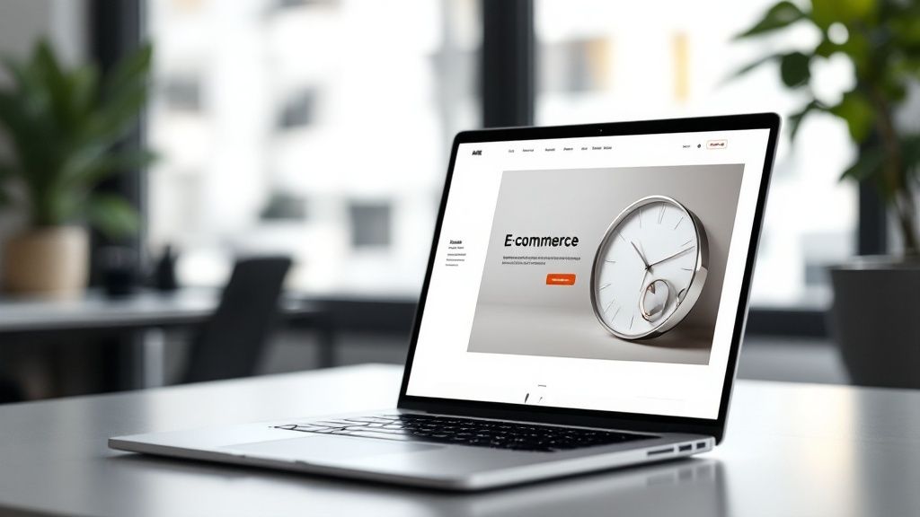
In the competitive world of online retail, simply having an online store isn't enough. Success hinges on driving targeted traffic and converting those visitors into paying customers. This is where e-commerce landing pages become essential. Think of your main e-commerce website as a large department store, offering a wide array of products. An e-commerce landing page, in contrast, is like a specialized boutique, designed to showcase specific products or promotions to a particular audience. This focused approach is key to maximizing conversions, making a deep understanding of landing page creation and optimization crucial for any online retailer.
Understanding the Purpose of E-commerce Landing Pages
So, what exactly is an e-commerce landing page? It's a standalone web page created with a single purpose: to encourage a specific action. Unlike other pages on your website, a landing page typically features a single, clear call to action (CTA). This CTA might encourage a purchase, a newsletter signup, or adding an item to a shopping cart. For example, if you're promoting a new line of shoes, a dedicated landing page for those shoes, highlighting their features, benefits, and any special offers, is far more effective than sending customers to your general footwear page. This prevents them from being distracted by other products and makes it much more likely they’ll take the desired action – buying the new shoes.
The Importance of Landing Pages in E-commerce
E-commerce landing pages are important for several key reasons. First, they streamline the customer journey. A focused message and a clear CTA guide the visitor directly toward the desired action, minimizing distractions and boosting conversion chances. Second, landing pages allow for personalized messaging. For instance, a landing page targeting new customers might offer a first-time buyer discount, while a landing page for existing customers could promote a loyalty program.
This targeted approach also extends to measuring marketing campaign effectiveness. By using dedicated landing pages for each campaign, you gain clear insights into which marketing efforts resonate most with your audience. Furthermore, landing pages can significantly enhance your search engine optimization (SEO). By optimizing each page for specific keywords related to your products or promotions, you can attract highly qualified organic traffic and boost your online visibility. Ultimately, it’s not just about getting traffic to your site, but converting that traffic into customers. This is where a well-optimized landing page truly excels, transforming clicks into conversions and driving revenue growth through a streamlined and persuasive online experience.
Essential Elements of Converting Landing Pages
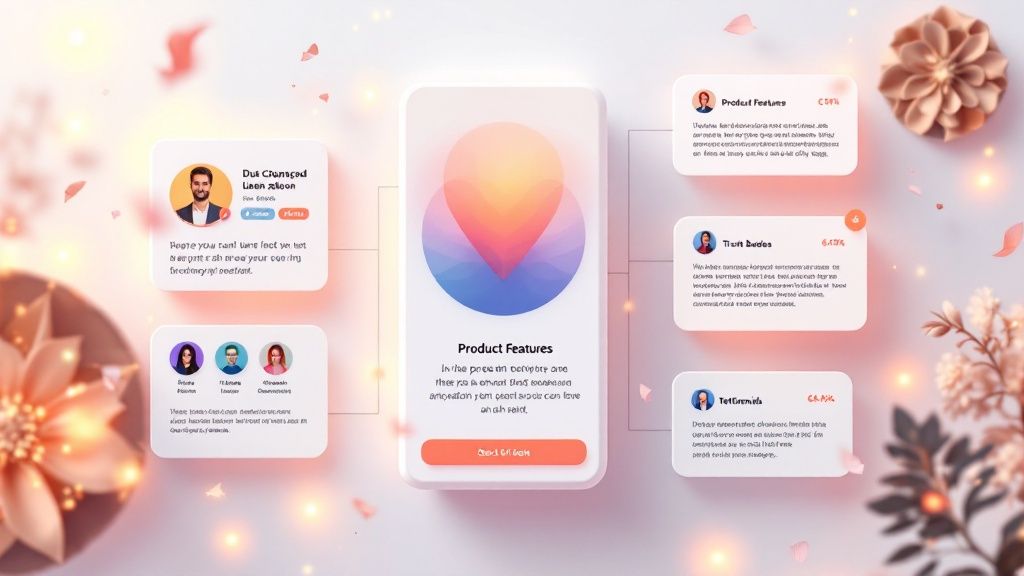
Building a successful landing page requires careful attention to key elements that work together to create a cohesive and persuasive experience. Understanding and implementing these elements is vital for maximizing your return on investment.
Crafting a Compelling Headline and Value Proposition
First impressions matter. Your headline and value proposition are the first things a visitor sees, so they must immediately grab attention and communicate the core benefit of your offer. A strong headline should be concise, impactful, and convey the essence of your message, much like a newspaper headline. Your value proposition then expands on the headline, explaining why the visitor should be interested. For example, instead of a generic "New Shoes" headline, consider something more specific like "Experience Unmatched Comfort with Our New Running Shoes." This immediately clarifies the unique value proposition for a targeted audience, increasing engagement from the start.
The Power of High-Quality Product Imagery and Videos
Visuals are essential in e-commerce. High-quality images and videos allow visitors to truly see your product, visualizing themselves owning and using it. Compelling visuals draw visitors in, encouraging them to learn more. Use a mix of images and videos, including lifestyle shots, close-ups, and even user-generated content, to provide a complete view of the product and build trust. Strong visuals are a cornerstone of a successful landing page.
The Importance of Clear and Concise Product Descriptions
While visuals attract attention, well-written product descriptions provide the necessary details to persuade visitors to convert. These descriptions should be concise yet informative, highlighting key features, benefits, and addressing potential customer questions. Imagine trying to buy a shirt online without knowing the material or size options. Clear product descriptions fill these information gaps, empowering customers to make informed decisions and enhancing their overall experience.
Strategic Call-to-Action (CTA) Placement
The CTA is the core of your landing page. It represents the specific action you want visitors to take and should be prominent, visually appealing, and use action-oriented language. Consider your CTA a guide, directing visitors down the path to conversion. Instead of a generic "Buy Now," consider more specific CTAs like "Shop the Collection" or "Claim Your Discount.” Strategically placing multiple CTAs throughout the page, both above and below the fold, provides multiple opportunities for engagement and conversion. Check out our guide on How to master landing page ecommerce design, optimization, and conversions for a deeper dive into this topic.
Building Trust with Signals and Social Proof
Building trust online is paramount. Incorporating trust signals, such as customer testimonials, security badges, and guarantees, can significantly reassure visitors. These act as endorsements, validating the quality and legitimacy of your offerings. Further bolstering trust, social proof like positive reviews and social media shares adds another layer of credibility. Displaying customer reviews or a "Trusted by X Customers" badge can significantly impact a visitor's confidence, converting hesitant browsers into confident buyers.
Mobile Optimization Strategies
Given that the majority of online traffic now comes from mobile devices, optimizing your landing page for mobile is no longer optional—it’s a necessity. Ignoring mobile optimization means potentially missing out on a large segment of your target audience.
Responsive Design for a Seamless Mobile Experience
The foundation of any mobile-friendly landing page is responsive design. This allows your page to adapt seamlessly to any screen size, whether it's a smartphone, tablet, or desktop. Like water adapting to the shape of its container, the content reflows to fit perfectly, ensuring a positive experience across all devices. Without responsive design, mobile users are left struggling with a zoomed-out desktop version, often leading to frustration and site abandonment.
Page Speed: Crucial for Mobile Conversions
Mobile users expect speed. A slow-loading landing page can significantly impact bounce rates and lead to lost conversions. Even a few seconds' delay can deter a mobile user, particularly those with limited data or a weak signal. Optimizing image sizes, using browser caching, and minimizing HTTP requests are critical for a fast mobile experience that captures and holds a user's attention.
Touch-Friendly Navigation and CTAs
Mobile navigation requires different considerations than desktop navigation. Buttons and links must be large enough and properly spaced for easy tapping. Small, clustered buttons can be frustrating on a touchscreen. Similarly, your CTA should be prominent and easily tappable, guiding users toward the desired conversion. This simplifies the user journey and increases the likelihood of a successful conversion.
Streamlined Content and Forms for Mobile Devices
Given the limited screen space on mobile devices, presenting content concisely and avoiding clutter is essential. Long paragraphs and complex layouts can be difficult to read. Using bullet points, headings, and subheadings can make content more digestible. Simplify forms by minimizing required fields, enabling quick and effortless completion. This streamlined approach ensures mobile users can easily find the information they need and complete the desired action.
A/B Testing Your Landing Page
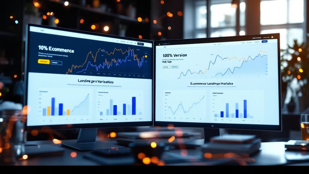
Creating a high-converting landing page is not a one-time task; it requires ongoing optimization. A/B testing, also called split testing, is a powerful tool for this process. It involves comparing two versions of a webpage to determine which performs better. This allows you to experiment with different elements on your landing page and collect data on what resonates best with your audience, leading to data-driven decisions for improved conversion rates.
The Value of A/B Testing for E-commerce
A/B testing empowers you to make informed decisions based on user behavior rather than guesswork. For instance, you might suspect a red call-to-action button will outperform a blue one. A/B testing lets you test this by showing different versions to different audience segments and tracking the resulting conversion rates. This data-driven approach eliminates assumptions and helps you optimize your landing page for maximum impact. You might be interested in: How to master Shopify landing page A/B testing.
Key Elements to A/B Test on Your Landing Page
The possibilities for A/B testing are extensive. You can test virtually any element you believe could influence conversions.
- Headlines: Test different headlines to identify which one best captures attention and communicates your value proposition.
- Call-to-Actions (CTAs): Experiment with button colors, text, and placement.
- Images and Videos: Test different visuals to find which ones resonate most with your target audience.
- Product Descriptions: Test variations in length and style.
- Form Fields: If your landing page includes a form, test the number and types of fields.
- Layout and Design: Experiment with different layouts and the use of whitespace.
Analyzing and Implementing Your A/B Test Results
After running your A/B tests, analyze the results to identify a clear winner. Look for statistically significant differences in conversion rates between the variations. Implement the winning variation on your live landing page. Remember, A/B testing is an iterative process. Continue testing different elements to continuously optimize your page and achieve the highest possible conversion rates.
Best Practices for Product Presentation

Effective product presentation is a cornerstone of a compelling landing page experience. How you present your products can heavily influence a visitor’s purchasing decision, converting casual browsing into actual sales.
Visual Storytelling: Showcasing Your Product's Value
High-quality images and videos are paramount for showcasing your product effectively. Lifestyle images demonstrate how the product fits into a customer's life, while close-up shots highlight key details. Videos bring your product to life, showcasing it in action and providing an engaging experience. This multi-faceted visual approach creates a richer, more informative experience for potential customers.
Writing Compelling Product Descriptions
While visuals are crucial, they need the support of effective product descriptions. These descriptions provide context and information, complementing the visual presentation. Focus on the benefits the product offers, explaining how its features translate into real-world advantages. For example, instead of listing technical specifications, explain how those specifications benefit the customer. Does the new phone's camera take better pictures of their kids? Does the new blender make healthier smoothies faster? Focusing on the "why" behind the "what" creates a stronger connection with the customer.
User-Generated Content: Leveraging Authenticity and Trust
User-generated content, such as customer reviews and testimonials, builds trust and authenticity. These authentic voices resonate with potential buyers, offering social proof and validating your product's value. Displaying customer testimonials or a feed of positive social media posts can create a sense of community and encourage conversions, inviting potential customers to join the ranks of satisfied users.
Conclusion and Next Steps
Building a high-converting landing page strategy requires a careful blend of compelling design and data-driven optimization. We've explored the key elements of effective landing pages, from headlines and visuals to calls-to-action and social proof. Simply creating a landing page and hoping for the best isn't enough; a thoughtful, structured approach is essential.
Implementing and Optimizing Your Landing Pages
Now that you're armed with this knowledge, it's time to take action. Analyze your existing landing pages. Are they mobile-friendly? Do they feature strong visuals and clear product descriptions? Is your call to action compelling? By critically evaluating your current pages, you can identify areas for improvement and implement the strategies discussed.
The Ongoing Power of A/B Testing
Remember the power of A/B testing. Even small changes can significantly impact your conversion rates. Continuously experiment with different elements to determine what resonates best with your audience. This data-driven approach enables constant refinement and maximizes performance. A/B testing should be an ongoing part of your optimization process.
By combining best practices with ongoing optimization, you can create landing pages that not only attract visitors but also convert them into loyal customers. Ready to elevate your e-commerce strategy and boost your bottom line? Checkout Links provides the tools you need to create dynamic, high-converting landing page experiences. Start your free trial today!
 Checkout Links

