Create a High-Converting Shopify Landing Page: A Comprehensive Guide
October 31, 2024

Introduction to Shopify Landing Pages

Think of your Shopify store as a marketplace. You have products, categories, and lots of information. A landing page is like a stall designed for one item or promotion. It’s where you direct customers who click a targeted ad or a special link. The goal? A Shopify landing page that turns visitors into buyers.
Landing pages differ from other pages in your store. They’re highly focused. Their single job is to get your visitor to act. This action could be a purchase, email signup, or resource download. Unlike your homepage, which offers many paths, a landing page simplifies the customer journey toward one goal. This focus is key for e-commerce success.
Why are landing pages so important?
Imagine a potential customer clicks your ad for a new backpack. Instead of landing on your homepage, surrounded by other products, they see a page entirely about that backpack. They see great images, compelling descriptions, and maybe even customer testimonials. The “Buy Now” button is easy to find. This experience is far more likely to result in a sale.
A landing page keeps the customer focused on what first interested them. It minimizes distractions and maximizes conversion chances. This focus makes landing pages powerful for driving sales and growth. A poorly designed page can mean lost sales and unhappy customers.
Types of Shopify Landing Pages
You can create several types of Shopify landing pages, each with a specific purpose:
- Product Landing Pages: Focus on one product, highlighting features and benefits for purchases.
- Collection Landing Pages: Showcase a product collection, ideal for seasonal promotions.
- Promotional Landing Pages: Feature a specific offer, like a discount, contest, or free shipping.
- Lead Capture Landing Pages: Gather customer information, often for a resource or discount.
- Coming Soon Landing Pages: Generate excitement for upcoming products, allowing signup for notifications.
Understanding these page types helps you tailor your approach to specific marketing goals and maximize your return on investment. Creating effective landing pages is crucial for better conversion rates. A/B testing on landing pages has been shown to increase conversions by as much as 30%. Building well-designed landing pages is essential for any successful Shopify store.
Essential Elements of High-Converting Landing Pages

Now that we understand the different landing page types, let’s look at what makes a standard page convert. Creating a Shopify landing page is about crafting an experience that guides visitors toward action.
A Compelling Headline That Grabs Attention
Your headline is the first thing visitors see. Make it powerful! It must be clear, concise, and benefit-driven. Instead of just stating the product, highlight its problem-solving abilities. For example, instead of "New Hiking Backpack," try "Conquer Any Trail with Our Durable, Lightweight Hiking Backpack." One describes, the other engages.
Crystal-Clear Value Proposition: Why Should They Care?
Your value proposition quickly communicates your offer's uniqueness. What problem does it solve? What benefits does it offer? Why choose you? Be specific and focus on the customer. Use examples and data, not generic statements.
High-Quality Visuals: Show, Don't Just Tell
Use high-quality images and videos to showcase your product. Visuals help people imagine owning and using it. Lifestyle images, close-ups, and user-generated content are effective. Optimize images for fast loading to avoid frustrating visitors. Slow loading can hurt conversions.
A Powerful Call to Action: Tell Them What to Do
Your call to action (CTA) should be prominent and clear. Use action language that tells visitors what to do. “Shop Now,” “Get Your Free Trial,” or “Learn More” are good examples. Experiment with CTA button colors, sizes, and placement. A/B test different CTAs. Small changes can make a big difference.
Social Proof: Build Trust and Credibility
Trust is crucial online. Include testimonials, reviews, and social media mentions to build credibility. Real-world examples of your product’s usefulness are persuasive. Show, don't just tell, people that your product is great!
Mobile-First Design: Optimize for Every Device
Most online traffic comes from mobile devices, so design your landing page to look and work well on smartphones and tablets. A responsive design adapts to different screens. A poor mobile experience leads to lost sales. Test on various devices.
By focusing on these elements, you can create a Shopify landing page that converts visitors into loyal customers, boosting sales and driving growth. This focused approach is what makes landing pages so effective for sales.
Step-by-Step Guide to Creating Your Landing Page
Ready to create a Shopify landing page that converts? Let’s break it down, step by step.
1. Choose Your Landing Page Type and Goal
First, ask yourself: what’s this page’s purpose? New product launch? Running a promotion? Building your email list? Different pages serve different purposes. Choose the type that aligns with your goal – product, collection, or lead capture.
2. Select a Shopify Landing Page Builder
Shopify offers built-in page builders that are easy to use. For more advanced features, explore dedicated landing page apps in the Shopify App Store. Many offer drag-and-drop functionality, making creation easy without coding. Find a tool that fits your needs and budget.
3. Craft Your Content
This is where it all comes together. Use the essential elements. Write a compelling headline, a clear value proposition, and a powerful call to action. Don’t forget high-quality images and videos! They’re essential for showcasing your product and building trust.
4. Design the Layout
Arrange everything visually. Choose a clean layout that’s easy to navigate. Keep your audience in mind – what appeals to them? What’s the best way to present your offer? Consider tools like Checkout Links to create shoppable links for pre-filled carts with discounts, enhancing the shopping experience and potentially boosting conversions. Keep the page focused on the goal – minimize distractions.
5. Optimize for Mobile
This is critical! Most traffic is mobile, so make sure your page looks great on phones and tablets. Test on different devices to ensure responsiveness and ease of use. A poor mobile experience can hurt sales.
6. Preview and Publish
Before going live, preview your page for errors. Check links, images, and the overall look on different devices. Once you're happy, publish!
7. Track and Analyze
Use Shopify’s analytics or other tools to monitor performance. Watch metrics like conversion rate, bounce rate, and time spent on page. This data reveals what's working and what needs improvement.
8. Test and Refine
A/B testing is key for improvement. Create different page versions with variations in headlines, images, calls to action, or layout. Test these versions to see what performs best. Small changes can significantly increase conversions – sometimes as much as 30%! This process optimizes your page.
By following these steps, you can create a Shopify landing page that looks great and delivers results. Building a high-converting page is an ongoing process. Keep testing, refining, and adapting to your audience.
Optimizing for Mobile Users
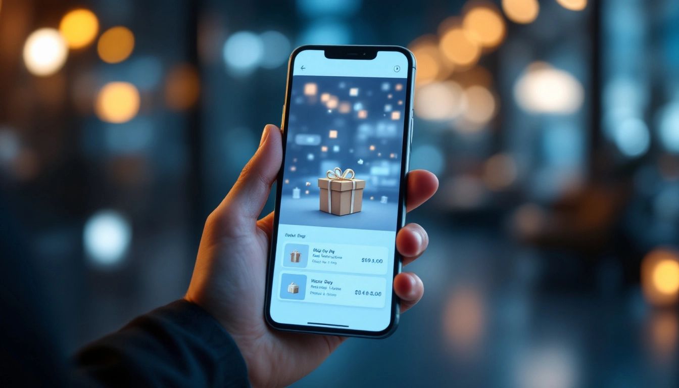
Over half of all online traffic comes from mobile devices. Optimizing your Shopify landing page for mobile is crucial. For a landing page to convert, it needs to work perfectly on smartphones and tablets. A slow, clunky page will send mobile users to your competitors.
Responsive Design: Your Foundation for Mobile Success
Responsive design is key for a great mobile experience. Your page automatically adjusts to different screen sizes. Text is readable, images display correctly, and navigation is simple, regardless of the device. Many Shopify themes are responsive, but it's always best to double-check. Preview on different devices.
Speed Matters: Don't Lose Customers to Loading Times
Mobile users are impatient. A slow page can kill conversions. Optimize images, minimize code, and use browser caching to ensure quick loading. Even a one-second delay can significantly reduce conversions. Aim for a load time of two seconds or less. Tools like Google PageSpeed Insights help identify areas for improvement.
Touch-Friendly Navigation: Make it Easy to Browse and Buy
Fingers are less precise than mouse cursors. Ensure your buttons and links are large enough for tapping. Avoid tiny text and cluttered layouts. Simplify navigation. Consider how users interact with their phones and design accordingly.
Streamlined Content: Get to the Point Quickly
Mobile users want information quickly. Keep your content concise. Use bullet points, short paragraphs, and clear headings for easy scanning. Prioritize important information and make it accessible.
Mobile-Specific Features: Enhance the User Experience
Consider mobile-specific features. Click-to-call buttons make contacting you easy. Location-based services can personalize the experience. These touches improve user perception of your brand. When you create a Shopify landing page with mobile users in mind, you’re more likely to turn visitors into customers. It’s a necessity.
A/B Testing Strategies
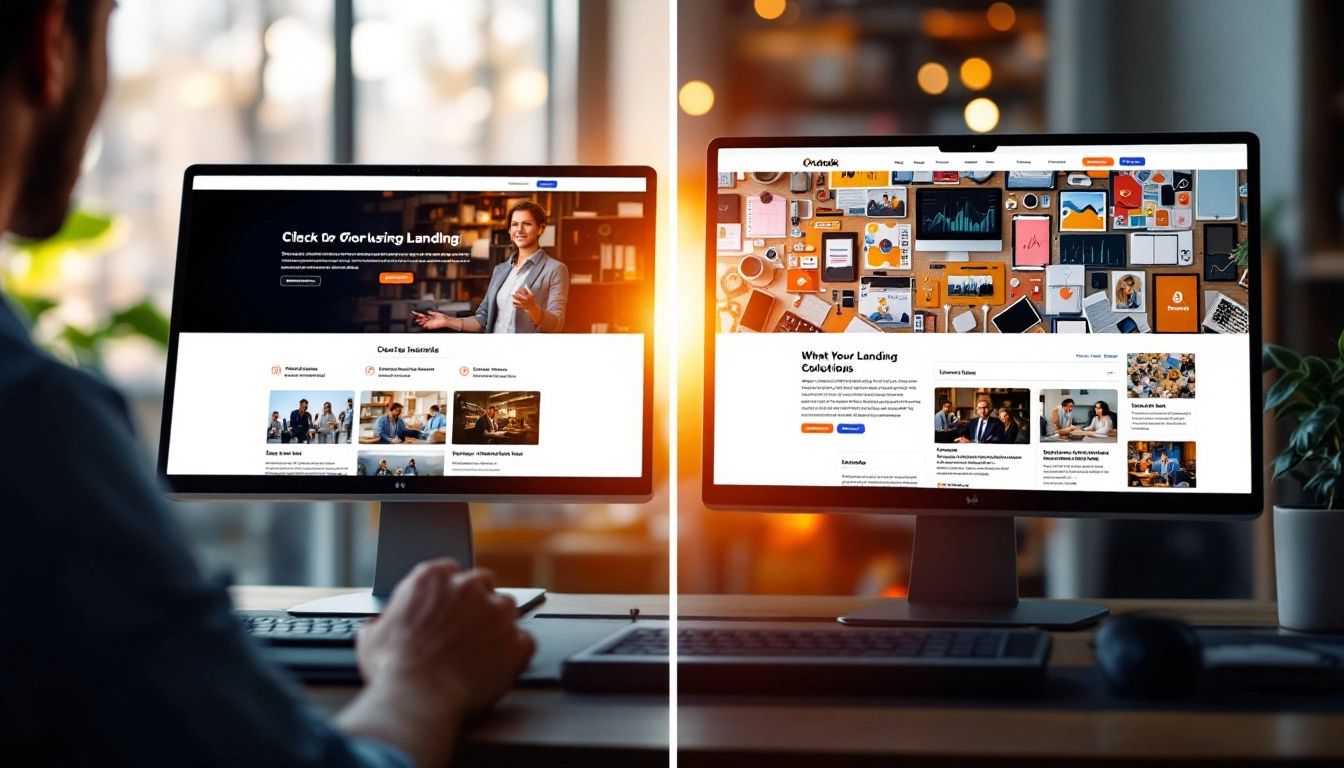
After launching your landing page, the work continues. A/B testing helps you make it even better. Create two slightly different versions (A and B) and show them to different visitor groups. Track which version performs better – making a sale, capturing leads, etc. This allows data-driven decisions and continuous optimization.
Why is A/B testing so important?
Think of your landing page as a recipe. A/B testing helps find the perfect proportions for conversions. Each element we discussed is a potential test variable. Small changes can have a big impact. You might see increased sales just by changing your call to action’s color or wording! A/B testing on landing pages can increase conversions by as much as 30%.
What should you A/B test?
- Headlines: Experiment with different headlines to see which grabs attention and communicates best.
- Call to Actions: Test CTA button colors, sizes, text, and placement. A stronger CTA can boost conversions. Wording matters; “Get Started Today” can outperform generic CTAs.
- Images and Videos: Try different visuals. High-quality images and engaging videos influence visitors.
- Layout and Design: Experiment with layouts to find what resonates with your audience. A streamlined layout improves user experience and conversions.
- Copy and Messaging: Test different wording in descriptions, value propositions, and testimonials. Persuasive or benefit-oriented messaging is effective.
How to Run an A/B Test
- Choose a Testing Tool: Shopify's analytics and third-party apps can help. Research options.
- Create Your Variations: Develop two versions, each with a single change. Keep everything else the same.
- Split Your Traffic: Direct equal traffic to both versions. Your testing tool should handle this.
- Monitor the Results: Track metrics like conversion rate, bounce rate, and time on page.
- Analyze and Implement: Analyze which version performed better. Implement the winner.
- Repeat the Process: A/B testing is ongoing. Continuously test and refine.
A/B testing makes your landing page evolve, ensuring it performs at its best. It's all about analyzing data and refining your approach based on what works.
Common Mistakes to Avoid
Before launching your Shopify landing page, let’s review common mistakes that can hinder even experienced store owners. Avoiding these can make the difference between a converting page and one that fails.
Neglecting Mobile Optimization
Over half of traffic is mobile. If your page isn’t optimized for mobile, you’re losing a large portion of your audience. Test thoroughly on various devices. Ensure it loads quickly and is easy to navigate.
Cluttered Design and Distracting Elements
A cluttered page is a confusing page. Keep it clean and focused. Every element should contribute to your goal. Too many elements can overwhelm visitors. Less is often more.
Weak or Unclear Call to Action
Your call to action is vital. It must be clear, concise, and compelling. Use action-oriented language and make the button stand out. A weak CTA will lead to lost conversions.
Ignoring the Importance of A/B Testing
A/B testing should be ongoing. Regularly test different versions. Small changes can greatly impact your conversion rate. Testing is key to continuous improvement.
Not Tracking and Analyzing Performance
Launching your page is just the start. Track performance and analyze data. Are visitors taking action? What's your bounce rate? Time spent on page? These metrics offer valuable insights.
Lack of Social Proof
Social proof is important. Include testimonials, reviews, and social media mentions to build trust. Show potential customers that others appreciate your product. This can influence shoppers.
Generic Value Proposition
Don’t just describe your product; explain why it’s needed. Focus on the benefits. A generic value proposition won’t persuade anyone. Address your audience’s problems and highlight your solution.
Slow Loading Times
A slow-loading page can be a deterrent. Optimize your images, minimize code, and ensure quick loading, especially on mobile. Every second counts.
Forgetting About SEO
While your landing page is focused on a specific goal, remember SEO. Use relevant keywords in your headlines, copy, and meta descriptions. This helps your page rank and attract organic traffic.
Overlooking the Power of Personalization
Consider tools like Checkout Links to create shoppable links to pre-filled carts with applied discounts. This personalization enhances shopping and can increase conversions. Personalization goes beyond just using a customer's name. Tailor messaging and offers to specific audience segments.
By avoiding these mistakes and creating a user-friendly experience, you can maximize the effectiveness of your Shopify landing pages. Creating a landing page is an ongoing process. Keep testing, refining, and adapting.
Conclusion and Next Steps
Creating a high-converting Shopify landing page is about method. We’ve covered the essentials, a step-by-step guide, mobile optimization, A/B testing, and common errors. You’re ready to build a landing page that looks good and drives results.
Putting it All Together
Your landing page is a focused sales pitch. It should grab attention, highlight benefits, build trust, and guide visitors to action. Remember the core principles:
- Clarity: Make your message clear.
- Focus: One landing page, one goal.
- Mobile-First: Design for mobile first.
- Testing: A/B test everything.
Your Next Steps: Take Action!
Define your landing page goal. Choose a builder and craft your content. Keep it concise, benefit-oriented, and visually appealing.
Want to improve your Shopify marketing? Checkout Links can help! Create shoppable links that take customers directly to pre-filled carts with discounts already applied. It’s a simple way to personalize shopping and drive sales. Try Checkout Links today! Get started with Checkout Links now!
 Checkout Links

