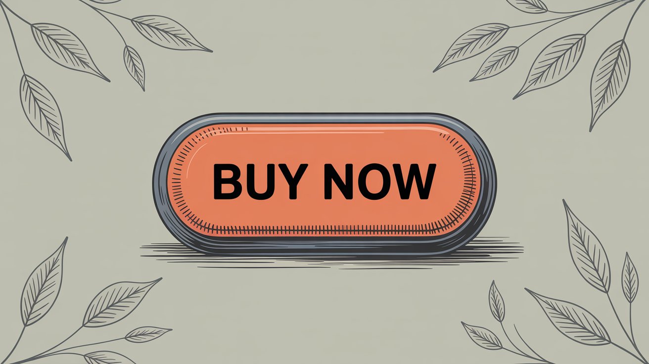
How to Create a Shopify Buy Now Button That Converts (2026)
Your checkout process is leaking money.
Not because your products aren't good or your pricing is wrong. It's because too many clicks stand between a customer who wants to buy and actually completing the purchase. Every extra page, every added step, every moment of friction gives them another chance to think "maybe later" and close the tab.
The solution? A properly implemented Buy Now button that eliminates the maze between interest and purchase.
This isn't just another Shopify feature to toggle on and forget. When done right, a Buy Now button can slash your cart abandonment rate, increase mobile conversions, and capture those impulse purchases that otherwise slip away. But when done wrong (and trust me, plenty of stores get this wrong) it creates confusion, cannibalizes your primary CTA, and can actually hurt your conversion rate.
So let's talk about how to create a Buy Now button that actually works for your Shopify store.
What Is a Shopify Buy Now Button and Why Does It Matter?
A Buy Now button isn't just a faster version of Add to Cart. It's fundamentally different in what it promises the customer.
On Shopify, the Buy Now button (officially called "Buy it now" in most themes) is part of Shopify's dynamic checkout system. When a customer clicks it, they skip the cart page entirely and land straight at checkout with that specific product ready to purchase. No intermediate steps. No opportunity to second-guess or get distracted.
The button adapts to each customer. If they're on Safari with Apple Pay enabled, they'll see an Apple Pay button. If they have Shop Pay saved, they get a Shop Pay option. If neither applies, they see a standard "Buy it now" button that takes them through Shopify's regular checkout.
Consider the psychology. When someone clicks "Add to Cart," they're essentially saying "I'm considering this." When they click "Buy Now," they're saying "I want this now." That subtle shift in commitment matters.
The numbers back this up. Research shows that roughly 26% of U.S. online shoppers abandon their orders specifically because the checkout process is too long or complicated. And overall cart abandonment sits at around 70% across e-commerce sites. A Buy Now button directly attacks both problems by removing steps and simplifying the path to purchase.
But (and this is important) it's not universally better than Add to Cart. It's a tool that works brilliantly in specific contexts and falls flat in others.
When Does a Buy Now Button Actually Improve Conversions?
Let's cut through the marketing fluff and talk about when this feature genuinely helps your bottom line.
Single-Product or Focused Purchases
If you sell one product, a tight product line, or run campaigns focused on specific items, Buy Now is your friend. Why make someone go through a cart when there's nothing else to add?
A customer lands on your product page from a Facebook ad. They've already seen the product, they know the price from the ad, and they're ready to grab it. Making them click "Add to Cart," then navigate to cart, then proceed to checkout is just... unnecessary friction.
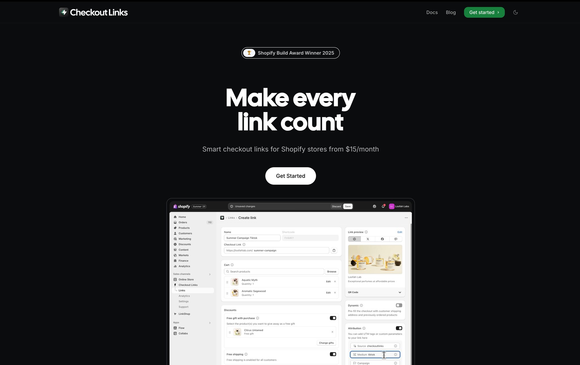
Checkout Links (Checkout Links's Shopify app) was built specifically for this scenario. You can create smart checkout URLs that not only skip the cart but also pre-apply discounts, add free gifts, and prefill customer information. It's the Buy Now concept taken to its logical extreme: one click from your marketing campaign straight to a configured checkout.
Mobile Shopping (Where Speed Is Everything)
Over 60% of e-commerce happens on mobile devices in 2026.
On a small screen, every extra tap feels like work. The cart page on mobile often requires scrolling, the checkout button might be below the fold, and typing in discount codes is a pain. A Buy Now button that integrates with mobile wallets like Apple Pay or Google Pay turns checkout into literally one tap with biometric authentication.
The experience difference is massive:
Traditional flow:
Product page → Add to Cart → Cart page → Checkout → Payment details → Complete
Buy Now with wallet:
Product page → Touch ID → Done
That's five steps reduced to two. For mobile users who might be shopping during a commute or in a coffee shop queue, that simplification is the difference between completing the purchase and abandoning it.
Impulse Purchases and Limited-Time Offers
The longer someone has to think, the more likely they are to talk themselves out of buying.
Buy Now capitalizes on impulse by keeping the momentum going. When you're running a flash sale, a product drop, or a limited-stock situation, you want to capture that "I need this right now" feeling before rational thinking kicks in.
This is exactly where time-limited checkout links that activate during your sale window shine. You can create scheduled links that expire automatically. Pair that with a Buy Now flow and you've got a conversion machine for time-sensitive campaigns.
Recovery and Reorder Flows
A specific use case that's pure gold: cart abandonment recovery emails.
Instead of sending a "You left items in your cart" email with a link back to the cart page (where they might browse more and get distracted again), send them a direct checkout link with an incentive. "Complete your purchase now with 10% off" (click) checkout with discount already applied.
For returning customers who want to reorder their previous purchase? A personalized Buy Now link with their last order pre-filled makes reordering literally one click. This is especially powerful for consumables, subscriptions, or products with predictable repeat purchase cycles.
The Hidden Downsides of Buy Now Buttons Nobody Talks About
Real talk. Buy Now buttons aren't magic, and they can backfire if you don't understand the trade-offs.
You're Limiting Basket Size
The most obvious downside: customers can only buy one product at a time through a Buy Now flow. If your business model depends on people adding multiple items or building an outfit or bundle, forcing them through a single-item checkout hurts your average order value.
Think about fashion retailers where customers often buy complete looks, or supplement companies where people stock up on multiple bottles. For them, the cart page is an opportunity to suggest "Complete the look" or "Buy 3, save 20%." Skip the cart, skip the upsell.
Buy Now Buttons Can Create Confusion (And That Kills Conversions)
Two competing buttons on the same page can paralyze decision-making.
The case study that really drives this home: Modern Gents, a Shopify merchant, had both Add to Cart and Buy Now on their product pages. Sounds good, right? Give customers options?
Their heatmaps showed something surprising. Visitors were scrolling past both buttons to read reviews and product details, but then many never came back up to click either button. The presence of two CTAs was creating decision friction. "Which one should I click? What's the difference?"
The lesson isn't "never use Buy Now." It's "understand your customer's mindset." Modern Gents sells products that require research and consideration. Their customers want to read reviews and details before deciding. A prominent Buy Now at the top was premature and aggressive.
Some Shopify Apps and Features Won't Work
A technical gotcha: when someone uses an accelerated checkout (like Apple Pay or PayPal), they might bypass some of your Shopify apps and customizations.
Certain apps that rely on the standard cart-to-checkout flow may not trigger properly. Custom cart attributes (gift messages, delivery date selectors, terms checkboxes) won't display if the customer never sees the cart. Some automatic discounts that are configured to apply at cart might not work correctly.
If you've invested in upsell apps, post-purchase offer apps, or have custom checkout scripts, you need to test the Buy Now flow thoroughly to ensure nothing breaks.
You Can't Customize It Much
Shopify's dynamic checkout button is intentionally standardized. You can adjust the color to match your theme, but you can't change the text (it'll always say "Buy it now" in English stores), and you definitely can't modify the branded buttons like Apple Pay or PayPal.
This standardization is actually a feature, not a bug. Customers recognize these payment methods and trust them. But if you wanted a custom message like "Instant Checkout" or "Express Purchase," you're out of luck with the native button.
Buy Now vs Add to Cart: Which Button Converts Better?
The wrong question.
It's not "which one" – it's "which one for your specific situation." Both have their place, and the best Shopify stores use both strategically.
| Feature | Add to Cart | Buy Now |
|---|---|---|
| Purpose | Exploration & collection | Immediate conversion |
| Best for | Large catalogs, browsing | Single products, campaigns |
| Customer mindset | "Let me collect and compare" | "I want this right now" |
| Basket size | Encourages multiple items | One product at a time |
| Upsell opportunities | Cart page upsells available | Skips upsell opportunities |
| Mobile experience | Multiple taps required | One-tap with wallets |
| Decision friction | Lower commitment initially | Higher commitment upfront |

Add to Cart is for exploration. It says "collect what you want, then decide." Perfect for:
• Stores with large catalogs where people browse multiple products
• Products often bought together or in combinations
• Higher-consideration purchases where people compare options
• Situations where you want to present upsells or volume discounts at cart
Buy Now is for conversion. It says "get this immediately." Perfect for:
• Single-product stores or focused product launches
• Impulse purchases and time-sensitive offers
• Mobile-first shopping experiences
• Recovery emails and retargeting campaigns
• Any situation where speed matters more than choice
Research indicates that Buy Now buttons are best for stores based on a single product, while Add to Cart buttons make more sense for stores with large catalogs.
But most stores can use both. You just need to design it so the distinction is clear and one doesn't cannibalize the other's effectiveness.
Some strategies that work:
Strategy 1: Primary + Secondary CTA
Make Add to Cart your primary, prominent button (in your brand color). Put Buy Now below it in a more subtle style, maybe with small text like "Skip cart - instant checkout."
Strategy 2: Context-Specific
Use Buy Now only on dedicated landing pages for campaigns (where you're driving paid traffic to one product), but keep it off your main catalog pages where people browse.
Strategy 3: Device-Specific
Show Buy Now more prominently on mobile (where speed matters) and emphasize Add to Cart on desktop (where people are more likely to multi-browse).
Strategy 4: Product-Specific
Enable Buy Now only on products that typically sell individually. Disable it on items that are usually part of bundles or multi-product purchases. Use A/B testing to optimize which products perform best with Buy Now enabled.
The only way to know what works for your store is to test. Which brings us to...
How to Add a Buy Now Button to Your Shopify Store (Step-by-Step)
The basic setup is dead simple. No coding required.
Step 1: Enable Dynamic Checkout in Your Theme
1. In your Shopify admin, go to Online Store > Themes
2. Click Customize on your active theme
3. Navigate to a Product page using the page selector dropdown
4. Click on the section containing your Add to Cart button (usually called "Product information" or "Buy buttons")
5. Look for the checkbox "Show dynamic checkout button"
6. Enable it
7. Save your changes
That's it. Your product pages now have a Buy Now option.
The button will automatically display the most relevant payment method for each visitor. Someone with Apple Pay set up sees an Apple Pay button. Someone who's used Shop Pay before sees Shop Pay. Everyone else sees the generic "Buy it now" button.
Step 2: Test the Buy Now Flow Thoroughly
Don't just toggle it on and walk away. You need to verify the experience works smoothly:
• Place a test order yourself using the Buy Now button
• Try it on mobile (both iOS and Android if possible)
• Test with different payment methods (credit card, PayPal, etc.)
• Verify your discount codes still work
• Confirm any essential checkout customizations still appear
• Check that your analytics are tracking these purchases correctly
If you have apps that modify checkout, test whether they still function with the Buy Now flow. Some won't, and you'll need to decide if the trade-off is worth it.
Step 3: Design Your Buy Now Button for Maximum Impact
Just because the button exists doesn't mean people will click it. You need to make it prominent and compelling.
Placement matters. Keep it above the fold, right next to your product price and Add to Cart button. Don't make people scroll to find it. If your product pages are long, consider implementing a sticky CTA bar that follows as they scroll, so the purchase option is always one tap away.
Color psychology matters. Studies analyzing top e-commerce stores found that red is the most common color for Buy/Add to Cart buttons, followed by orange, green, and blue. Why? These colors create urgency (red), grab attention (orange), signal "go" (green), or build trust (blue).
But more important than following trends is contrast. Your Buy Now button needs to visually pop against your background. If your site is primarily white or light-colored, use a bold, saturated button color. If your design is dark, go brighter.
The rule: someone glancing at your product page should immediately see where to take action.
Trust signals reduce friction. Right near your Buy Now button, include small reassurances:
• Security badge ("Secure checkout" with a lock icon)
• Return policy ("30-day free returns")
• Payment methods accepted (let the dynamic button itself show this)
• Shipping guarantee ("Free shipping over $50")
These don't need to be large or attention-grabbing. A single line of small text or a few discrete icons is enough. You're just addressing last-second hesitations at the moment of action.
Mobile optimization is non-negotiable. Test your button on actual mobile devices, not just the desktop preview. Make sure it's:
→ Large enough to tap easily (minimum 44px tall)
→ Not too close to other clickable elements
→ Visible without zooming
→ Ideally full-width on mobile screens for easy thumb access
A button that works great on desktop but is frustrating on mobile wastes your mobile traffic (which is the majority of your traffic).
Advanced Tactics: How to Use Buy Now Links in Marketing Campaigns
Things get interesting when you take the Buy Now concept off your website and into your marketing channels.
The most powerful implementations happen in your email campaigns, social ads, and customer touchpoints.
Direct Checkout Links in Email Campaigns
Imagine an abandoned cart email that doesn't just remind someone about their cart. Instead, it takes them directly to checkout with their items already loaded and an incentive discount pre-applied.
"Your cart is waiting + 10% off if you complete checkout now" → Click → Straight to checkout, discount already applied, just pay.
No clicking through to the cart page. No remembering to enter a discount code. No extra steps where they might get distracted. Just: click, confirm, done.
This is exactly what Checkout Links is built for. You create a smart checkout URL that prefills the cart, applies the discount automatically, and tracks the conversion with UTM parameters for your analytics.
One-Click Reorder Links for VIP Customers
Got customers who buy the same product monthly? Send them a personalized email: "Reorder your usual – click here."
That link can:
• Pre-fill their previous order in checkout
• Pre-populate their saved shipping address
• Apply their VIP discount automatically
• Track that this is a repeat purchase
Checkout Links' customer parameter feature makes this trivial to set up. You're turning a 10-click reorder process into literally one click.
Social Media and Paid Ads
Running a Facebook ad for a specific product? Instead of sending clicks to your product page (where they might browse, get distracted, leave), send them to a direct checkout link with:
• The featured product pre-loaded
• The advertised discount already applied
• Campaign tracking built into the URL
• Optionally, a free gift added automatically
This is perfect for retargeting campaigns. Someone viewed a product but didn't buy? Hit them with an ad that shows the product plus a 15% discount, and the link takes them straight to checkout with everything configured. They click once and buy, or they don't. No multi-step funnel to leak conversions.
You can create these campaigns manually with Shopify's Buy Button sales channel, or use Checkout Links to build them at scale with automatic discount logic, threshold-based free gifts, usage limits, QR codes, and native Shopify analytics integration. (Side-by-side: Shopify Buy Button alternative — Checkout Links.)
The Checkout Links approach essentially turns any marketing touchpoint into a direct conversion opportunity. Email, SMS, social posts, influencer campaigns, print ads with QR codes, even in-store signage. Anywhere you can put a link or QR code, you can create a frictionless Buy Now experience.
How to Know If Your Buy Now Button Is Working (Measuring What Matters)
Adding a Buy Now button and hoping for the best is amateur hour. You need to track specific metrics to know if it's helping or hurting.
The Metrics That Actually Matter
Conversion rate (overall)
The percentage of visitors who complete a purchase. This is your north star. If Buy Now is working, this should trend up after implementation (controlling for seasonality and other changes).
Checkout reach rate
What percentage of visitors make it to the checkout page. Buy Now should increase this since it's a direct path to checkout.
Checkout abandonment rate
Of those who reach checkout, how many actually complete it. Watch this carefully. If Buy Now is routing people to checkout before they're ready, this might increase.
Average order value (AOV)
The average dollar value per order. If Buy Now reduces this noticeably, you're trading larger baskets for more frequent smaller purchases. That's not necessarily bad, but you need to know it's happening.
Button click rates
Track how often Buy Now gets clicked vs Add to Cart. If Buy Now is rarely clicked, it might be confusing or unnecessary for your audience.
Device segmentation
Look at these metrics separately for mobile vs desktop. You might find Buy Now crushes on mobile but doesn't move the needle on desktop. That's valuable intel.
Track all these metrics in Checkout Links' native analytics dashboard if you're using smart checkout URLs for your campaigns.
Use Heatmaps and Session Recordings
Tools like Hotjar, Lucky Orange, or Microsoft Clarity let you watch actual user sessions. You'll see:
→ Do people hover over the Buy Now button, hesitate, then leave?
→ Are they scrolling past it to read more, then never coming back?
→ Do they click it accidentally when trying to click something else?
→ Is the button even visible on their device?
These qualitative insights explain the why behind your quantitative metrics.
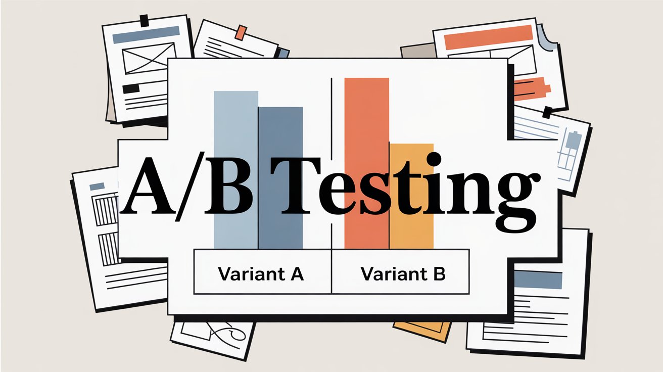
A/B Test Systematically
The gold standard: run proper split tests.
Test 1: Buy Now vs No Buy Now
Show half your traffic the product page with Buy Now enabled, half without it. Measure conversion rate, AOV, and revenue per session for each group. Let it run until you have statistical significance.
Test 2: Primary vs Secondary CTA Design
If using both buttons, test which should be more prominent. Maybe version A has Add to Cart in your brand color and Buy Now subtle below it. Version B flips this. See which converts better.
Test 3: Placement Variations
Test a sticky Buy Now bar vs no sticky bar on mobile. Test different positions on the page.
Even if you can't run formal A/B tests, do before-and-after comparisons. Note your conversion rate, AOV, and cart abandonment rate for two weeks before enabling Buy Now. Then measure the same metrics for two weeks after (keeping other variables constant). The difference tells you the impact.
Watch for Technical Issues
Check your Shopify checkout logs and analytics for errors. If you see:
• Spike in payment failures for a specific method (Apple Pay, PayPal, etc.)
• Unusual drop-offs at the shipping step
• Complaints about "button doesn't work"
These could indicate Buy Now is triggering technical issues that need fixing. Shopify Payments integration problems, app conflicts, or theme bugs can all cause silent conversion killers.
The Smart Buy Now Strategy: What Actually Works in 2026
After analyzing successful Shopify stores and conversion data, what consistently works:
① Match the button to customer intent
If your traffic comes from awareness-stage content marketing, most visitors aren't ready to Buy Now. They're researching. Add to Cart makes sense. But if you're running retargeting ads to people who viewed specific products, they're much warmer. Buy Now matches their intent.
Know your traffic sources and customize accordingly.
② Don't force it on every product
Enable Buy Now on:
• Your hero products that drive most sales
• Products typically bought alone
• Items on promotion or in time-limited campaigns
Keep it off products that:
• Are usually bought in multiples
• Have complex variant selection that needs explanation
• Require customization or personalization
③ Use it aggressively in recovery flows
Cart and browse abandonment emails should almost always use direct checkout links. These people already showed interest. Remove every possible barrier to completion.
④ Make mobile your priority
If you have to choose between optimizing Buy Now for desktop or mobile, choose mobile every time. That's where the majority of your traffic is, and where friction hurts most.
⑤ Integrate it into your campaign infrastructure
Every email campaign, every paid ad, every influencer collaboration should consider whether a direct checkout link would convert better than sending to a product page.
Checkout Links makes this operational. Instead of manually creating checkout URLs, you build them in the app with all the rules (discounts, gifts, limits, tracking) configured, then deploy those links across all your marketing channels. The app handles the checkout logic and tracks everything in native Shopify analytics.
It's Buy Now as a systematic marketing advantage, not just a random button on your site.
⑥ Continuously test and refine
Set a calendar reminder to review your Buy Now metrics monthly. Look for:
• Is the button being clicked?
• Is it converting when clicked?
• Is AOV acceptable?
• Are there patterns by device, traffic source, or product?
Based on what you learn, adjust. Maybe you hide it on certain pages, emphasize it more on mobile, or only show it to returning visitors. Optimization is iterative.
Frequently Asked Questions About Shopify Buy Now Buttons
Q: Will adding a Buy Now button hurt my sales if I already have a good Add to Cart flow?
Not necessarily, but it depends on implementation. The Modern Gents case study showed that sometimes removing Buy Now improved conversions because it eliminated confusion. The key is testing. Enable it, watch your metrics for 2-3 weeks, and compare to your baseline. If conversion rate holds or improves and AOV doesn't tank, keep it. If you see negative movement, reconsider.
Q: Can I customize what the Buy Now button says?
With Shopify's native dynamic checkout, you can't change the text without editing theme code. It'll say "Buy it now" (or the equivalent in your store's language) plus any branded payment buttons. If you need different messaging, you'd need to code a custom solution or use apps that create custom checkout links with different CTAs.
Q: Does Buy Now work with subscription products?
Yes, but with caveats. If you're using a subscription app like Recharge or Bold, you need to check their documentation. Some subscription apps have their own Buy Now options that work with their checkout, but Shopify's native dynamic checkout might not support subscription parameters. Test thoroughly before relying on it for subscriptions.
Q: What's the difference between Buy Now buttons and Checkout Links?
Shopify's Buy Now button is a feature of your theme that appears on product pages and takes customers to checkout. Checkout Links is a Shopify app that creates smart checkout URLs you can use anywhere (emails, ads, social media, QR codes, etc.). Checkout Links gives you much more control: automatic discounts, free gift logic, customer prefill, usage limits, scheduling, and detailed analytics. Think of native Buy Now as the basic feature, and Checkout Links as the advanced marketing tool.
Q: How do I track conversions from Buy Now separately from Add to Cart?
In Shopify Analytics, you'll see overall conversion rates. To track them separately, you can use Google Analytics events (if you've set up enhanced e-commerce tracking) or use apps/tools that differentiate the checkout initiation source. If you're using Checkout Links for marketing campaigns, it has built-in analytics that track per-link performance natively in Shopify.
Q: Can I use Buy Now for products with lots of variants (size, color, etc.)?
Yes, but the customer must select their variant on the product page before clicking Buy Now. The button will take them to checkout with whichever variant they had selected. If your products have complex variant selection (like custom engraving or multiple dependent options), make sure the UI is clear before the Buy Now button, so people don't accidentally check out with the wrong configuration.
Q: What about international customers and multi-currency?
Shopify's dynamic checkout handles multi-currency if you have it enabled in your store settings. The Buy Now button will show prices in the customer's local currency (if you've set up Shopify Payments multi-currency). For Checkout Links, fixed discount amounts auto-convert to the buyer's currency, so your campaigns work globally without manual adjustment.
Q: Should I show Buy Now on my cart page too?
Some themes allow this. It can be useful if someone is reviewing their cart and wants to checkout quickly with a preferred payment method (like PayPal). But it's less impactful than having it on product pages since they've already committed enough to add items to cart. Test it if your theme supports it, but prioritize the product page experience first.
Q: How do I prevent customers from using Buy Now links multiple times if I want one-time offers?
This is where Checkout Links' usage limits shine. You can set links to work only once ever, or once per customer (requires enabling Checkout Links validation in your Shopify checkout settings). You can also require a passcode for exclusive access.
Buy Now Is a Tool, Not a Magic Button
The truth that most "just enable this one feature!" blog posts won't tell you: a Buy Now button isn't inherently good or bad for conversions. It's a tool that works brilliantly in the right context and fails in the wrong one.
The right context? When you're selling to someone who already knows what they want and you just need to eliminate friction. The wrong context? When you're asking someone to commit before they're ready or when you're sabotaging larger basket sizes for your business model.
The stores that win with Buy Now are the ones that:
✓ Actually understand their customer's buying journey
✓ Test instead of assuming
✓ Design the experience intentionally
✓ Track the right metrics
✓ Iterate based on data
If you take only one thing from this guide, make it this: remove unnecessary friction, but don't remove necessary information. A Buy Now button removes steps from checkout. Great. But if your customers need to read reviews, compare options, or understand your return policy before buying, removing steps before they get that information will backfire.
The most sophisticated approach treats Buy Now not as a yes/no decision for your whole store, but as a strategic tool you deploy in specific contexts:
→ Direct checkout links in email campaigns
→ One-click reorder for consumables
→ Landing pages for paid ads
→ Mobile-optimized quick checkout
→ Recovery flows with incentives
Tools like Checkout Links exist specifically to make this strategic deployment operational. Instead of a blunt "enable Buy Now site-wide or not" decision, you can create precisely configured checkout experiences for each campaign, customer segment, and use case.
That's how you turn Buy Now from a theme checkbox into a competitive advantage.
Want to see how smart checkout links can improve your conversion rate? Try Checkout Links free for 7 days and create your first campaign-optimized checkout link in under 5 minutes. No credit card required.