Boost Conversions with ecommerce website optimization: A Practical Guide
Ecommerce website optimization is all about a simple, powerful idea: continuously improving your online store to drive more sales and create a better experience for your customers. It’s the art and science of making data-backed tweaks to everything from your site’s speed and mobile design to your checkout flow, turning more of your hard-won traffic into paying customers.
Why Ecommerce Optimization Is Your Growth Engine
Think of an unoptimized ecommerce site as a leaky bucket. You pour marketing dollars in at the top, but potential revenue drips out with every frustrated click and abandoned cart. Too many brands treat issues like high bounce rates or slow load times as isolated problems. The top-tier stores? They see them as massive opportunities.
This isn't just about patching holes. It's about building a powerful engine that drives sustainable profit.
Every single second of delay, every moment of confusion, costs you real money. We know that a site taking longer than three seconds to load can lose nearly half of its potential mobile visitors. That’s not just a single lost sale; it's a negative brand experience that might stop that shopper from ever coming back.
Turning Problems Into Opportunities
So, what's the secret? It's a mindset shift. Stop seeing problems and start seeing pathways to more revenue.
An abandoned cart isn't a failure—it's a warm lead just waiting for the right nudge. A high bounce rate on a product page isn't a dead end; it's a clear signal that you need to rethink your photos, copy, or call-to-action.
This playbook is designed to walk you through turning these common friction points into high-converting advantages. We'll dive into actionable strategies for:
- Boosting Site Speed: Pinpoint and eliminate the performance bottlenecks that are bleeding you sales.
- Refining User Experience (UX): Make your site a breeze to navigate, no matter the device.
- Streamlining Checkout: Tear down the barriers causing cart abandonment and create a frictionless path to purchase.
Before we dive deep into the specific tactics, let's get a high-level view of the key areas we'll be focusing on. This table breaks down the core pillars of a successful optimization strategy.
Key Pillars Of Ecommerce Optimization
| Optimization Pillar | Primary Goal | Key Metrics To Track |
|---|---|---|
| Site Performance & Speed | Reduce load times to improve UX and SEO rankings. | Page Load Time, Core Web Vitals, Time to First Byte (TTFB) |
| User Experience (UX) | Make the site intuitive, engaging, and easy to navigate. | Bounce Rate, Pages per Session, Conversion Rate by Device |
| Product Page Optimization | Persuade visitors to add products to their cart. | Add-to-Cart Rate, Product Page Conversion Rate, Wishlist Adds |
| Checkout Flow | Minimize friction and steps to complete a purchase. | Cart Abandonment Rate, Checkout Completion Rate |
| Mobile & Accessibility | Ensure a flawless experience for all users on any device. | Mobile Conversion Rate, Accessibility Score (e.g., WCAG) |
| Analytics & Testing | Make data-driven decisions to continuously improve. | A/B Test Win Rate, Revenue per Visitor (RPV) |
Each of these pillars works together to transform your website from a simple digital storefront into a highly efficient sales machine.
Modern tools like Checkout Links can seriously speed up this process. Imagine bypassing slow product pages for a flash sale or sending pre-filled carts directly to customers in a recovery campaign—you're directly tackling those friction points head-on. At the end of the day, your optimization efforts are only as good as their impact on the bottom line. To truly measure your success, you need to master your profit and loss insights and connect every change back to real growth.
How Site Speed Is Quietly Killing Your Sales
In e-commerce, speed isn't just a technical metric; it's a direct reflection of your customer experience. Every millisecond a potential buyer waits for your page to load is a moment they could be heading over to a competitor. A slow website isn't just an annoyance—it's a silent conversion killer and a major drain on your revenue.
Online shoppers are not known for their patience. In fact, a staggering 40% of them will abandon a site that takes more than just 3 seconds to load. The difference between a good experience and a bad one is razor-thin. We've seen data showing that sites loading in a single second have conversion rates 3 times higher than those that take a sluggish 5 seconds. You can dig into the full research on these ecommerce SEO statistics to see just how critical this is.
This chart really drives home how site speed, mobile experience, and checkout are all tied together.
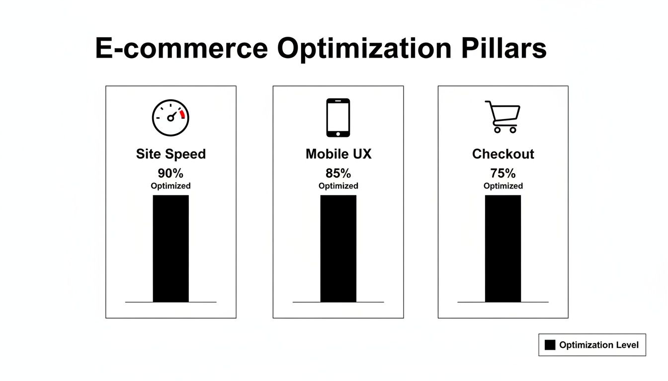
As you can see, they’re all essential pillars. But a slow site will sabotage everything else you do, from designing a beautiful mobile experience to crafting a frictionless checkout.
Finding and Fixing the Speed Killers
Before you can get faster, you have to figure out what’s holding you back. All the technical talk can feel overwhelming, but diagnosing your site's performance is actually pretty straightforward if you know where to look.
Your first stop should be Google PageSpeed Insights. It’s a free tool that gives your site a performance score and, more importantly, a checklist of things to fix. Don't get lost in the weeds trying to understand every single technical term. Instead, focus your energy on the biggest offenders, which usually fall into a few common buckets.
Common Performance Bottlenecks:
- Uncompressed Images: We all need gorgeous, high-resolution product photos, but huge image files are the number one cause of slow pages. We often see images that are several megabytes when they only need to be a fraction of that size for the web.
- Clunky Third-Party Apps: That flashy new reviews widget or social feed might look great, but if it's poorly coded, it can add precious seconds to your load time. Make a habit of auditing your apps and getting rid of anything that isn't absolutely essential.
- Inefficient Code: Bloated JavaScript and CSS files are like dead weight. They force a visitor's browser to work way too hard just to render your page. It's all happening "behind the scenes," but the impact on speed is massive.
Practical Steps to a Faster Storefront
Once you’ve found the problems, the fixes are often much simpler than you might expect.
Let's imagine a Shopify store with a 4-second load time. They run a PageSpeed report and discover two main culprits: their hero banner and product images are way too big, and a recently installed countdown timer app is dragging everything down.
Here’s their game plan:
- Smart Image Compression: First, they use an app or an online tool to compress all their product images and that huge homepage banner. This one change can often slash file sizes by 70% or more with no visible drop in quality. It’s the lowest-hanging fruit.
- App Audit: Next, they disable the countdown timer app. The site immediately feels snappier. They decide to either find a more lightweight alternative or see if their theme has a built-in feature that can do the same job.
- Enable Browser Caching: This is a simple setting that tells a returning visitor's browser to "remember" parts of the site—like the logo and navigation. This way, it doesn’t have to reload everything from scratch on every single visit.
Sidestep the Lag for Your Biggest Campaigns
Sometimes, even a well-optimized product page is too slow for high-stakes moments like a flash sale or a big influencer drop. When you’re driving thousands of clicks in a very short window, the path to purchase needs to be instant. Any friction means lost sales.
This is the perfect use case for a tool like Checkout Links.
Instead of sending your paid ad traffic to a product page that has to load all its images, scripts, and apps, you can send them straight to a pre-loaded checkout. The customer clicks the ad, and boom—the payment page loads instantly with the right product and discount already applied.
This strategy completely bypasses the usual bottlenecks, turning your ad spend directly into revenue without giving customers a chance to get frustrated by lag. It's a powerful tactic for any ecommerce optimization plan looking to squeeze every last conversion out of peak traffic moments.
Designing a Flawless Mobile Shopping Experience
Let's be real: your customers aren't just shopping from their desktops anymore. They're in line for coffee, on their lunch break, and scrolling on the couch. A mobile-first experience isn't just a nice-to-have; it's the cost of entry for modern ecommerce. Ignoring mobile shoppers is like building a beautiful store but forgetting to install a front door.
Mobile optimization has become the absolute lifeline for online stores. Mobile devices now drive 59% of total online retail sales and a staggering 75% of all ecommerce site traffic. But here's the kicker: despite all that traffic, mobile carts see an almost unbelievable 85.65% abandonment rate.
Why? The usual suspects are slow load times, awkward navigation, and clunky checkout forms. You can dive deeper into these critical ecommerce speed statistics to see just how damaging they are.
This massive abandonment rate points to one unavoidable truth: a desktop site that's been "shrunk down" for a smaller screen is doomed to fail. A great mobile experience has to be designed with thumbs in mind, accounting for smaller screens, touch inputs, and the on-the-go mentality of the shopper.
Auditing Your Mobile User Experience
Before you can smooth out the friction, you have to find it. A thorough mobile UX audit is a non-negotiable first step in any serious ecommerce website optimization plan. So, grab your phone and actually try to buy something from your own store. As you go, pay close attention to these areas.
- Navigation and Menus: Can you easily tap menu items without hitting the wrong one? Hamburger menus need to open smoothly and present options that are crystal clear. If you have big thumbs, you'll know right away if your tap targets are too small.
- Button and CTA Sizing: Every clickable element, from "Add to Cart" to a filter toggle, needs to be big enough for a clean tap. A good rule of thumb is to aim for a minimum tap target of 44x44 pixels.
- Form Fields and Keyboards: This is a big one. When a customer taps the phone number field, does the numeric keypad pop up? This small detail makes a huge difference in reducing frustration and input errors.
- Readability and Font Size: Can you read the text without pinching and zooming? Your body copy should be at least 16px to be comfortably legible on most mobile devices.
Responsive Design Is Non-Negotiable
A truly responsive design is the bedrock of any good mobile experience. This isn't just about making your site look okay on a phone. It's about the entire layout, from images to text, intelligently adapting to provide the best possible view on any screen.
This means images automatically resize, text columns reflow to prevent horizontal scrolling, and navigation elements morph to fit the available space. Without this fluid foundation, you're just patching up an experience that was never built for mobile in the first place.
Creating Frictionless Mobile Purchase Paths
Even with a perfect responsive site, the classic journey—product page, add to cart, view cart, checkout—can feel like a marathon on a small screen. This is especially true when you're running marketing campaigns where every second counts.
Think about a flash sale email. On mobile, linking a customer to a standard product page introduces a bunch of steps: wait for the page to load, find the "Add to Cart" button, navigate to the cart, and then start checking out. Every single one of those steps is an opportunity for them to drop off.
This is where a tool like Checkout Links can be a game-changer. Instead of that long, winding path, you can embed a direct checkout link into your email, SMS, or social media ad. When a mobile user clicks it, they completely bypass the product and cart pages, landing directly on a pre-filled, mobile-optimized checkout with their discount already applied.
This super-direct flow is perfectly tuned for the mobile mindset, turning a fleeting moment of interest into an immediate sale. It’s a powerful way to slash the friction that leads to that sky-high cart abandonment rate and make sure your mobile marketing efforts actually convert.
The Art of Conversion Rate Optimization in Ecommerce
If you’ve nailed site speed and mobile design, you've built a solid foundation. Now comes the fun part: Conversion Rate Optimization (CRO). This is where we shift from the technical groundwork to the art and science of persuading visitors to actually buy something.
Think of it as the meticulous process of refining every single touchpoint on your site to guide shoppers from "just looking" to "just bought." It’s less about massive overhauls and more about small, deliberate changes backed by an understanding of customer psychology.
The impact here is huge. There's a reason why CRO is the second-most-used technique among marketers at 50%, right behind audience segmentation. This intense focus is why the market is projected to hit $5 billion. Getting traffic is only half the battle; CRO is how you turn that traffic into revenue. You can dig into some powerful CRO statistics to see just how much small tweaks can pay off.
At its core, CRO is about making your most important pages work harder for you. It's time to stop thinking "this is my product page" and start thinking "this page is my best digital salesperson."
Fine-Tuning Your Highest-Impact Pages
Let's be honest, not all pages on your site pull the same weight. Your homepage, category pages, and especially your product pages are where the magic needs to happen. They are the front lines of conversion, and each one has a job to do: move the customer seamlessly to the next step.
Your product pages are the real heavy hitters. This is where a customer’s decision to buy is won or lost.
- Persuasive Copywriting: Ditch the boring, manufacturer-supplied descriptions. Your copy needs to tell a story and solve a problem. Speak directly to your ideal customer and focus on the benefits, not just the features. Instead of "100% cotton t-shirt," try "Feel the difference with our ultra-soft, breathable 100% cotton tee—perfect for all-day comfort."
- High-Quality Visuals: Since customers can't physically touch your products, your images and videos have to do all the heavy lifting. Use crisp, high-resolution photos from every angle, show the product in a real-life setting, and if you can, include a short video. Great visuals build trust and answer questions before a customer even has to ask.
- Strategic Social Proof: We’re all influenced by what others are doing. Displaying customer reviews, star ratings, and testimonials front and center is non-negotiable. Even better is User-Generated Content (UGC), like photos from happy customers using your product. This kind of social proof validates a buyer's choice and makes them feel much more confident hitting "Add to Cart."
The Power of Personalization
A one-size-fits-all experience is a recipe for mediocre results. Shoppers today expect to see content and offers that feel relevant to them.
Personalization can be as simple as adding a "recently viewed items" widget. Or it can be as sophisticated as showing different homepage banners based on a visitor's location or past purchases. This is where you can really start to move the needle. When you segment your audience, you can create tailored journeys that resonate on a much deeper level.
Imagine a Shopify Plus brand that wants to give its top customers a little extra love. Instead of blasting out a generic discount code that will inevitably leak online, they can create exclusive, high-value offers just for their VIPs.
Case Study: Personalized Cart Recovery for VIPs
A luxury accessories brand noticed a pattern: their top 10% of customers would sometimes abandon carts, and the standard recovery emails just weren't cutting it. They needed a more exclusive, personalized approach.
- Segment VIPs: First, they identified customers who had spent over a specific amount in the last year.
- Create a Unique Offer: They put together a special "20% off + free gift" deal, but they needed to keep it exclusive.
- Use Passcode-Protected Links: This is where it gets clever. Using Checkout Links, they generated unique checkout links for each abandoned cart and then protected them with a simple, unique passcode sent only to that VIP.
- Execute the Campaign: The recovery email felt like a private invitation. It acknowledged the customer's VIP status and provided the passcode. Clicking the link took them directly to a pre-filled checkout with the discount and gift already applied—a truly frictionless, premium experience. The results were fantastic. The brand saw a 35% increase in their cart recovery rate for this specific VIP segment, turning what would have been lost revenue into high-value sales. To really get good at this, I recommend digging into proven Conversion Rate Optimization Best Practices that can seriously lift your site's performance.
Streamlining Your Checkout to Stop Cart Abandonment
The checkout page. It’s the final hurdle, the moment of truth where you turn a browser into a buyer. It's also where an astonishing 70% of shoppers bail on their carts. A clunky or confusing checkout is often the only thing standing between you and a sale you should have won.
When we talk about ecommerce website optimization, we’re talking about obsessing over this final step. You’ve already done the hard work of getting a customer to the checkout; losing them there because of a fixable issue is just throwing away your marketing budget.
The reasons for this mass exodus aren't a big secret. Shoppers tell us the same things over and over again. Once you know what drives them away, you can start tearing down the walls between them and the "complete purchase" button.
Fixing the Most Common Checkout Blockers
The top reasons people abandon their carts almost always come down to two things: unexpected surprises and unnecessary hoops to jump through. Let's walk through how to fix them.
Surprise Costs (The #1 Offender) Nearly 50% of abandoned carts are due to extra costs—shipping, taxes, fees—that pop up at the last second. The fix is simple: be upfront.
How to solve it: Show estimated shipping costs right on the product or cart page. A free shipping threshold (like "Free shipping on orders over $75") is a classic for a reason—it not only removes the negative surprise but also nudges customers to spend a little more. Forced Account Creation Making someone create an account to buy from you is a notorious conversion killer. It’s responsible for over 25% of lost sales. People are busy; they don't want another password to manage.
How to solve it: Always, always offer a prominent guest checkout option. If you want them to create an account, ask them after the sale is complete. You can frame it as an easy way for them to track their new order.
A Smarter Path from Ad to Purchase
Even with a perfectly polished checkout, the standard journey—ad to product page, to cart, to checkout—is leaky by design. For your most motivated traffic, especially from paid ads or email campaigns, you need a more direct route.
This is where a tool like Checkout Links can be a game-changer for your optimization strategy. Instead of funneling everyone through the same steps, you can create direct, pre-filled checkout links that let them skip the line.
Think about a customer seeing your ad on Instagram for a 20% off flash sale. Here’s how you can slash the friction:
- Generate a Smart Link: First, create a checkout link for the sale item that automatically applies the 20% discount.
- Run Your Ad: Use that special link as the destination URL for your Instagram ad.
- Instant Checkout: When a shopper clicks, they completely bypass the product page and cart. They land directly on the checkout page with their item and discount already loaded, ready for them to enter their payment details. This one-click flow is incredibly powerful. It captures the impulse of the moment, giving the customer no time to get distracted or have second thoughts. For Shopify merchants looking to master this, digging into different strategies for Shopify checkout optimization can unlock even more ways to reduce friction.
By turning a multi-step process into a single-click action, you can dramatically lower your abandonment rates and turn more of your ad spend directly into revenue.
Using Analytics And Testing To Fuel Your Decisions
https://www.youtube.com/embed/hEzpiDuYFoE
Real ecommerce optimization isn’t a one-and-done project. It’s a constant process of learning, tweaking, and improving. All the strategies we’ve covered so far are great starting points, but true growth comes from listening to what your customers are actually doing on your site. This is where analytics and testing come in, transforming guesswork into a reliable, data-driven engine for growth.
Think of your analytics platform, like Google Analytics, as more than just a traffic counter. It's an absolute goldmine of behavioral insights. The key is not to get lost in the sea of reports but to start by asking the right questions.
Asking The Right Questions Of Your Data
Your first move should be to hunt for friction points in the customer journey. Don't just glance at your overall bounce rate; you need to dig deeper.
- Where are people dropping off? The checkout behavior analysis report is your best friend here. It shows you precisely where users abandon the process. Is it the shipping page? The payment step? This pinpoints exactly where you need to focus your attention.
- Which pages are turning them away? Take a hard look at your top exit pages. If a popular product page has a shockingly high exit rate, that's a massive red flag. Something is wrong. Maybe the photos are confusing, the description is weak, or the price isn't what they expected.
- What paths do my best customers take? Study the user flow for customers who actually complete a purchase. By identifying the common pages they visit, you can start to understand what a successful journey looks like and optimize that path for everyone else.
A Simple Framework For A/B Testing
Once your data has pointed you to a problem area, you can form a hypothesis and start testing solutions. A/B testing (or split testing) is simply comparing two versions of a page element to see which one performs better.
You don't need a team of developers to run meaningful experiments. Start small with high-impact elements, like your homepage headline or the call-to-action button on your product pages.
Let's say you believe a more benefit-focused CTA will convince more people to add an item to their cart. You could test:
- Version A (Control): "Add to Cart"
- Version B (Variant): "Get Your Comfort Now" Run the test until you get a statistically significant result, then roll out the winner. This creates an incredibly powerful feedback loop where every change is validated by your actual customers. If you want to dive deeper, you can explore the core benefits of A/B testing for data-driven growth.
This is where a flexible tool like Checkout Links can be a game-changer. It allows you to create and track different offers without writing a single line of code. You can easily test different bundles, offers, and discounts by creating unique links for each variation and comparing their performance through built-in analytics. Imagine creating one link for a "15% off" offer and another for a "Buy One, Get One 50% Off" deal for the same product. You can see which promotion actually drives more revenue in real-time, helping you make smarter, more profitable decisions.
Ready to turn insights into action and build a frictionless shopping experience? With Checkout Links, you can create powerful, direct checkout flows, track your promotions with detailed analytics, and recover abandoned carts more effectively. Start for free and see how much you can grow.