Shopify Conversion Optimization: Boost Your Sales Now
When we talk about Shopify conversion optimization, we're really talking about a continuous process of fine-tuning your online store. The goal is simple: get a higher percentage of your visitors to actually buy something. This isn't about one magic fix; it's about methodically improving everything from your product descriptions and site navigation to how seamless your checkout is. You're essentially paving a smoother, more compelling path from browsing to buying.
What Is A Good Shopify Conversion Rate?
It’s the first question every store owner asks: "What's a good conversion rate?" The honest answer? It's not a single number. Your ideal rate is a moving target that depends heavily on your niche, where your traffic comes from, and how much your products cost. A store selling high-end furniture will naturally have a different conversion benchmark than one selling novelty t-shirts.
That said, you need a starting point to know if you're on the right track. The latest industry data shows that the average Shopify conversion rate is around 1.4%. Think about that for a second—for every 100 visitors, only one or two are making a purchase. While Shopify is an incredibly powerful platform, that average tells us there's a huge opportunity for most stores to do better.
Shopify Conversion Rate Benchmarks At a Glance
Use this table to quickly compare your store's performance against industry averages and see where you have room to grow.
| Performance Tier | Average Conversion Rate | What This Means For Your Store |
|---|---|---|
| Needs Improvement | Below 1.0% | You might have significant friction points in the user journey. Start with a full store audit. |
| Average Performer | 1.0% - 2.5% | You're on par with many stores, but there are clear opportunities to pull ahead of the pack. |
| Strong Performer | 2.5% - 4.5% | You're doing a lot of things right. Focus on A/B testing and refining smaller details. |
| Top 10% Elite | 4.7% or Higher | Your store is a conversion machine. Keep optimizing to maintain your edge. |
These benchmarks show that just aiming for "average" isn't the goal. The real magic happens when you push beyond that.
Beyond the Average Numbers
The top 10% of Shopify merchants aren't just slightly better; they're in a different league entirely, boasting conversion rates of 4.7% or higher. That's more than three times the average! This massive gap proves that strategic optimization is about more than just minor tweaks. It's about building a fundamentally better customer experience that earns trust and encourages people to click "buy."
This is the power of Conversion Rate Optimization (CRO) in action. It's a structured approach to figuring out why visitors are leaving and then fixing those problems. If you want to get into the nitty-gritty, it’s worth spending some time understanding Conversion Rate Optimisation and its core principles.
Setting Your Store's Goals
Ultimately, a "good" conversion rate for your store is one that's always getting better. Forget about a universal number and start focusing on your own data.
Here’s how to set meaningful goals:
- Find your baseline: Before you can improve, you need to know where you stand. Dive into your Shopify Analytics and find your current overall conversion rate.
- Slice up your data: Don't just look at the big number. Break it down. What’s your conversion rate from Instagram traffic versus Google search? How does mobile performance compare to desktop? You might discover that your mobile conversion is terrible, which immediately gives you a clear problem to solve.
- Set small, realistic targets: Instead of aiming to double your rate overnight, try for something manageable. A goal to increase your rate by 0.5% in the next quarter is achievable and keeps your team motivated. These small wins stack up, leading to huge gains over time.
Finding and Fixing What’s Tripping Up Your Customers
Somewhere on your store, there are hidden friction points quietly killing your sales. I call them “conversion blockers.” They’re often tiny issues—a confusing button, a slow-loading image—that add up, creating just enough frustration to make a potential customer give up and leave.
The first step in any real conversion optimization is to stop thinking like a store owner and start thinking like a first-time visitor. You have to become your own customer.
Seriously, go through the entire process. Start from wherever your customers do—a Google search, an Instagram ad, a link in an email—and follow the path all the way to the thank you page. Pay attention to how it feels. Is the journey smooth and obvious? Or is it clunky and confusing? This initial walkthrough, a customer journey audit, is your starting point for figuring out what’s broken.
This visual guide breaks down the typical customer journey, showing the common spots where people get stuck.
It’s a great reminder that having beautiful product photos is only half the battle. The path a customer takes to get to that product has to be just as polished.
See Your Store Through Your Customers’ Eyes
Your own walkthrough is a solid start, but it’s naturally biased. You already know how your site is supposed to work. To get the real, unfiltered story, you need tools that show you exactly how actual users are interacting with your store.
- Heatmaps: Tools like Lucky Orange or Microsoft Clarity are fantastic for this. They create a visual overlay showing where people click, what they ignore, and how far down they scroll. A heatmap might reveal that your most important selling points are sitting below the fold, completely unseen.
- Session Recordings: This is like looking over a user’s shoulder. You can watch their entire visit in real-time—their mouse movements, where they hesitate, and where they rage-click in frustration before bouncing. Watching just a few of these recordings can give you more "aha!" moments than weeks of guesswork.
These tools stop you from guessing what to change and start showing you what you need to fix.
Prioritizing the Big Three Conversion Killers
While every store has its own unique quirks, I’ve found that most conversion problems boil down to three main culprits. If you focus your energy here first, you’ll almost always see the biggest impact on your bottom line.
1. Painfully Slow Site Speed
Nothing—and I mean nothing—kills the mood faster than a slow website. We’re talking about seconds. If your page takes too long to appear, a huge chunk of your visitors will be gone before they even see what you’re selling.
- Compress your images. This is the #1 offender. Huge, unoptimized product photos will bring any store to its knees. Use an image compression app to shrink file sizes without making them look pixelated.
- Audit your apps. Every Shopify app you install adds code that can slow your site down. Be ruthless. If you aren’t actively using an app to make money, delete it.
- Keep code simple. Fancy scripts and heavy theme customizations can seriously drag down performance. Sometimes, the simplest solution is the fastest.
2. A Clumsy Mobile Experience
The majority of your traffic is likely on a phone, so a bad mobile experience isn’t just an annoyance anymore—it’s a dealbreaker. If people have to pinch, zoom, and struggle to tap tiny buttons, they’re not going to stick around to buy.
- Test on a real phone. Don't just trust the mobile preview on your desktop. Grab your own phone and complete a purchase. How does it actually feel? Is it a pain to type in your info?
- Think "thumb-friendly." Make sure every button, link, and form field is big enough to be tapped easily with a thumb. No precision tapping required.
- Simplify your menu. A massive, multi-level dropdown menu might look great on a desktop, but it's a nightmare on a small screen. Streamline it.
3. Confusing Store Navigation
This one’s simple: if people can’t find it, they can’t buy it. Confusing navigation is the digital equivalent of a messy store with no aisle signs. Visitors get lost, get frustrated, and leave.
- Use clear, simple menu labels. Don't get clever with jargon. "Men's Shirts" works a lot better than "Gentleman's Haberdashery." Be direct.
- Get a great search bar. Make sure your search function is front and center. It should handle typos gracefully and deliver relevant results instantly.
- Add "breadcrumbs." These are the little navigational links (e.g., Home > Collections > Winter Jackets) that show users where they are. They're a lifeline that helps people easily backtrack without starting over.
Designing Product Pages That Actually Sell
Think of your product page as your final sales pitch. This is where a curious visitor decides to become a paying customer—or bounces. It’s the digital equivalent of them picking up your product, feeling its weight, and asking, "Is this really for me?" Getting this page right is absolutely critical for boosting your Shopify conversions.
Too many stores just list out sterile features. But here’s the thing: people don't buy "durable nylon straps." They buy the peace of mind that comes with knowing their backpack won't fail them on a busy commute or a weekend adventure. We need to stop describing what a product is and start showing what it does for the customer.
It's the difference between saying a jacket is "waterproof" and painting a picture: "Caught in a downpour? Stay completely dry and comfortable on your way to that important meeting." See the difference? One is a spec; the other is a solution.
Craft Visuals That Let Customers Virtually Experience Your Product
In eCommerce, your photos and videos do all the heavy lifting. Since a shopper can't physically touch or try on your product, your visuals have to close that gap. A couple of low-quality, single-angle photos just won't cut it anymore—it's a guaranteed conversion killer.
High-quality visuals are non-negotiable. They instantly signal the quality of your brand and build a foundation of trust.
- Show Every Angle: Give them the full tour. Let shoppers see the front, back, sides, and even close-ups of specific details like stitching, textures, or unique hardware.
- Use Lifestyle Photos: Show your product in its natural habitat. If you're selling yoga mats, you need photos of people actually using them in a beautiful, serene studio. This helps customers mentally place the product into their own lives.
- Bring It to Life with Video: Nothing demonstrates scale, function, and feel quite like a short video. It’s powerful stuff. In fact, some studies show that adding a video to a landing page can crank up conversions by as much as 80%.
Build Unshakeable Trust with Social Proof
Let's be honest: people trust other people far more than they trust brands. Before buying anything, today's shoppers are hardwired to look for reviews, opinions, and experiences from previous customers. This is social proof in action, and it's one of the most potent conversion tools you have.
Your product page is the perfect spot to showcase this. When a visitor sees that hundreds of others have bought and loved a product, their own hesitation starts to melt away.
This screenshot from a Shopify guide on product page design nails it.
Look closely. The star rating is right under the product title, making it impossible to miss. It immediately signals "this is popular and well-liked" before the user even thinks about scrolling.
But it’s not just about collecting reviews; it’s about making them impossible to ignore.
- Customer Reviews: Get a good reviews app and make it easy for customers to leave feedback. Display the star ratings prominently and feature the most compelling written testimonials.
- User-Generated Content (UGC): Encourage customers to share photos of your products on social media with a unique hashtag. Sprinkle these authentic, real-world images throughout your product pages. It's gold.
- Trust Badges: These are small but mighty. Displaying familiar logos for secure payments (like Visa or PayPal) or icons for free shipping and money-back guarantees can soothe any last-minute jitters.
Structure Your Page for a Clear Path to Purchase
A gorgeous page is worthless if customers can't figure out how to buy. Your product page layout needs to act like a friendly guide, leading the visitor's eye straight to the most important element: the "Add to Cart" button.
That call-to-action (CTA) button has one job: to get clicked. Make it pop with a contrasting color and use clear, direct language. "Add to Cart" or "Buy Now" are standards for a reason—there's zero confusion about what happens next.
Finally, make sure all the mission-critical info is "above the fold" (what you see without scrolling).
- Product Title: Make it clear and descriptive.
- High-Quality Images: Lead with your best shot.
- Price: Display it clearly, and make any discounts obvious.
- Social Proof: That star rating needs to be visible instantly.
- The CTA Button: Big, bold, and begging to be clicked. When you structure your page this way, you give visitors everything they need to make a fast, confident decision. That’s how you turn a browser into a buyer.
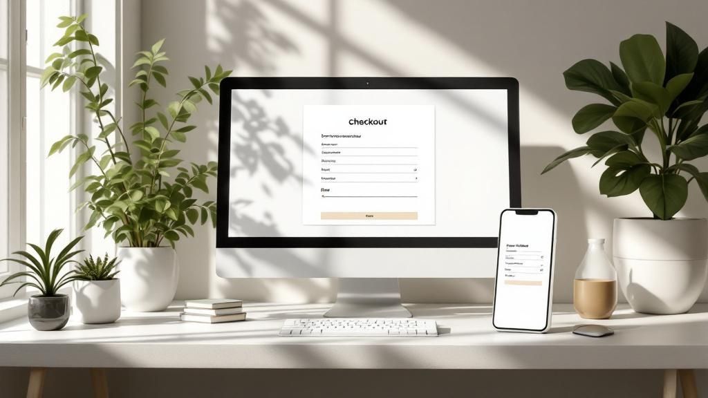
Optimizing Your Checkout to Reduce Abandoned Carts
https://www.youtube.com/embed/hEzpiDuYFoE
An abandoned cart is the digital equivalent of a customer walking to the register, placing items on the counter, and then simply walking out the door. It's a sale you almost made. The checkout process is the final, most crucial step in the entire customer journey, and it’s often where stores bleed the most revenue.
Every bit of friction, every moment of hesitation, and every unexpected surprise at this stage dramatically increases the odds of a customer bailing. Think about it from their perspective: they’ve done the hard part. They’ve browsed your products, compared options, and decided they want what you're selling. Now, your only job is to make it as easy as possible for them to give you their money.
Eliminate Surprise Shipping Costs
If I had to point to one single reason for cart abandonment, it wouldn't be product price or a last-minute change of heart—it's those dreaded unexpected costs. Imagine a shopper happily agreeing to a 50 price tag, only to see an extra ****12 in shipping fees tacked on at the very last second. That immediate feeling of being misled is a powerful, and often fatal, deterrent.
To get ahead of this, you need to be radically transparent about shipping costs from the very beginning.
- Display shipping info upfront. Don't hide it. Use a banner on your homepage or state your shipping policies clearly on product pages.
- Offer a shipping calculator. Let customers estimate shipping costs right in their cart before they even start the checkout process.
- Embrace free shipping. This is a massive psychological lever. Even if you have to bake the cost into your product prices, the words "Free Shipping" are far more compelling than a lower price with a surprise fee at the end. This kind of transparency builds trust and manages expectations, ensuring the final price is never a shock.
Ditch the Forced Account Creation
Asking a new customer to create an account before they can buy is like putting up a wall just before the finish line. In their mind, they're just trying to complete a simple transaction. Forcing them to stop, think of a password, and fill out extra fields adds unnecessary friction and time.
This small change shows respect for the customer's time and removes a huge psychological barrier to completing the purchase.
Simplify The Checkout Flow
A long, complicated checkout form can feel like an interrogation. Each field a customer has to fill out is another tiny hurdle, another chance for them to get distracted or frustrated and leave. Your goal should be to create a checkout that feels quick, effortless, and secure.
Take a hard look at your own checkout page. Ask yourself: is every single field here absolutely essential to process this order?
- Cut out non-essential fields. Do you really need their company name or a second address line? Probably not. Get rid of it.
- Use auto-fill and auto-detect features. Shopify's checkout is great at this, especially with tools like Shop Pay that can make the process a one-click affair for returning customers.
- Add a progress bar. A visual indicator showing "Step 1 of 3" gives customers a sense of momentum and control. It shows them the end is in sight, which reduces the anxiety of being stuck in a never-ending form. The difference between a good checkout and a bad one is often just a handful of clicks. For more advanced ideas, you can dive into detailed strategies for a complete Shopify checkout optimization that go even deeper into customizing the flow.
Offer Multiple Payment Options
Today's shoppers expect flexibility. If you only offer traditional credit cards, you're likely alienating a huge chunk of your audience. People have their preferred, trusted payment methods, and not seeing their favorite option can be enough to make them second-guess the entire purchase.
Integrating a variety of payment gateways is one of the easiest ways to boost your conversion rate.
- Digital Wallets: Be sure to include express checkout options like Shop Pay, PayPal, Apple Pay, and Google Pay. These are often faster and feel more secure to many users.
- Buy Now, Pay Later (BNPL): Services like Afterpay or Klarna can dramatically increase conversions, especially for higher-priced items, by breaking the cost into manageable, interest-free installments. The impact of a well-oiled checkout is immense. For perspective, the top 20% of Shopify stores achieve conversion rates over 3.2%, while the average store hovers around 1.4%. This gap shows just how critical it is to fine-tune every step, especially the checkout, to move into that top tier of performers. By removing friction and offering choices, you make it incredibly easy for your customers to say "yes."
Using Post-Purchase Strategies To Win Back Sales
The conversation doesn't end when a visitor clicks away from your store. In fact, some of your biggest wins in Shopify conversion optimization happen after a potential customer leaves. These post-abandonment strategies are all about re-engaging shoppers who showed clear interest but, for whatever reason, didn’t pull the trigger.
This is more than just a single "Hey, you left this!" email. It's about a smart, multi-channel game plan to stay on their radar and give them a compelling reason to come back. When you get this right, you can turn a significant chunk of those almost-sales into real revenue.
Master the Abandoned Cart Email Sequence
Your most powerful weapon for clawing back sales is a well-crafted abandoned cart email sequence. Notice I said sequence, not a single email. This is a carefully timed series of messages designed to persuade, not just remind. The goal is to create a personal, helpful path back to your checkout.
A proven sequence usually follows this simple but effective formula:
- The Gentle Nudge (1-2 hours later): The first email should feel like a simple service reminder. Always assume the best—maybe their kid distracted them or the Wi-Fi cut out. Keep the tone helpful, not pushy. Just show them what they left behind and include a direct link to their pre-filled cart.
- The Value Reminder (24 hours later): Now you go a bit deeper. Remind them why they wanted the item in the first place. You could include a snippet from a top-rated customer review or highlight a key feature that solves a problem. It’s all about reigniting that initial desire.
- The Sweetener (48-72 hours later): If they’re still on the fence, it's time to introduce a gentle incentive. This is where a small discount like 10% off or a free shipping code can work wonders. Often, this is just the little nudge a price-conscious shopper needs to get over their hesitation.
This is where tools like Checkout Links are incredibly useful. They let you generate custom URLs that not only pre-load a customer's cart but also automatically apply a discount. It makes returning to buy an absolute no-brainer.
Reinforce Your Message with Retargeting Ads
Let's be real: not everyone opens their emails. That's where paid retargeting comes in. Using platforms like Facebook, Instagram, and Google, you can display targeted ads specifically to people who visited your store and left items in their cart. This multi-channel approach keeps your brand visible and hammers the message home.
Your retargeting ads should be a mirror image of your email sequence. Show them the exact product they were looking at. If you offered a 10% discount in that third email, make sure your ad creative reflects that same offer. Consistency across channels builds trust and makes the whole experience feel cohesive.
With about 4.82 million active Shopify-powered websites out there, the competition is intense. As this study on Shopify's market influence shows, brands generate roughly $4.2 million per minute during major sales events. Retargeting ensures you don't just fade into the background after a visitor leaves.
Build a Long-Term Relationship with Your Email List
While cart recovery is about closing an immediate sale, a solid email list strategy is your play for long-term growth. Every person who signs up for your newsletter—even if they don't buy anything right away—is a warm lead. They’ve given you direct permission to talk to them. Don’t waste it.
This is your chance to build a relationship that goes way beyond a single transaction.
- Share valuable content: Send out newsletters with useful tips, behind-the-scenes stories, or exclusive content your audience actually wants to read.
- Announce new products: Your email subscribers should always be the first to know about new arrivals. It makes them feel like VIPs.
- Run exclusive promotions: Offer special discounts or early access to sales just for your subscribers to thank them for their loyalty. When you consistently provide value, you build a community. You transform one-time shoppers into repeat customers and, eventually, genuine brand advocates. And that's the ultimate goal for any e-commerce business built to last.
Continuously Testing and Improving Your Store
Getting your Shopify store to convert well isn't a one-and-done project. I've seen far too many store owners make a bunch of changes, celebrate a small bump, and then walk away. The truly successful stores, the ones that consistently grow year after year, treat their business like a living thing—it needs constant attention and fine-tuning. This is where you move from making big, one-off fixes to building a habit of continuous improvement.
It all starts with a simple, educated guess. We call it a hypothesis. A good hypothesis isn't just a vague idea; it's a clear, testable statement. For example, you might look at your store and think, "I bet changing our main 'Add to Cart' button from our standard blue to a vibrant green will grab more eyeballs and get more clicks."
See? That single thought gives you a specific action to take and a clear metric to track. That’s the entire foundation of A/B testing, and it’s not as complicated as it sounds.
Forming a Hypothesis and Choosing Your Tools
The best hypotheses almost always come directly from your own data and observations. Did your heatmap show that people are completely ignoring a key feature section on your product page? Great—test a new layout that brings it front and center. Did you watch a session recording and see a visitor hesitate on the product page? Try testing a new headline or a product description that tackles a potential objection right away.
Once you have a solid idea to test, you need the right tools for the job. Luckily, there are some fantastic apps in the Shopify ecosystem built just for this:
- A/B Testing Apps: Tools like Intelligems or Shoplift are designed to split your traffic automatically. They'll show version A of your page to one group of visitors and version B to another, then report back on which one made more sales.
- Analytics Platforms: Your Shopify dashboard is a great start, but tools like Google Analytics are essential for digging deeper. They help you understand the why behind your test results with solid, undeniable data.
This approach pulls your ego out of the equation. It stops the guesswork and ensures that every single change you make is a calculated step forward.
From Simple Tweaks to Significant Lifts
You absolutely do not need to overhaul your entire website to see a real impact. In my experience, some of the most powerful improvements come from small, strategic changes that either reduce friction or build trust at just the right moment.
Think about these real-world examples. They’re simple tests, but they can lead to a serious lift in your conversion rate:
- The Headline Tweak: Changing a product headline from something generic like "Premium Leather Wallet" to a benefit-focused one like "The Last Wallet You'll Ever Need" can completely change how a customer feels about the product.
- The Image Swap: If you sell clothing, does a picture of the item on a mannequin convert better than a lifestyle shot with a model at the beach? Only one way to find out. Testing this will tell you exactly what resonates with your specific audience.
- The CTA Change: I’ve seen stores increase clicks just by changing the button text from a bland "Purchase" to something more compelling like "Get Mine Now." It creates a sense of ownership and excitement. Beyond these individual tweaks, the best results come from a holistic approach. It’s about adopting comprehensive customer experience optimization strategies and making sure every single touchpoint on your site adds to a smooth and reassuring journey for the buyer.
Interpreting Results and Building Momentum
Once you've run a test for long enough to get a clear winner, the work isn't over. The next step is crucial: implement that winning change and immediately form your next hypothesis. What’s the next small thing you can improve? This creates a powerful feedback loop where your store is always evolving based on how real customers are behaving.
If you want to see how these small, iterative improvements can stack up over time, we have a complete guide on how to improve your Shopify conversion rate that breaks it down with actionable steps.
This cycle of hypothesizing, testing, and analyzing is what builds real momentum. Each successful test doesn't just add to your bottom line; it gives you a deeper insight into your customers' psychology. Over time, you’ll develop an almost instinctual feel for what works for your audience, putting you miles ahead of competitors who are still just guessing.
Your Shopify Conversion Questions, Answered
As you start digging into conversion optimization, you're bound to have questions. Everyone does. I've heard them all over the years, so let's tackle the most common ones with some straight-to-the-point advice.
"My Store Needs Help. Where Do I Even Start?"
It’s easy to get overwhelmed and think you need a complete overhaul. My advice? Don't touch your design, don't fiddle with your logo—start with site speed. It's the one thing that impacts every single visitor.
Think about it: if your store is slow, a huge chunk of your potential customers will bounce before they even see your beautiful products. We're talking seconds. A load time over three seconds is often a death sentence.
Grab a baseline score using Google's PageSpeed Insights. Then, attack the usual suspects:
- Image Bloat: This is a big one. Your product photos need to be crisp, but they don't need to be gigantic files. Use a Shopify app to compress them automatically. It’s a non-negotiable step.
- App Graveyard: Every app you install adds code, and that code can drag your site down. Go through your app list with a critical eye. If it’s not actively improving the user experience or making you money, get rid of it.
- Theme Choice: Some themes are built for speed, others... not so much. If you're starting fresh or planning a redesign, make a fast, lightweight theme a top priority. Get your speed right first. Everything else you do depends on it.
"How Much Is This Going To Cost Me?"
This is a common worry, but you're asking the wrong question. It's not about the cost; it's about the return on investment (ROI). And you can get started for free.
Seriously. Tools like Microsoft Clarity give you heatmaps and session recordings—incredible insights into what your users are actually doing—at no cost. You can literally watch where people get stuck or confused. Your built-in Shopify Analytics is another goldmine for spotting drop-off points in your funnel.
Once you’ve squeezed all the value out of the free stuff, you can think about paid tools for A/B testing or deeper personalization. A good personal rule is to only pay for something if you can draw a straight line from its features to increased revenue. Prove the ROI on a small scale, then you can confidently invest more.
"Should I Bother With AI For Optimization?"
Absolutely. AI isn't some far-off future tech anymore; it's a practical tool that can give you a serious edge. It’s like having a data scientist on your team who never sleeps.
AI can spot patterns in customer behavior that a human would miss. It can analyze thousands of data points to figure out what really drives a sale.
It’s not just about running tests faster. It's about getting more reliable results and using them to create hyper-personalized experiences. Imagine showing each visitor the products and offers they are most likely to want, based on their specific clicks and history. According to McKinsey, that level of personalization can lift revenue by 5% to 15%.
"How Long Until I See a Difference?"
This is the classic "it depends" answer, but I can give you some real-world context. Some fixes deliver results almost immediately.
Did you find a broken link in your checkout flow? Fixing that can boost sales literally within 24 hours. Making your "Add to Cart" button bigger and brighter? You might see a lift just as quickly.
But the real, needle-moving optimization is a marathon, not a sprint. A proper A/B test needs time to collect enough data to be statistically valid, which could take a couple of weeks, depending on your traffic. An abandoned cart email sequence will show its true value over months as it works its magic on thousands of shoppers.
The best mindset is to treat optimization as an ongoing process of small, steady improvements. Don't chase a single silver bullet. It's the compound effect of all those small, consistent wins that builds a truly high-converting store.
Tired of watching abandoned carts pile up? Checkout Links helps you build powerful, pre-filled checkout links to drop right into your email campaigns and ad funnels. Turn more "almost" customers into sales with a personalized, one-click recovery path. Try Checkout Links today and watch your conversion rate climb.