Supercharge Your Sales: The Ultimate Guide to Shopify Landing Pages
October 27, 2024
The Art of High-Converting Landing Pages

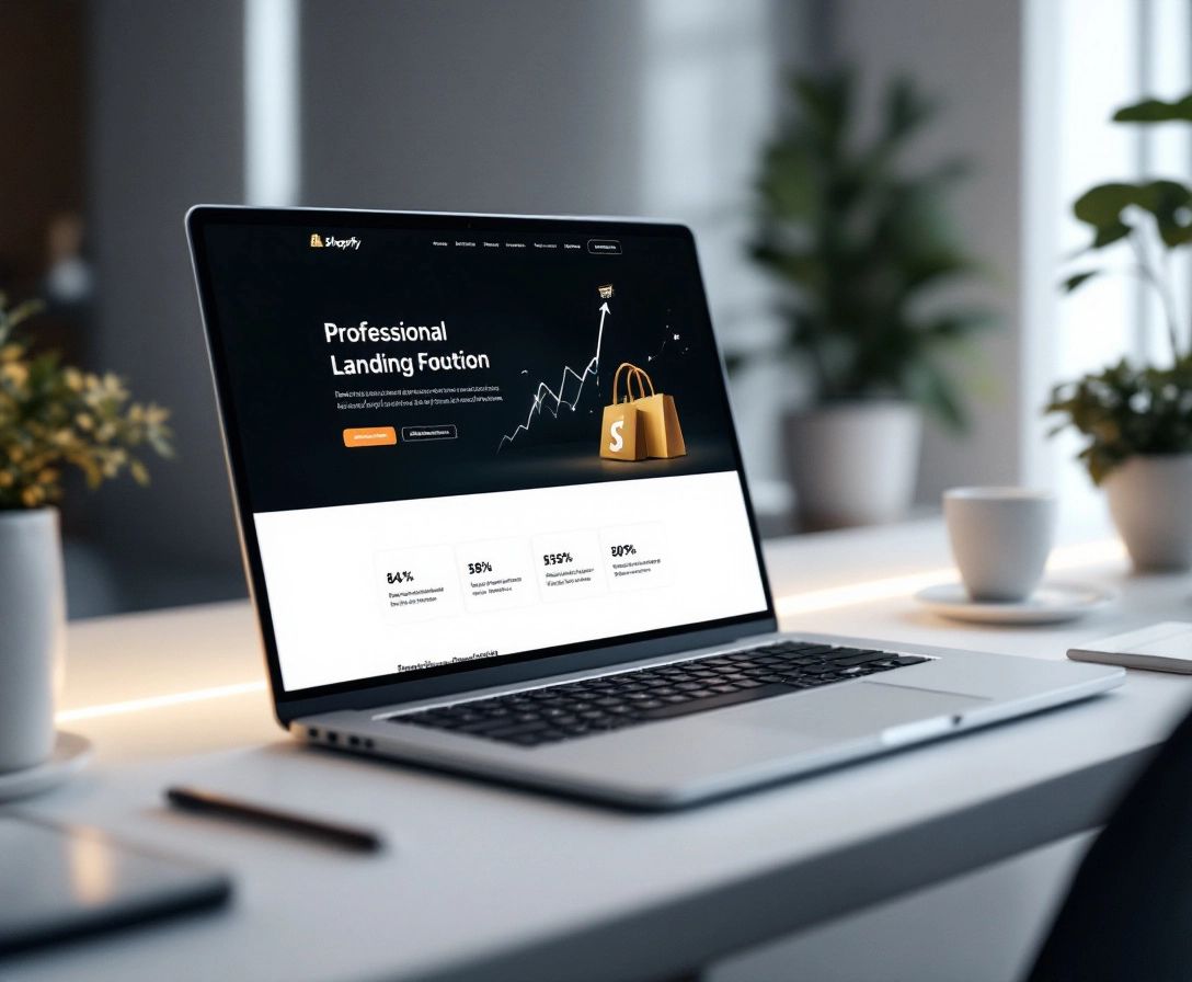
Imagine driving traffic to your Shopify store, only to find your sales aren't reflecting your efforts. The issue might not be your products, but rather where you're sending potential customers. That's where Shopify landing pages come in. These specialized pages are designed with a single objective: turning visitors into customers.
Think of a landing page as a captivating shop window display, strategically highlighting specific products or promotions to entice customers. A well-designed Shopify landing page can be the decisive factor in turning a casual browser into a paying customer.
But what makes Shopify landing pages so vital? Unlike your homepage, which caters to a wider audience, landing pages are highly focused. They minimize distractions, guiding visitors towards a specific action, whether it's signing up for your newsletter, making a purchase, or taking advantage of a special offer. This focused approach can significantly increase your conversion rates.
Essential Elements of Effective Landing Pages

While the targeted approach of Shopify landing pages is undeniably valuable, what are the key components that make them successful? Much like a physical storefront, it's the elements within that draw customers in and encourage them to engage.
Compelling Headlines and Value Proposition
First impressions are paramount. Your landing page's headline should instantly grab attention and convey the value you offer. Keep it clear, concise, and benefit-oriented. What problem are you solving for your customer? Immediately following the headline, your value proposition should succinctly explain how your product or service provides the solution.
High-Quality Images and Videos
The adage "a picture is worth a thousand words" rings especially true for landing pages, where visuals can be the difference between a click and a lost opportunity. Utilize high-quality images that showcase your product in the best possible light. Consider incorporating videos to offer even more engaging content and demonstrate your product's functionality.
Clear and Concise Copy
Simplicity and clarity are key in your language. Focus on benefits rather than just features. Instead of merely listing product specifications, explain how those specs translate into a better experience for the customer.
Strong Call to Action
Think of your call to action as a guiding hand, leading your visitor towards the desired conversion. It should be clear, concise, and impossible to miss. Employ action-oriented language such as "Shop Now," "Claim Your Discount," or "Get Started Today."
Social Proof and Testimonials
In a marketplace saturated with choices, people seek reassurance before making a purchase. Integrating customer testimonials, reviews, and social proof elements helps build trust and credibility. Showcasing positive experiences from past customers can significantly influence purchasing decisions.
Step-by-Step Landing Page Setup
You now understand the elements of a high-converting Shopify landing page, but how do you actually build one? Fortunately, setting up Shopify landing pages is more straightforward than you might think. Let's break down the process into manageable steps:
1. Choose the Right Tool
Shopify offers a variety of options for creating landing pages. You can choose their built-in page builder for ease of use and integration, or explore third-party apps for more advanced customization. Consider your budget, technical skills, and desired level of design flexibility before deciding.
2. Craft a Compelling Headline
Remember, first impressions are crucial. Your headline should instantly capture attention and communicate the unique value of your offer. Keep it clear, concise, and benefit-driven.
3. Write Persuasive Copy
Use simple language and focus on benefits over features. Instead of listing product specifications, explain how those specs translate into a better customer experience. For instance, instead of stating that a jacket is "waterproof," emphasize how it allows customers to "stay dry and comfortable on their adventures."
4. Add Visual Appeal
Incorporate high-quality images and videos to showcase your product in action. Choose visuals relevant to your offer and evoke the desired emotions from your audience.
5. Integrate a Clear Call to Action
Make it abundantly clear what action you want visitors to take. Use a prominent and compelling call-to-action button with action-oriented language like "Shop Now" or "Claim Your Offer."
6. Build Trust with Social Proof
Incorporate customer testimonials, reviews, and social proof elements to establish credibility and encourage conversions.
7. Optimize for Mobile
Ensure your Shopify landing page is fully responsive and provides a seamless experience across all devices. Test how your landing page appears on different screen sizes to identify and resolve any display issues.
8. Track and Analyze
Use Shopify's built-in analytics or integrate with tools like Google Analytics to track key metrics such as traffic, conversions, and bounce rates. Regularly analyze this data to understand what's working and identify areas for improvement.
Mobile Optimization Strategies

In our mobile-first world, ensuring your Shopify landing pages are optimized for smartphones and tablets is no longer optional — it's essential. A smooth, user-friendly mobile experience can be the difference between gaining a customer and losing one.
Imagine a potential customer scrolling through their social media feed on their phone, encountering your ad. They're intrigued and click through, expecting an easy and engaging experience. However, if your Shopify landing page isn't mobile-friendly, with slow loading times and a cluttered layout, they're likely to abandon it and return to their social feed.
So how do you ensure your Shopify landing page is primed for mobile success?
Responsive Design: A Non-Negotiable
Above all, your Shopify landing page must be responsive. This means it automatically adjusts its layout and content to fit any screen size, delivering a consistent and user-friendly experience across all devices.
Keep it Clean and Concise
Mobile screens have limited space, making it crucial to keep your content concise and to the point. Use short paragraphs, bullet points, and clear headings to make your landing page easy to scan and understand on smaller screens.
Optimize Images and Videos
Large image and video files can significantly hinder your landing page's loading time, leading to frustrated visitors and higher bounce rates. Optimize your visuals for mobile by compressing them without compromising their quality.
Thumb-Friendly Navigation
Consider how people interact with their mobile devices. Ensure buttons and links are large enough to be easily tapped with a thumb and that forms are optimized for mobile input.
Test, Test, Test!
Don't assume your Shopify landing page looks great on mobile just because it looks good on your desktop. Regularly test your landing pages on various mobile devices and screen sizes to identify and fix any display issues.
A/B Testing Your Landing Pages
You've now built an aesthetically pleasing Shopify landing page with all the essential elements. But how do you know if it's truly optimized for conversions? The answer lies in A/B testing.
A/B testing, also known as split testing, involves creating two or more versions of your Shopify landing page with slight variations. You then direct equal traffic to each version and analyze which one performs better in terms of conversions. Think of it as a scientific experiment for your landing pages.
Why is A/B Testing Essential?
- Data-Driven Decisions: A/B testing removes the guesswork from optimization. Instead of relying on intuition, you make informed decisions based on real user data.
- Improved Conversion Rates: By identifying what resonates best with your audience, you can continuously refine your landing pages to drive more conversions. Even minor changes, like a different headline or call-to-action button color, can have a significant impact.
- Reduced Bounce Rates: A/B testing can help you pinpoint elements on your Shopify landing page that might be causing visitors to leave prematurely.
- Enhanced Customer Insights: A/B testing provides valuable insights into your target audience's preferences and behaviors.
What to A/B Test on Your Shopify Landing Pages:
- Headlines: Experiment with different headlines to see which one effectively grabs attention and communicates your value proposition.
- Call to Action: Test different button colors, sizes, and copy to see what encourages more clicks.
- Images and Videos: Try using different visuals to see which ones resonate best with your audience and boost engagement.
- Copy Length and Style: Experiment with long-form versus short-form copy, and test different tones and styles to see what leads to the most conversions.
- Layout and Design: Test different page layouts, font choices, and whitespace usage to optimize for readability and visual appeal.
Remember, A/B testing is an ongoing process. Continuously test and refine your Shopify landing pages based on the data you gather to maximize your conversion potential.
Case Studies and Success Stories
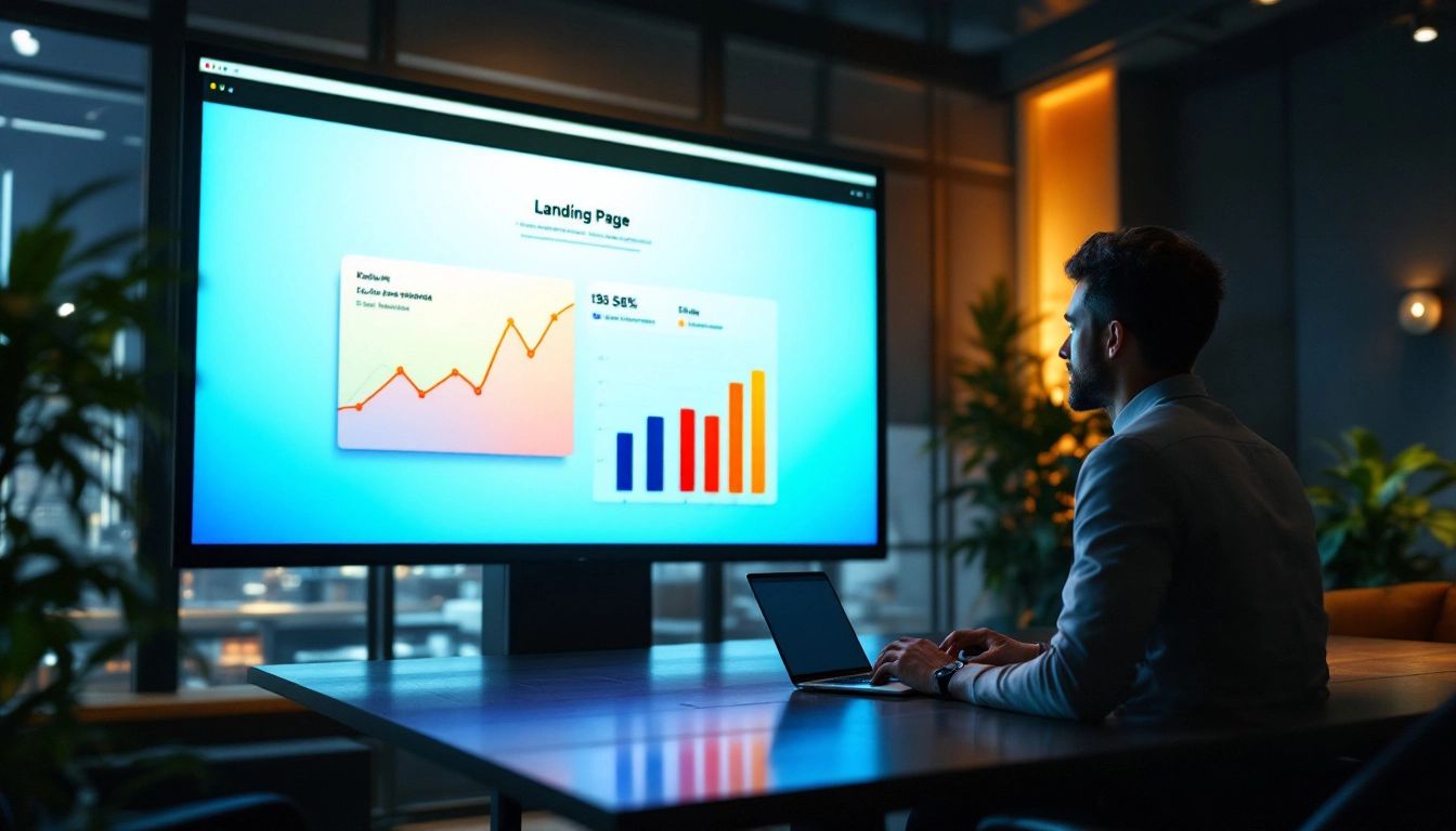
We've discussed the theory; now let's look at some real-world applications. Seeing how other Shopify businesses have successfully used landing pages can inspire your own strategy.
Case Study 1: The Power of Simplicity
A minimalist skincare brand used a Shopify landing page for a new product launch. They kept the design clean and focused, highlighting the product's key benefits and a single, compelling call to action. The result? A 15% conversion rate, significantly higher than their average product page.
Case Study 2: Urgency Drives Action
An online clothing retailer leveraged the power of scarcity. They created a Shopify landing page for a flash sale, emphasizing the limited-time offer and dwindling stock. Adding a countdown timer and showcasing real-time purchase notifications created a sense of urgency, leading to a 25% increase in conversions during the sale.
Case Study 3: Personalization Wins
A subscription box service wanted to attract new customers. They created a Shopify landing page with a personalized quiz to understand individual customer preferences. Based on the quiz results, they showcased tailored product recommendations, leading to a 10% higher conversion rate compared to their generic landing pages.
These are just a few examples of how Shopify landing pages can be tailored to different goals and audiences. The key takeaway? A well-crafted Shopify landing page can be the difference between a visitor and a loyal customer.
Ready to improve your customer journey and increase sales? Discover the power of personalized, shoppable links with Checkout Links! Forget generic landing pages and create a seamless path to purchase. Start your free trial today! https://checkoutlinks.com
 Checkout Links
