The Ultimate Guide to A/B Testing on Shopify
October 15, 2024

Introduction to A/B Testing on Shopify
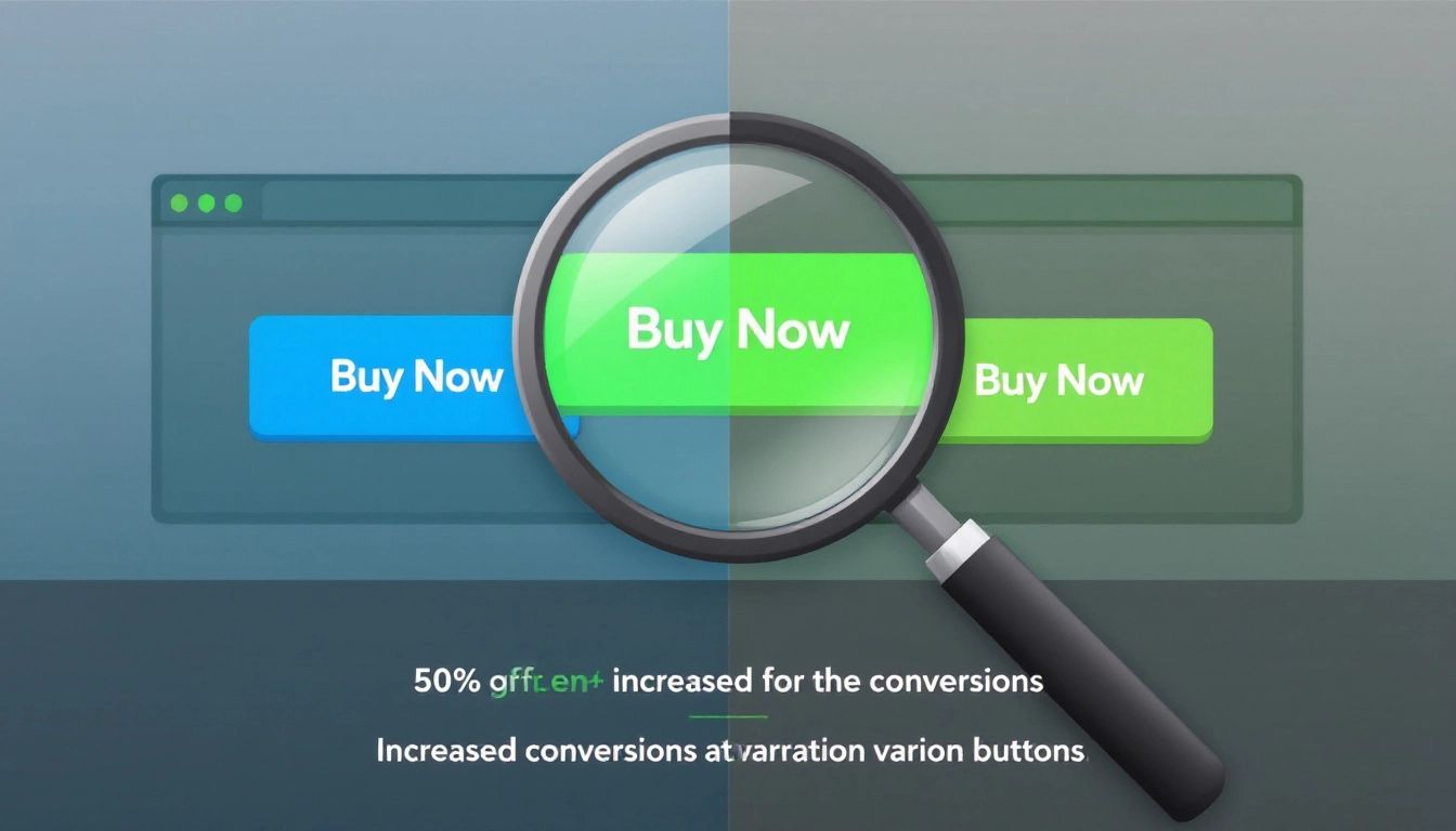
Want to boost sales on your Shopify store but not sure which changes will resonate with your customers? Instead of guessing, why not test your ideas directly? That's where A/B testing comes in.
A/B testing on Shopify lets you compare two versions of a webpage element, like running a science experiment in your store. Create version A (your original) and version B (with your change). Shopify then shows these versions to different visitors and tracks their behavior.
For example, let's say you want to test two product descriptions for a hot-selling item. Keep your current description as Version A and make Version B shorter, focusing on the benefits. After a set period, analyze which version led to more purchases. The winner, supported by data, becomes your new standard.
This data-driven approach removes the guesswork, letting you make informed decisions to improve your store's performance. From headlines and images to call-to-action buttons and the checkout process, A/B testing helps you optimize elements and improve your conversion rates.
Setting Up A/B Tests on Shopify
We know A/B testing on Shopify can significantly improve your store. But how do you actually set one up? Thankfully, Shopify and its apps make it quite simple.
-
Identify Your Goal: What's your aim? More sales? More email sign-ups? Fewer abandoned carts? Choose a specific goal for your test.
-
Select Your Target: What element on your Shopify store do you want to test? Your headline, product description, "Add to Cart" button, checkout process – there are many options!
-
Create Your Variations: Let's say you're testing your headline. You'll need Version A (your current headline) and Version B (your new headline). Make the difference between the two clear to see which element impacts your results.
-
Choose Your A/B Testing Tool: Shopify offers some basic A/B testing functionality, but for more advanced features, explore dedicated apps from the Shopify app store. These apps can help you manage tests, track data, and analyze results.
-
Set Up Your Test: Most A/B testing tools guide you through the process. Generally, you'll input your variations, decide the test duration, and specify the percentage of traffic to include. Remember, testing with a small portion of your traffic initially helps identify significant issues before implementing changes for everyone.
-
Run the Test: Now, the fun begins – let your test run! Letting the test run long enough (usually at least one to two weeks) is crucial to gather enough data for accurate conclusions.
-
Analyze and Implement: Once your test is complete, examine the results! Most A/B testing tools provide detailed reports. Identify the best-performing variation based on your initial goal. Then, implement that winning variation in your store!
Key Metrics to Track in Shopify A/B Tests

You've launched your A/B tests – fantastic! Now comes the exciting part: tracking the results to see what's working. But looking at the right metrics is essential to make informed decisions. Here are the key metrics to watch during your Shopify A/B testing:
-
Conversion Rate: This crucial metric shows what percentage of visitors completed your desired action. Did they purchase after visiting your product page? Did they sign up for your email list from your homepage? A higher conversion rate usually signals a successful variation.
-
Add-to-Cart Rate: This metric tracks how frequently visitors add a product to their cart. A higher add-to-cart rate suggests your product presentation is attractive but doesn't guarantee a sale. Use this metric with the conversion rate to get the complete picture.
-
Checkout Abandonment Rate: This metric shows how many people added items to their cart but didn't complete the purchase. Aim for a lower abandonment rate. It indicates a smoother and more appealing checkout process.
-
Click-Through Rate (CTR): This is vital for testing elements like call-to-action buttons and links. CTR shows the percentage of visitors who clicked on your element. A higher CTR suggests the variation is more engaging and enticing to your audience.
-
Revenue Per Visitor (RPV): While the conversion rate is important, RPV goes a step further. It shows the average revenue generated for each visitor to your store. This metric is particularly helpful when testing pricing strategies or promotional offers.
-
Bounce Rate: This tracks how many visitors leave your site after viewing only one page. A high bounce rate might indicate that your page isn't engaging or relevant. A lower bounce rate generally means visitors are finding what they need and staying longer.
Remember, the most critical metrics for your Shopify A/B tests depend on your specific goals. Define your goals upfront, then select the metrics that best measure the success of your variations.
Best Practices for A/B Testing on Shopify
Knowing how to set up A/B tests on Shopify is great. But to truly maximize this tool, implement these best practices:
-
Start with a Hypothesis: Don't just change things randomly. Have a clear idea of why you're making a change and its expected impact. For example, "I believe changing the 'Add to Cart' button from green to red will increase click-throughs because red creates a sense of urgency."
-
Test One Element at a Time: It's tempting to change multiple things, but this makes it impossible to know which change impacted your results. Test your headline and button color in separate tests.
-
Focus on Your Target Audience: Consider user segmentation. A successful change for one group might not work for another. If testing a new product page layout, analyze its performance with new visitors versus returning customers.
-
Be Patient and Let the Test Run: Don't end a test prematurely. Give it enough time (at least one to two weeks) to account for variations in traffic and user behavior. This ensures statistically significant data.
-
Don't Ignore "Losing" Variations: Even if a variation doesn't win, analyze why. It might offer valuable insights. Maybe your new headline decreased conversions, but only on mobile devices. This helps you refine future tests.
-
Document Everything: Keep a detailed record of your tests, noting the hypothesis, variations, test duration, results, and your analysis. This "testing log" becomes a valuable resource for future optimization.
-
Continuously Test and Iterate: A/B testing isn't a one-time activity. Your store and customers constantly evolve. Regularly revisit your testing strategy, identify new areas for improvement, and keep experimenting to stay ahead.
Common A/B Testing Mistakes to Avoid
You're on your way to becoming a Shopify A/B testing expert! But even with the best intentions, mistakes can skew your results. Let's look at some common pitfalls and how to avoid them, ensuring your A/B testing on Shopify is always accurate:
-
Changing Too Much at Once: Imagine testing a new headline, button color, AND product description simultaneously. If conversions increase (or decrease!), you won't know the cause. Always test one element at a time for clear, actionable insights.
-
Ending Tests Too Soon: Don't stop a test just because you see an early "win." Allow sufficient time (at least one to two weeks) to account for variations in traffic and user behavior. A longer testing period provides more reliable data and conclusions.
-
Ignoring Statistical Significance: Shopify A/B testing isn't about gut feelings; it's about data! Don't declare a winner based on a tiny margin. Use a statistical significance calculator (many are available online) to ensure reliable results, not just random chance.
-
Neglecting Your Target Audience: A successful approach for one customer group might not work for another. If testing a new checkout process, analyze how it performs with first-time buyers compared to loyal customers. Segmenting your audience provides more nuanced and useful insights.
-
Failing to Document Your Tests: Imagine running a great A/B test but forgetting what you changed! Document everything: your hypothesis, variations, test duration, results, and analysis. This "testing log" becomes invaluable for future optimization.
By avoiding these common mistakes, you'll ensure your A/B testing on Shopify is always accurate, insightful, and drives real improvements in your store's performance.
Case Studies: Successful A/B Tests on Shopify

Ready to see A/B testing on Shopify in action? Let's explore some inspiring real-world examples where small changes led to big wins:
1. The Power of Urgency: A fashion retailer wanted to increase sales. They believed adding a countdown timer to their "limited-time sale" banner would create a sense of urgency, prompting more purchases. They A/B tested the banner with and without the timer. The result? The timer variation increased sales by a considerable 20%!
2. Simpler Checkout, Happier Customers: An online beauty brand struggled with cart abandonment during checkout. They believed simplifying the checkout process, from four steps to two, would reduce friction and increase completed purchases. After A/B testing on Shopify, their hypothesis proved correct. The streamlined checkout process led to a 15% decrease in cart abandonment and significantly boosted revenue.
3. Images That Tell a Story: A home decor store wanted to improve product page conversions. They A/B tested two versions of product images: simple product shots on a white background and lifestyle images showcasing the products in real-life settings. The lifestyle images were the clear winner, leading to a 12% increase in conversions. Customers connected better with the products when they could envision them in their own homes.
4. Social Proof for the Win: A new online clothing store wanted to build trust with potential customers. They thought adding customer reviews to their product pages would increase sales. Their A/B test confirmed this. The variation with reviews saw a 10% jump in conversions, demonstrating the persuasive influence of social proof.
These case studies highlight the effectiveness of A/B testing on Shopify. But these are just a few examples. Every store is unique. The key is to continuously test and refine, finding what resonates with your audience and drives your goals.
Speaking of driving goals, imagine crafting a unique shopping experience for each customer. You could create targeted offers, pre-filled carts, and personalized landing pages designed to boost conversions. That's the power of Checkout Links. This versatile Shopify app lets you create dynamic shoppable links that elevate the customer journey from click to checkout. Want to discover the magic of personalized shopping experiences? Learn more about Checkout Links today.
 Checkout Links
