The Ultimate Guide to Shopify Landing Pages: Drive Sales & Conversions
October 21, 2024
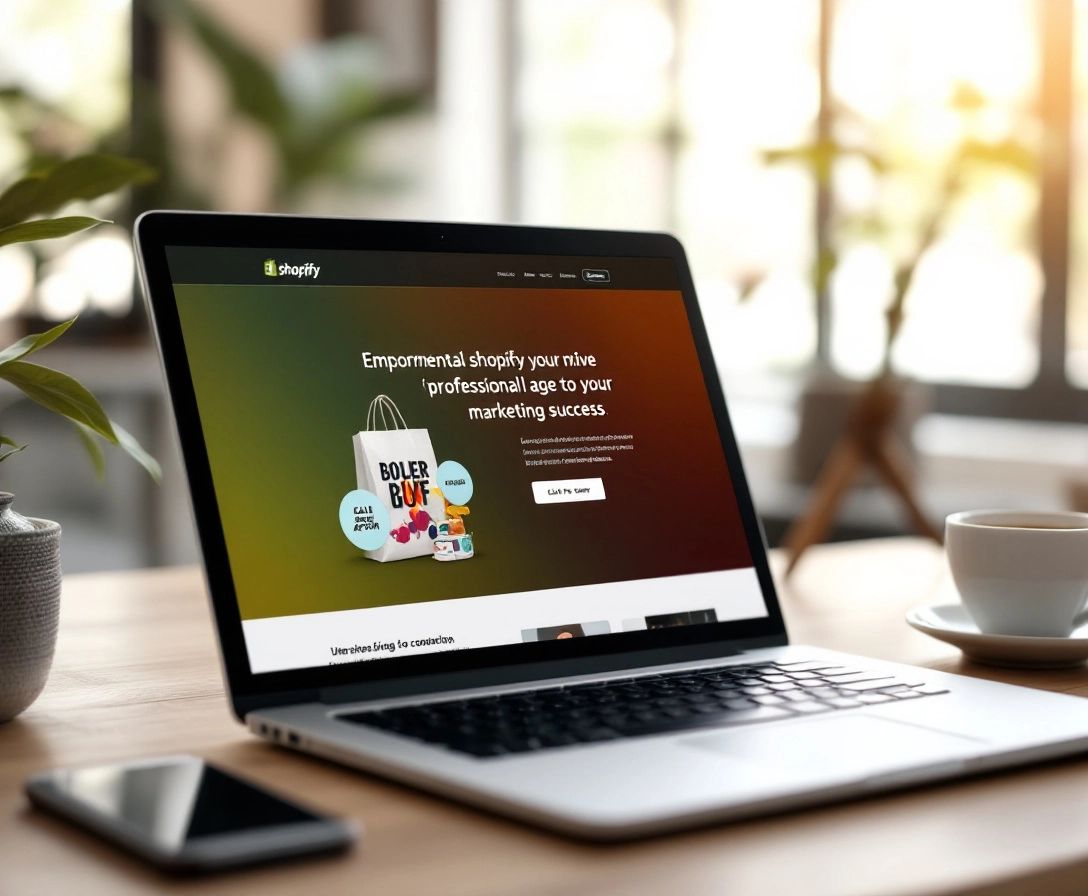
Introduction to Shopify Landing Pages
Imagine: you've launched a fantastic ad campaign that's bringing loads of traffic to your Shopify store. But then… nothing. No sales. Where did it all go wrong? The problem might be your landing page.
A standard product page often isn't enough to make the sale. For effective Shopify marketing, you need a dedicated landing page – a focused page with a single objective: conversions.
Think of it as an inviting storefront showcasing a specific product or offer. Rather than overwhelming visitors with choices, a Shopify landing page guides them toward a single, clear action, such as making a purchase or subscribing to your email list. This laser focus is what makes landing pages so impactful.
Key Elements of an Effective Shopify Landing Page
Creating a high-converting landing page for Shopify is similar to crafting the perfect sales pitch – it needs to capture attention, pique interest, and ultimately, drive action. But what are the key ingredients that make this happen?
1. A Crystal-Clear Value Proposition
Imagine walking into a store with no signs, no clear sections, just a chaotic mix of products. Overwhelming, right? Your landing page should be the complete opposite.
From the moment a visitor arrives, they need to immediately understand what you're offering and why it's relevant to them. This is where a strong, concise value proposition is essential. Emphasize the unique advantages of your product or offer, and answer the visitor's unspoken question: "What's in it for me?"
2. Compelling Headlines that Hook Visitors
Your headline is like a first impression – it needs to be impactful. It should be catchy, benefit-driven, and relevant to the ad or link that led the visitor there. Don't shy away from using powerful verbs and language that connects with your target audience.
3. Persuasive Copywriting that Sells
The copywriting on your landing page should weave a story – the story of how your product or service solves a problem, satisfies a need, or enhances the customer's life. Use a conversational style, emphasize benefits over features, and include social proof to build credibility.
4. High-Quality Visuals that Capture Attention
Visuals are essential for maintaining visitor engagement and presenting your product in its best light. Use high-quality images and videos that spotlight its features, benefits, and applications. Remember, visuals speak volumes, especially in online shopping.
5. A Clear and Concise Call-to-Action
Your call-to-action (CTA) is the final push that encourages visitors to take the desired action, whether it's making a purchase, subscribing to a newsletter, or claiming a discount. Use powerful action words, create a sense of urgency, and make the button visually prominent.
6. Trust-Building Elements for Credibility
Building trust is crucial, particularly for newcomers. Include trust badges, customer testimonials, and social proof to showcase credibility and demonstrate that others have had positive interactions with your brand.
By focusing on these key elements, you can elevate your Shopify landing page from a basic page into a high-converting powerhouse that generates sales and boosts your revenue.
Designing for Conversions
Having the right elements on your Shopify landing page is essential, but they won't automatically transform into a successful page. You need the right approach, and in the realm of landing pages, that's design. A well-designed Shopify landing page isn't just visually appealing; it seamlessly guides your visitors towards that desired conversion.
Guiding Principles for Landing Page Design Success
So, how do you achieve that conversion-driving landing page? It's about understanding visitor behavior and using design to gently nudge them in the right direction. Here's your guide:
1. Visual Hierarchy is King: Imagine a newspaper with no headlines, no images, just endless text. Your landing page should be the opposite. Use size, color, and contrast to guide the eye towards your most important elements – your value proposition, your CTA, and your most compelling visuals.
2. Embrace White Space: White space, or negative space, provides breathing room around elements on your page. It's not wasted space; it's vital for readability and visual appeal. Avoid cramming everything together – let your design breathe.
3. Keep it Clean and Consistent: Consistency builds trust and reinforces your brand identity. Use a consistent color scheme, typography, and imagery that aligns with your brand and creates a unified experience.
4. Above the Fold Matters: Remember, you have mere seconds to make a strong first impression. Your Shopify landing page needs to instantly grab attention and communicate value. Ensure your headline, value proposition, and a compelling visual are front and center above the fold.
5. CTA – Make it Shine: Your CTA button should be impossible to miss. Use contrasting colors, clear action-oriented text, and consider adding visual cues like arrows or animations to draw attention.
6. Mobile-First is Non-Negotiable: In our mobile-driven world, your Shopify landing page must be responsive and provide a seamless experience across all devices. Test thoroughly to ensure it looks and functions flawlessly on smartphones and tablets.
By incorporating these design principles, you create a user-friendly, visually appealing landing page that not only attracts attention but also encourages visitors to stay engaged and, ultimately, convert.
Mobile Optimization for Shopify Landing Pages
Remember all the talk about mobile users? It's not just a passing trend; it's the reality of how people shop online. If your Shopify landing page isn't optimized for mobile, you're essentially turning away a significant portion of potential customers.
Think about it: a cluttered layout, slow loading times, tiny buttons that are difficult to tap – these are all guaranteed ways to send mobile users running (or to your competitor's mobile-friendly site!).
Making Your Shopify Landing Page Mobile-First
So, how do you make sure your Shopify landing page is mobile-friendly?
1. Responsive Design is Non-Negotiable: This means your landing page automatically adapts to any screen size, whether it's a smartphone, tablet, or desktop.
2. Keep it Concise: Mobile users are often on the move and have limited attention spans. Get to the point quickly, use concise copy, and highlight your most crucial content.
3. Large, Thumb-Friendly Buttons: Make it easy for users to tap those important CTA buttons with their thumbs.
4. Optimize Images and Videos: Large files can slow down loading times, which is a major deterrent for mobile users. Use compressed images and consider hosting videos on platforms like YouTube or Vimeo.
5. Test, Test, and Test Again: Don't assume your Shopify landing page looks good on mobile just because it looks good on your desktop. Test it on various devices and screen sizes to guarantee a smooth experience.
A/B Testing and Analytics
You've dedicated time and effort to building the perfect Shopify landing page, but your work isn't finished yet. Now it's time to harness the power of data with A/B testing and analytics – your tools for continuous improvement.
Why A/B Testing is Your New Best Friend
Think of A/B testing as conducting experiments on your Shopify landing page. You create two or more versions of the page, each with a slight difference (like a different headline or CTA button), and then show these versions to separate groups of visitors.
By analyzing which version performs better in terms of conversions, you gain invaluable insights into what connects with your audience. This data-driven method eliminates the guesswork from optimization and allows you to make informed choices that yield results.
Unlocking the Insights with Analytics
Analytics platforms, like Google Analytics, provide valuable data about how visitors interact with your page, uncovering information such as:
- Traffic Sources: Where are your visitors coming from (ads, social media, organic search)?
- Bounce Rate: How many people leave your page without taking action?
- Time on Page: How long are visitors staying on your page?
- Conversion Rate: The most important metric! How many visitors are completing the desired action?
By closely monitoring these metrics, you can pinpoint areas for improvement and track the impact of your A/B tests.
Remember, crafting a high-converting Shopify landing page is an ongoing journey. By embracing A/B testing and analytics, you can turn your landing page into a well-oiled machine that consistently delivers outstanding results.
Best Practices and Common Mistakes
You're now acquainted with the essential elements of a high-converting Shopify landing page and understand the design principles that attract visitors. Now, let's explore some proven best practices – those crucial dos and don'ts that can either make or break your landing page's success.
Best Practices for Landing Page Success
Consider these your golden rules, the secret ingredients that elevate your Shopify landing page from good to exceptional:
- Keep it Laser-Focused: Remember, one landing page, one goal. Don't confuse visitors with multiple offers or CTAs.
- Test Different Headlines: Your headline is the first impression – make it impactful. Experiment with different versions to find what resonates best.
- Use High-Quality Images and Videos: Show, don't just tell. Use visuals to highlight your product's best attributes and advantages.
- Incorporate Social Proof: Testimonials, reviews, and social media mentions foster trust and credibility.
- Make Your CTA Prominent: Use contrasting colors, clear language, and consider adding visual cues to draw attention to your CTA button.
- Optimize for Mobile: A significant portion of your visitors are likely on mobile. Ensure a smooth experience across all devices.
- Track and Analyze: Use analytics to understand what's working and what's not. A/B test different elements to continually enhance your conversion rate.
Common Mistakes to Avoid
Even with the best of intentions, it's easy to fall into common landing page pitfalls. Here's what to be wary of:
- Cluttered Design: Too much text, too many images, or a confusing layout will overwhelm visitors. Keep it clean and straightforward.
- Ineffective Headlines: Your headline should be catchy, benefit-driven, and relevant to the visitor's intention.
- Neglecting Mobile Optimization: A non-responsive Shopify landing page is detrimental to conversions.
- Not Testing: A/B testing is crucial for optimization. Don't assume you know what works best – let the data guide your decisions.
By following these best practices and avoiding common mistakes, you'll be well on your way to building a Shopify landing page that consistently delivers conversions. And to simplify the creation of personalized, high-converting landing pages for your Shopify store, consider exploring Checkout Links. It's a game-changer for streamlining the customer journey and maximizing your sales efforts.
 Checkout Links
