Build a High-Converting Ecommerce Landing Page
An ecommerce landing page isn't just another page on your website. It’s a specialized, standalone page built for a single purpose: to turn a visitor from a specific marketing campaign into a customer. Think of it as a direct, distraction-free sales pitch designed to get one specific action—a purchase, a signup, or a registration.
Laying the Foundation for a High-Converting Landing Page
Before you even think about design or copywriting, you have to nail the strategy. I’ve seen countless beautiful pages fail because they skipped this crucial first step. A winning landing page is built on a solid foundation, which means reverse-engineering your customer's journey to create an experience that feels like it was made just for them.
It all starts with defining one single, crystal-clear conversion goal. What is the one thing you want people to do on this page? Are you trying to sell a hot new product? Maybe you’re aiming to build an email list for an upcoming launch. Or perhaps you're running a flash sale and need to create urgency. Each goal demands a unique message, a different emotional trigger, and a very specific call to action.
Go Deep on Understanding Your Audience
Once your goal is locked in, it's time to get inside your audience's head. And I'm talking about more than just their age and location. To build a page that truly connects, you need to understand what makes them tick.
- What keeps them up at night? What's the real pain point your product solves? If you're selling a premium coffee subscription, the pain isn't just "needing coffee." It's the frustration of running out, the disappointment of a bad cup, and the desire for a simple, delightful morning ritual.
- How do they talk about their problems? Spend time on Reddit, in Facebook groups, and reading product reviews. Listen to the exact words and phrases your potential customers use. When you echo their language back to them, you build instant trust.
- What's their ultimate goal? What's the transformation they're really after? The person buying that coffee subscription wants to feel like a connoisseur, to impress their friends, and to start every day perfectly. Your copy needs to sell that feeling, not just the coffee beans. This deep dive allows you to craft a message that resonates on a personal level, making your product feel like the only logical solution. This process is absolutely essential. For those just setting up shop, brushing up on some key e-commerce SEO tips will help ensure people can find your pages in the first place.
Size Up the Competition
Your landing page doesn't exist in a bubble. Your visitors have seen ads and offers from your competitors, so you need to know what you’re up against. This isn't about copying what they do—it's about finding your unique angle.
Identify your top 3-5 direct competitors and study their landing pages. What's their main value proposition? What kind of imagery and social proof are they leaning on? By breaking down their strategy, you can find gaps to exploit. Maybe their messaging is all about technical features, giving you a golden opportunity to focus on the emotional benefits and the customer experience.
Product Page vs. Landing Page: Why It Matters
A common mistake is sending paid traffic directly to a standard product page. While it seems logical, it’s often a conversion killer. Standard product pages are built for browsing, with navigation menus, related products, and other distractions. A dedicated landing page is built for action.
Here's a quick breakdown of why a focused landing page often outperforms a general product page for targeted campaigns.
| Attribute | Standard Product Page | Dedicated Ecommerce Landing Page |
|---|---|---|
| Primary Goal | Encourage browsing & discovery | Drive a single, specific conversion |
| Navigation | Full site menu, header, footer | Minimal or no navigation links |
| Content Focus | General product information | Targeted messaging for a specific campaign/audience |
| Distractions | Related products, sale banners, blog links | None. The focus is on the single offer. |
| Call to Action | "Add to Cart," often alongside others | A single, clear, and prominent CTA |
A dedicated page strips away the noise, guiding the user on a focused journey from interest to action.
This three-part foundation—a clear goal, deep audience insight, and competitive awareness—is the blueprint for everything that comes next.
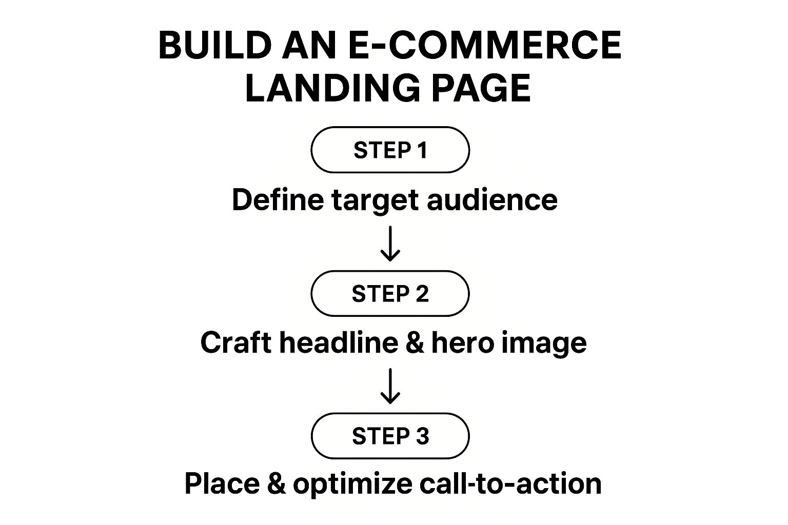
As the graphic shows, every decision you make, from the headline to the hero image, flows directly from understanding who you're talking to and what you want them to do. This focused approach really works. Studies show that well-optimized landing pages can achieve a conversion rate 160% higher than traditional pop-ups. It’s a testament to the power of focus.
Designing for Persuasion and Building Trust
A great ecommerce landing page does more than just show off a product. It creates a psychological space where a visitor feels secure and confident enough to pull out their wallet. This is where your design work goes beyond simple aesthetics and becomes a powerful tool for persuasion. You need to build a visual path that guides your visitor's eye and systematically dismantles any hesitation they might have.
Your main goal? Create a completely frictionless journey to that "buy" button. It all starts with the content "above the fold"—the very first thing a visitor sees without scrolling. This is your prime real estate. Think about it: first impressions are 94% design-related. This means a new visitor decides whether they trust you in a matter of milliseconds, based almost entirely on what they see.
Establishing a Clear Visual Hierarchy
Visual hierarchy is all about controlling what your visitors see first, second, and third. It’s the art of using size, color, and placement to pull their attention toward your most important elements, like the value proposition and, of course, the call-to-action (CTA) button.
Think of it as telling a visual story. The headline should be the biggest, boldest piece of text on the screen. From there, the eye should naturally drift to your stunning product photos or video, then to the compelling bullet points explaining the benefits, and finally land squarely on a bright, impossible-to-miss CTA.
Here’s a simple way to check your work: the "squint test." Seriously. Step back from your screen and squint until the text gets blurry. What elements still pop? If it's not your headline, hero image, and CTA, you’ve got some redesigning to do.
Leveraging High-Impact Visuals
Words sell, but visuals are what truly convince. For an ecommerce landing page, your product photography and videos are your star salespeople. They do the heavy lifting, showing off the product's quality, features, and benefits in a way that plain text never could.
- High-Resolution Product Photography: Don't just show one angle. Use multiple, crisp images. Even better, show your product in a lifestyle context so customers can picture themselves using it. If you sell hiking boots, get them on a trail, caked in a little mud—not just floating against a sterile white background.
- Engaging Product Videos: A quick video can bring your product to life, demonstrating features more dynamically than a dozen static images ever could. In fact, some studies show that putting a video on a landing page can boost conversions by over 80%.
- Strategic Color Psychology: Color isn't just for branding; it's for influencing emotion. Blues and greens often communicate trust and security, making them perfect for checkout buttons or security seals. In contrast, oranges and reds create urgency, which is great for "Limited Time Offer" banners.
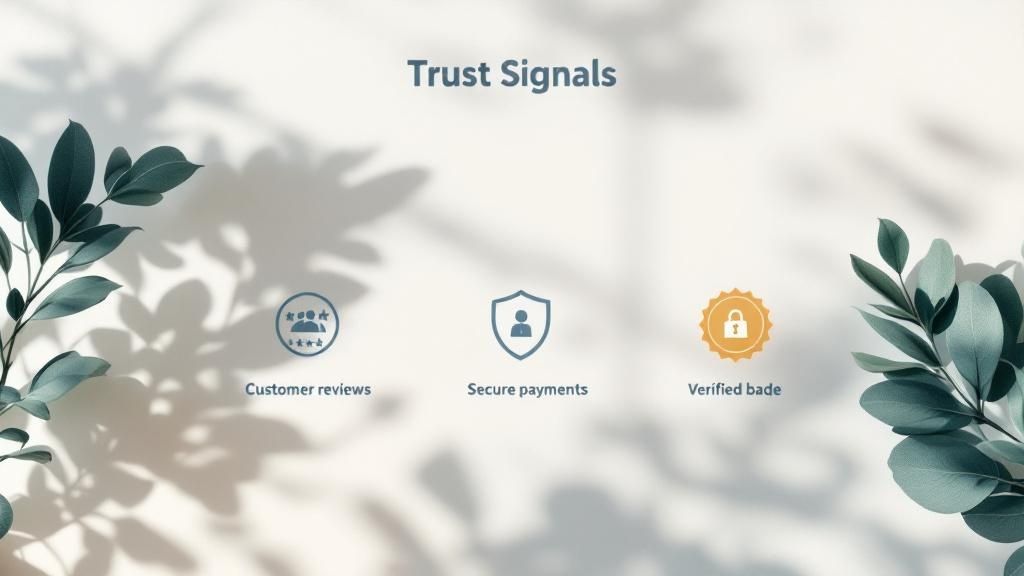
Building Unshakeable Trust and Credibility
Every single online shopper arrives with a healthy dose of skepticism. Your job is to erase that doubt by peppering your landing page with trust signals. These are the visual cues that reassure visitors your business is legit and their purchase is safe.
The key is to place these elements strategically, especially near the call-to-action button where last-minute hesitation is most likely to creep in.
Essential Trust Signals to Weave In:
- Customer Reviews and Testimonials: Social proof is absolute gold. Don't just stick a star rating on the page; feature a full testimonial from a real, happy customer. Highlighting a specific quote that solves a common pain point is incredibly persuasive.
- Security Badges: Show off those familiar logos from payment processors like Visa, Mastercard, and PayPal. If you use services like McAfee or Norton, add their security seals to prove the checkout process is locked down.
- Clear Return Policies and Guarantees: Make your return policy and any money-back guarantees impossible to miss. This removes the financial risk from the customer's mind. A simple "30-Day Money-Back Guarantee" badge can work wonders for conversions.
- "As Seen On" Logos: If your product has been featured in well-known publications or blogs, create a "brag bar" with their logos. This lets you borrow credibility from established brands and apply it to your own. Fine-tuning these design and trust elements is an ongoing job. For a deeper look into boosting your store’s overall performance, exploring resources on Shopify conversion rate optimization can offer even more actionable strategies for turning curious visitors into loyal customers.
Crafting Compelling Copy That Actually Sells
Let's be honest: a gorgeous design might make someone stop and look, but it's your words—the copy—that actually make the sale. Think of your copy as your best salesperson, working tirelessly around the clock to turn a visitor's curiosity into a purchase.
Great copy isn't about listing dry, technical features. It’s about connecting on an emotional level. It solves problems and paints a clear picture of how your product makes the customer's life better. Your goal is to build a narrative that makes your offer feel not just like a nice-to-have, but an absolute must-have.
Hook Them with a Problem-Focused Headline
You have just a few seconds to make an impression. Your headline is your one shot to grab a visitor and convince them they’re in the right place. The best way to do that? Speak directly to their biggest pain point or their most pressing desire.
A powerful headline doesn't just describe your product; it reflects what the visitor is already thinking. For example, instead of a boring headline like "Premium Noise-Canceling Headphones," you could try something like, "Finally, Silence for Your Commute." The first is a feature; the second is a solution.
Write Benefit-Driven Descriptions
Once your headline gets them interested, your body copy has to deliver on that promise. This is where many businesses go wrong. They talk about themselves and their product's features, when they should be focusing entirely on the customer's benefits.
A feature is what your product has. A benefit is what the customer gets.
People don’t buy a drill; they buy a perfectly hung picture frame. They don't buy skincare with hyaluronic acid; they buy the confidence that comes from having hydrated, glowing skin.
For instance, a waterproof phone case has a technical IP rating (the feature). The benefit? The complete peace of mind to capture amazing underwater photos on your next vacation. See how much more powerful that is?
Tell a Story That Builds an Emotional Connection
Facts can be informative, but stories are what truly sell. Your brand has a story, and your landing page is the perfect place to share it. You don't need to write a novel, just a simple narrative that makes your brand feel more human and trustworthy.
Share the "why" behind your product. Did it come from a personal frustration you experienced? Was it created to make a difficult task easier for people? This human element creates an emotional anchor that sets you apart from generic, faceless competitors.
For new and growing brands, mastering copywriting for small business is a game-changer, and a compelling origin story can be your most valuable asset.
Master the Irresistible Call to Action
Your call to action (CTA) is the grand finale. It's the moment of truth where you ask for the sale. A weak, generic CTA like "Submit" or "Click Here" can absolutely tank your conversion rate. Your CTA button needs to be clear, direct, and inspiring.
The most effective CTAs work because they clearly state the value the user is about to receive.
- Instead of "Buy," try "Get My Skincare Set Now."
- Instead of "Subscribe," try "Send Me the Weekly Deals."
- Instead of "Download," try "Claim My Free Guide." Notice the pattern? These examples are specific and use first-person language ("My," "Me"). While it's essential to have a CTA above the fold, don't be afraid to repeat it further down on longer pages. This ensures the option to buy is always just a click away, helping to turn a hesitant browser into a happy customer.
Optimizing for Page Speed and Higher Conversions
You can have the most stunning design and the sharpest copy, but it all falls apart if your landing page is slow. In ecommerce, speed isn't a luxury—it's the bedrock of a good customer experience. A slow page is more than just an annoyance; it actively erodes trust and sends your hard-won traffic clicking away before your offer even loads.
Put yourself in your customer’s shoes. They’ve just clicked an ad that promises a solution, only to be met with a frustratingly blank screen. Every second that ticks by is another reason for them to give up and check out a competitor. This is why getting your load time under three seconds isn’t just a goal anymore. It’s the table stakes for playing the game.
Get Your Landing Page Running Faster
The good news is that you don't need to be a developer to make a real impact on your page speed. A few smart adjustments can dramatically cut down load times, which in turn gives your conversion rate a healthy boost.
Here are a few high-impact fixes you can implement right away:
- Shrink Your Images. Those beautiful, high-resolution product shots are often the number one cause of page bloat. Use a tool like TinyPNG or the built-in compression features on your ecommerce platform to cut down file sizes. You can often reduce them significantly with no visible loss in quality.
- Use Browser Caching. Caching tells a visitor's browser to save static parts of your page—like your logo, header, and footer. When they visit again, the browser can pull up these saved files instantly instead of re-downloading everything from your server. It makes return visits feel lightning-fast.
- Cull Your Third-Party Scripts. Every app, tracking pixel, and fancy widget you add to your page adds a little more weight and slows things down. It's time to be ruthless. Do a quick audit of your landing page and remove any scripts that aren't absolutely critical for tracking sales or core functionality. Of course, technical fixes are just one piece of the puzzle. For a more complete picture, it’s worth digging into broader strategies to increase website conversions.
Use A/B Testing to Settle the Debates
Once your page is technically sound, the real fun begins. Never, ever assume you know what will work best. A/B testing (or split testing) is your secret weapon for letting the data decide. It’s a simple process: show two different versions of your page to your audience and see which one drives more sales.
The trick is to be methodical. Instead of throwing random changes at the wall to see what sticks, focus on a single high-impact element. You could test a headline that highlights a problem against one that sells a benefit. Or see if a green "Add to Cart" button outperforms a red one. The golden rule is to change only one thing at a time. If you switch up the headline and the button color, you’ll have no idea which change actually made the difference.
Start with the elements that have the biggest sway over conversions, like your headline and your primary call-to-action. Run the test long enough to get a statistically significant result, then make the winning version your new control.
Watch How Users Behave to Find the Leaks
A/B testing tells you what is happening, but understanding user behavior analytics tells you why. Tools like heatmaps are a goldmine, showing you exactly where people click, how far they scroll, and what parts of your page they completely ignore.
This is where you find the real insights. For instance, a heatmap might reveal that almost no one is clicking your CTA. Maybe it’s buried too far down the page ("below the fold") or the color doesn't stand out. If you see a "scroll map" where most people drop off at the same spot, that's a glaring sign that the content in that section isn't pulling its weight.
This continuous feedback loop—launch, measure, test, and repeat—is how you build a landing page that doesn't just look good, but actually performs.
Advanced Tactics from Real-World Landing Pages
https://www.youtube.com/embed/hEzpiDuYFoE
Once you've nailed the basics of design and copy, it's time to dig into what separates the good landing pages from the truly great ones. The most successful ecommerce brands don't just put up a page; they meticulously engineer a conversion experience. By looking at what these top-tier companies are doing, we can find a playbook of strategies to really make your pages perform.
Let's be real: just having a page isn't enough to guarantee sales. A massive global study by Unbounce looked at over 41,000 landing pages and found the median conversion rate was a sobering 6.6%. That statistic alone shows just how much room for improvement there is and why you need to go beyond the fundamentals to stand out.
This means moving past static, one-size-fits-all designs and embracing pages that are dynamic, responsive, and tailored to the user.
Go All-In on Mobile-First Design
It's no longer enough for your landing page to be "mobile-friendly." You have to think mobile-first. With well over half of all web traffic now coming from smartphones, the small-screen experience isn't an afterthought—it's the main event.
This approach flips the traditional design process upside down. Instead of building a beautiful desktop page and then trying to cram it onto a smaller screen, you start with the most constrained view: the smartphone. This forces you to be ruthless with your priorities and focus only on what truly matters.
Here’s how to do it right:
- Stick to a Single Column: A single, scrollable column is the most natural way people use their phones. It gets rid of clumsy horizontal scrolling and guides the user down a clear path toward your call-to-action.
- Design for Thumbs: Where does a user's thumb naturally rest? That's where your CTA button should be. Make it big, use high-contrast colors, and give it plenty of space to prevent frustrating mis-taps.
- Hide Secondary Info: Use collapsible menus (accordions) for things like FAQs, shipping details, or size charts. This keeps the primary view clean and focused on the sale, while still giving curious shoppers the info they need. A slick mobile experience sends a powerful signal of professionalism and makes buying feel easy—a huge driver for conversions.
Personalize the Experience Based on Traffic Source
Treating every visitor exactly the same is a massive missed opportunity. Your best landing pages will deliver a personalized experience by changing the content based on where the traffic came from. Someone who clicked a TikTok ad has a completely different mindset and set of expectations than someone who clicked a link in your email newsletter.
For instance, a visitor coming from a Facebook ad that highlights a specific product feature should land on a page where that exact feature is front and center. If they clicked from an email promising a 20% discount, your headline better confirm that offer immediately.
You can make this happen with URL parameters that trigger different headlines, hero images, or even testimonial blocks. It makes the visitor feel seen and confirms they've landed in the right place. To take this concept even further, you should always be looking for ways to improve your site's overall performance by learning more about ecommerce conversion optimization.
Boost Engagement with Interactive Elements
Passive scrolling is the enemy of conversion. The most effective ecommerce landing pages don't just talk at the customer; they invite them to participate. Using interactive elements gets people to spend more time on your page and helps them find the perfect product, which builds their commitment to the purchase.
Some great examples I've seen in the wild:
- Product Quizzes: Brands like Jones Road Beauty use a simple quiz to help customers find their ideal foundation shade. It's a brilliant way to solve a common online shopping pain point, provide a custom recommendation, and capture a lead all at once.
- Product Configurators: Let people build their dream product. Imagine a furniture store that lets you pick the fabric, leg style, and color for a sofa. This process of co-creation makes the item feel like theirs before they've even clicked "buy."
- Interactive Calculators: Instead of a confusing static pricing grid, companies like Descript use interactive calculators. Users can move sliders to see exactly what they'll pay based on their specific needs. This transparency and hands-on engagement builds a ton of trust. By turning shopping into a conversation instead of a monologue, you create a far more memorable and effective landing page that's truly built to convert.
Answering Your Top Landing Page Questions
Even with the best strategy in hand, you’re bound to hit a few specific questions when you're in the trenches building your ecommerce landing page. Getting these sorted out is what separates a smooth launch from getting stuck in analysis paralysis.
Let's clear up some of the most common sticking points I see come up time and time again.
Should I Have More Than One CTA Button?
This one comes up a lot. While you should absolutely stick to one primary goal for your page (like "Buy Now" or "Get the Deal"), that doesn't mean you're limited to a single physical button.
Think about the user's journey, especially on a longer page. Making someone scroll all the way back to the top just to click your button is a surefire way to lose them. It’s a frustrating experience.
Instead, strategically place your CTA button throughout the page:
- Above the Fold: The first button needs to be visible the moment the page loads. This is for the decisive visitor who's already sold.
- After Key Features or Testimonials: Once you've made a compelling case with your benefits or social proof, give them another chance to act right then and there.
- At the Very Bottom: For the diligent reader who consumed every word, a final CTA is essential to close the deal. The critical thing to remember is that all of these buttons must point to the same action. Don't muddy the waters with competing calls-to-action, like a "Buy Now" button next to a "Join Our Newsletter" link. That creates decision fatigue and absolutely torpedoes conversions.
Can I Use a Landing Page for SEO?
Yes, you can and you should! The approach is just a little different than it would be for, say, a blog post. Your landing page is built for direct conversions from ads or emails, but ranking in search is a massive long-term win.
The trick is to focus on a very specific, high-intent long-tail keyword. Forget broad terms like "skincare." Instead, you'd target something like "vegan retinol alternative serum for sensitive skin."
Make sure this phrase appears naturally in the key spots:
- Your main headline and supporting subheadings
- The product description copy
- Your image alt text (a surprisingly powerful spot)
- The page's URL slug
How Many Landing Pages Do I Need?
I get this question constantly, and the answer is almost always, "probably more than you have now." One generic landing page for your entire business just won't cut it.
Here’s how to think about it: every distinct audience and traffic source deserves its own dedicated landing page.
For instance, you should create separate, tailored landing pages for:
- A Facebook ad campaign targeting first-time parents.
- A Google Ads campaign for people searching for a specific product feature you offer.
- An email blast to your VIP customers with an exclusive bundle offer. Each page would feature slightly different headlines, images, and maybe even a unique offer that speaks directly to that specific group. This is how you achieve those impressive conversion rates. A hyper-relevant page will always crush a one-size-fits-all-approach.
Ready to turn your email campaigns and abandoned carts into sales? Checkout Links lets you create powerful, pre-filled checkout links that make buying from your Shopify store effortless. Stop losing customers to complicated checkouts and start boosting your conversions today. Get started with Checkout Links.