Editing Checkout Page Shopify: Boost Conversions Like a Pro
Shopify’s checkout process is designed for conversions. But what makes it so effective? Discussions with successful Shopify store owners highlight a key insight: understanding the platform’s existing strengths is essential before making any customizations. This means recognizing how Shopify’s checkout integrates seamlessly with various business models and uses features designed to minimize friction and maximize sales.
Why Shopify’s Checkout Excels
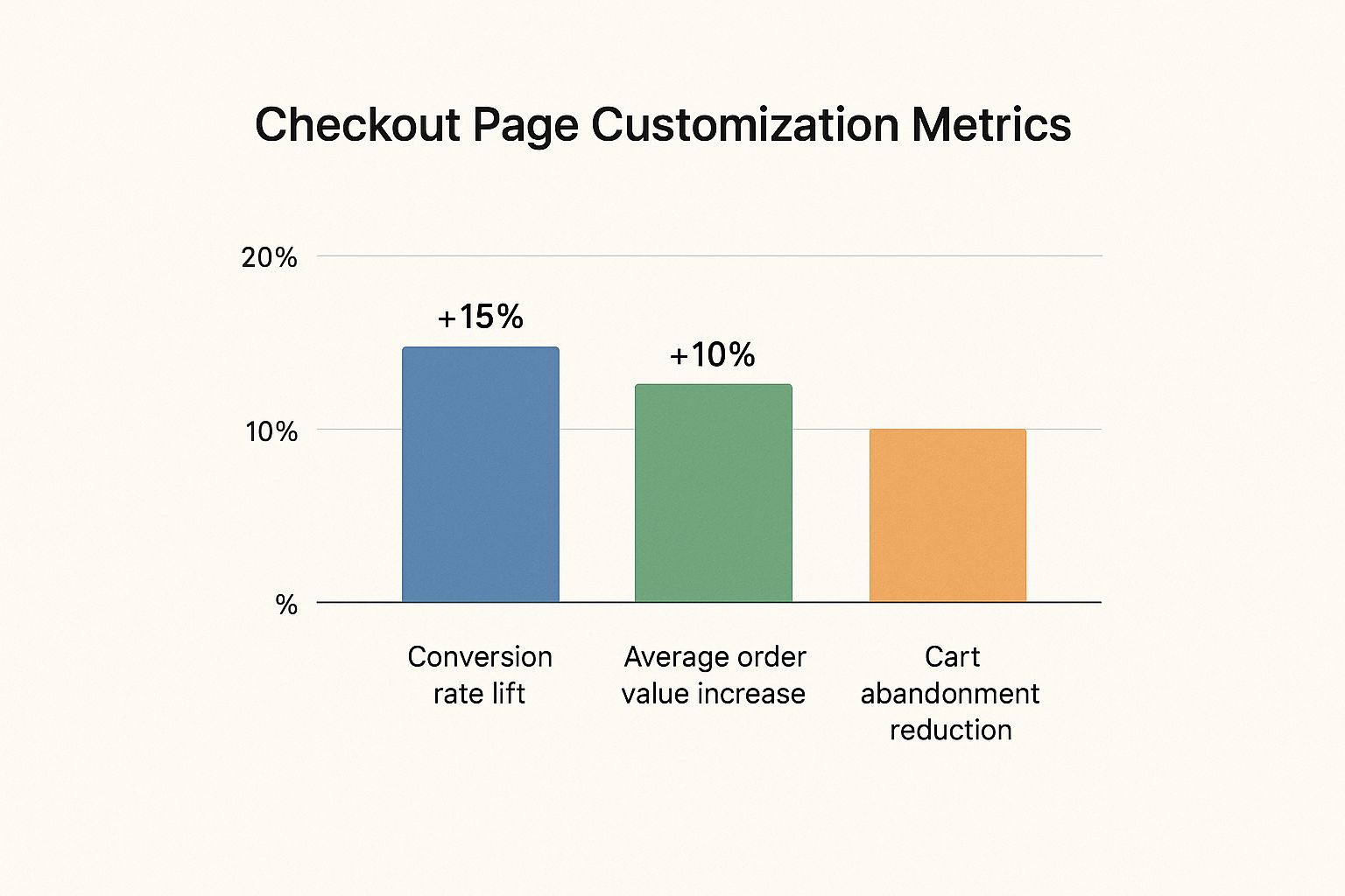
One compelling reason to use Shopify's native checkout is its impressive performance. It consistently surpasses competitors, featuring a streamlined design that guides customers toward purchase completion. This isn’t just anecdotal evidence; Shopify's checkout outperforms other platforms by up to 36% and boasts an average 15% higher conversion rate than its competitors. This success is partly due to features like Shop Pay, an accelerated checkout option that can increase conversions by as much as 50% compared to guest checkout. It even outperforms other accelerated checkouts by at least 10%. You can find more detailed statistics here. This inherent advantage provides a strong foundation for further optimization.
Building on a Strong Foundation
Effective checkout editing on Shopify is not about drastic changes; it's about strategically improving what already works. Consider it like fine-tuning a high-performance engine. You wouldn't replace the whole engine; you'd focus on adjustments that boost its power and efficiency. Likewise, understanding the core strengths of Shopify's checkout helps you identify areas where small changes can yield substantial results.
Avoiding Common Customization Mistakes
Many merchants over-customize their checkout page. This often leads to unintended problems, disrupting the user experience and reducing conversions. For example, adding unnecessary fields or complicated navigation can confuse customers and cause cart abandonment. This highlights the need for a data-driven approach, where changes are tested and improved based on actual customer actions. A well-optimized checkout page balances branding with functionality, making a seamless and intuitive purchase process.
Maximizing Your Conversion Potential
By focusing on enhancing Shopify's existing checkout flow, you can build a truly powerful conversion engine. This approach helps you use the platform’s built-in advantages while adapting the experience to your brand and target audience. The result? A checkout process that not only looks good but also boosts sales and builds customer loyalty.
Navigating Your Checkout Customization Options
Before changing your Shopify checkout page, it's essential to understand your customization options. Your Shopify plan determines your access level. This section explains the customization hierarchy, from basic settings to the advanced features of Shopify Plus. This knowledge allows you to create a prioritized optimization roadmap tailored to your needs.
Understanding Your Shopify Plan’s Capabilities
Not all Shopify plans offer the same checkout page editing functionality. Your customization level depends on your subscription tier. All plans offer basic customization, but advanced features, like accessing the checkout.liquid** file**, are reserved for Shopify Plus users.
The following data chart visualizes the increasing levels of customization available with each Shopify plan. The chart shows how functionality increases as you move up the Shopify plan hierarchy.

The chart illustrates a significant jump in functionality for Shopify Plus merchants, especially regarding custom code edits and third-party app integrations. Basic Shopify users have limited control, primarily over visual elements like logo and color schemes. Shopify and Advanced Shopify plans offer more control over fields and some scripting. However, Shopify Plus provides the most significant increase in customization with access to checkout.liquid.
To further illustrate the customization options based on the Shopify plan you choose, let's take a look at the table below:
Shopify Checkout Customization Options By Plan
A comparison of the checkout editing capabilities across different Shopify subscription plans
| Customization Feature | Basic Shopify | Shopify | Advanced Shopify | Shopify Plus |
|---|---|---|---|---|
Access to checkout.liquid |
No | No | No | Yes |
| Customizing checkout branding (logo, colors) | Limited | Yes | Yes | Yes |
| Editing checkout fields | Limited | More options | More options | Extensive |
| Third-party app integrations within checkout | Limited | More options | More options | Extensive |
| Custom scripting capabilities | No | Limited | More options | Extensive |
This table summarizes the key differences in checkout customization across Shopify plans. As your business expands, choosing a plan that aligns with your long-term checkout optimization goals becomes increasingly important. This allows you to leverage more sophisticated tools as you grow.
Strategic Approach to Checkout Modifications
A strategic approach to editing your Shopify checkout is critical. This means focusing on high-impact areas for your business model. For example, if you have high cart abandonment rates, focus on streamlining form fields and building trust with security badges.
Consider the impact on user experience (UX). Small changes can negatively affect conversions if not implemented correctly. A/B testing is valuable for analyzing the effectiveness of your edits. By comparing different checkout versions, you can identify what resonates with your customers and drives higher conversion rates.
Leveraging Checkout Links for Enhanced Customization
Apps like Checkout Links can enhance checkout customization, especially for email marketing and automation. Creating unique, shoppable links lets you pre-fill carts, apply discounts, and direct customers to specific landing pages. This enables personalized checkout experiences, especially for recovering abandoned carts.
For example, a Shopify Plus merchant can segment customers based on past purchases. Then, they can send personalized checkout links with relevant product recommendations and discounts directly in abandoned cart emails. This increases conversions and average order value.
High-Impact Checkout Tweaks That Drive Conversions
Optimizing your Shopify checkout page is crucial for increasing conversions. This is where customers make their final purchase decisions, so even minor improvements can significantly impact your bottom line. Let's explore common friction points that cause cart abandonment and offer practical solutions for a better checkout experience.
Building Trust and Reducing Purchase Anxiety
One of the biggest obstacles to online conversions is purchase anxiety. Customers often worry about security, unexpected costs, and complicated return processes. Addressing these concerns directly on your checkout page is paramount. Here's how to build trust and alleviate those fears:
- Display Security Badges: Show recognizable security badges from trusted providers like Norton or McAfee to reassure customers that their information is secure.
- Offer Transparent Pricing: Clearly display all costs upfront, including shipping and taxes. Hidden fees are a major reason for cart abandonment.
- Simplify Return Policies: Make your return policy easy to find and understand. A hassle-free return process encourages hesitant buyers. For example, fashion retailer Everlane saw a significant increase in conversions after adding a clear and concise return policy directly on their checkout page. This simple change addressed a major customer concern and boosted sales.
Optimizing Form Fields for Effortless Checkout
Long and complicated checkout forms can frustrate customers and lead to abandoned carts. Streamlining your form fields and minimizing the required information can greatly improve the user experience.
- Use Autofill Where Possible: Implement address autofill and browser-saved payment information to reduce manual entry.
- Only Ask for Essential Information: Avoid unnecessary fields that don't directly contribute to the purchase.
- Clearly Label Fields: Ensure all fields are clearly labeled and easy to understand to minimize confusion and errors. Also, consider using a progress indicator to visually guide customers through the checkout process. Knowing how many steps remain can encourage completion, especially on mobile devices where users appreciate clear and concise navigation.
Crafting Compelling Checkout Messaging
The language used on your checkout page can significantly impact conversion rates. Reinforcing the purchase decision and clear calls to action are crucial for guiding customers to the final click.
- Use Positive and Encouraging Language: Phrases like "Secure Checkout" and "Guaranteed Satisfaction" can boost customer confidence.
- Highlight Key Benefits: Remind customers of your product or service's benefits to solidify their purchase intent.
- Make the Call to Action Clear: Use a prominent and visually distinct button with a clear call to action, like "Complete Order" or "Pay Now."
Editing the checkout page on Shopify also focuses on a seamless customer experience, reflected in the platform's best practices for customization. Shopify provides tools like the
checkout.liquid** file**, allowing merchants to make advanced changes to the checkout layout and functionality. Learn more about customizing checkout.liquid. However, these changes require careful consideration and testing. For more tips, check out this resource: 10 Shopify Checkout Customization Tips to Boost Sales in 2024. Remember, your checkout page is the final step in the customer journey. Optimizing it for conversions can significantly improve sales and build a loyal customer base.
Mastering Advanced Customization With Checkout.liquid
For Shopify Plus merchants, the checkout.liquid file offers extensive control over the checkout experience. This article provides practical guidance on using checkout.liquid, even for those without coding expertise. We'll explore modifying layouts, adding custom fields, and integrating tools, all while prioritizing a secure, high-converting checkout.
Understanding the Power of checkout.liquid
The checkout.liquid file is the core of your Shopify Plus checkout customization. It allows direct modification of the underlying code, giving you control over the layout, functionality, and overall look of the checkout process.
This control allows for distinct branding and highly personalized customer experiences, both of which drive conversions. Consider checkout.liquid the blueprint for how customers complete purchases in your store.
Safely Modifying Layouts and Adding Custom Fields
Modifying layouts within checkout.liquid can significantly impact the user experience. You can rearrange elements, add fields to collect specific customer data, or integrate third-party tools like Checkout Links for targeted upselling and cross-selling opportunities. This is particularly beneficial for personalized offers and recovering abandoned carts.
When adding custom fields, strategic placement and clear labeling are essential to avoid disrupting the checkout flow. For example, requesting a customer's birthday can be useful for future personalized marketing. However, if this field isn't placed correctly, it can increase friction and negatively affect your conversion rate.
Integrating Third-Party Tools and Maintaining Functionality
checkout.liquid allows the integration of third-party apps to extend your checkout's capabilities. You can seamlessly incorporate tools for advanced analytics, subscription management, or personalized product recommendations. However, proceeding with caution is vital.
Incorrect integrations can disrupt core checkout functions. Thorough testing after any modifications is critical. A malfunctioning payment gateway during a busy period could lead to substantial revenue loss.
Testing and Security: Essential Considerations
Testing is paramount when working with checkout.liquid. A solid testing strategy, including A/B testing different checkout versions, ensures that changes improve, not hinder, the customer experience. Always back up your checkout.liquid file before making changes; this allows quick restoration should any issues arise.
Security is also paramount when handling sensitive customer data within the checkout. All modifications to checkout.liquid should be made with security best practices in mind. Consult with Shopify experts or experienced developers if you're uncertain about security implications. A compromised checkout can severely damage your brand's reputation and erode customer trust.
Maximizing the Potential of checkout.liquid
Mastering checkout.liquid unlocks extensive customization options for Shopify Plus merchants. This empowers you to craft a checkout experience that is not only visually appealing and on-brand but also highly optimized for conversions. This requires careful planning, thorough testing, and a consistent focus on functionality and security. The potential rewards are substantial: increased sales, improved customer satisfaction, and a stronger brand presence.
Crafting Mobile Checkouts That Actually Convert

A perfectly crafted desktop checkout experience doesn't guarantee success on mobile. Mobile shoppers have distinct needs and encounter unique frustrations. This section explores the pain points specific to mobile checkouts and offers practical strategies for optimizing your Shopify store's checkout process for higher conversion rates.
Optimizing For Touch Interactions and Mobile Usability
Mobile users interact with their devices differently than desktop users. Elements designed for mouse clicks can be challenging on touchscreens. Buttons need to be large enough for comfortable tapping. Forms should be designed with mobile input in mind, and navigation must be intuitive for one-handed use.
For example, consider form field placement. A variety of configurations might work on a desktop, but a single-column layout is generally best for mobile, facilitating easier scrolling and input with a thumb.
Streamlining Mobile Payments For Faster Conversions
Mobile shoppers expect fast and easy payment options. Supporting mobile wallets like Apple Pay and Google Pay is crucial. These options significantly reduce the friction of manually entering payment information on a smaller screen.
Also, consider offering express checkout options such as Shop Pay. A streamlined payment process, particularly helpful for returning customers, simplifies buying on the go. This can significantly improve conversion rates.
Improving Form Usability On Small Screens
Completing forms is a common obstacle in mobile checkouts. Long forms with many required fields can quickly deter mobile users. Optimizing forms for mobile involves minimizing the number of fields, using autofill whenever possible, and providing clear and concise labels.
Input field design also plays a role. Larger text and adequate spacing between fields makes accurate input easier for mobile users. This reduces errors and frustration, making for a smoother checkout experience.
Enhancing Load Times For On-The-Go Purchases
Mobile users are often on the go and have little patience for slow loading times. A slow checkout page can quickly lead to abandoned carts. Optimizing images, minimizing unnecessary code, and using browser caching are essential for fast mobile load times.
Consider a customer trying to purchase something while waiting in line or commuting. A slow checkout page could easily cause them to abandon their cart. This underscores the importance of optimizing load times to capture impulsive mobile purchases.
To understand the key differences in checkout optimization for mobile and desktop, let's look at the following comparison:
Mobile vs Desktop Checkout Optimization: Key differences in checkout optimization strategies between mobile and desktop experiences
| Optimization Area | Mobile Approach | Desktop Approach | Impact on Conversion |
|---|---|---|---|
| Form Design | Single-column, minimal fields, large text, autofill | Flexible layouts, more detailed forms | Mobile simplification reduces friction and increases conversions. Desktop allows for more comprehensive data collection. |
| Payment Options | Mobile wallets (Apple Pay, Google Pay), express checkout (Shop Pay) | Wider range of options, potentially including financing | Mobile prioritizes speed and convenience. Desktop can offer more complex payment choices. |
| Navigation | Thumb-friendly, intuitive one-handed use | Mouse-driven, more complex navigation acceptable | Streamlined mobile navigation improves the user experience and reduces drop-off. |
| Page Load Speed | Image optimization, code minimization, browser caching | Important, but higher tolerance for slightly longer load times | Fast mobile load times are critical for preventing abandoned carts. |
This table highlights how a mobile-first approach to checkout design requires prioritizing simplicity and speed. While desktops can handle more complex processes, mobile optimization focuses on reducing friction at every step.
Implementing Mobile-Specific Checkout Strategies On Shopify
Implementing these mobile optimization strategies on your Shopify store is possible across various plans. While Shopify Plus users have more flexibility with checkout.liquid, even basic plans allow for optimizations through apps and theme settings.
Tools like Checkout Links can further enhance mobile checkout flow. Creating direct links to pre-filled carts allows for a more personalized and seamless experience, particularly useful for recovering abandoned carts. This streamlined approach caters to mobile shoppers seeking quick and easy purchases. Optimizing your Shopify checkout for mobile is essential for maximizing conversions.
Measuring What Matters After Checkout Changes

Optimizing your Shopify checkout involves more than just making edits. It’s essential to understand if those changes truly improved performance. This section delves into analyzing checkout effectiveness, going beyond basic metrics to grasp the real impact of your modifications. We'll cover setting up comprehensive tracking and interpreting the data to refine your optimization strategy.
Setting Up Tracking in Shopify Analytics and Google Analytics
Accurate tracking forms the bedrock of any successful optimization. Shopify Analytics provides valuable data on your store's performance, including checkout specifics. Combining this with the detailed data from Google Analytics offers a more holistic perspective.
Key metrics to track within Shopify:
- Checkout Conversion Rate: This crucial metric measures the percentage of visitors completing the checkout.
- Average Order Value (AOV): Understanding AOV helps evaluate the profitability of your checkout process.
Enhanced Tracking with Google Analytics
For a deeper understanding of user behavior, utilize Google Analytics. Setting up Enhanced Ecommerce tracking captures valuable data points:
- Cart Abandonment Rate: Identify where users exit the checkout process.
- Time to Purchase: Locate bottlenecks and friction points in the checkout flow.
- Checkout Behavior Analysis: Learn how users interact with different checkout elements. Tools like Checkout Links further enhance tracking by creating unique URLs for specific campaigns. This allows you to attribute conversions to individual marketing efforts, offering more granular data for optimization.
Identifying Key Performance Indicators (KPIs)
While many metrics are available, focusing on the right Key Performance Indicators (KPIs) is critical for meaningful improvements. Beyond conversion rate and AOV, consider:
- Form Completion Rate: Are specific form fields causing user difficulties?
- Checkout Step Completion Rate: Find drop-off points in multi-step checkouts.
- Payment Method Usage: Are preferred payment options easily accessible?
Developing Testing Frameworks for Continuous Improvement
A/B testing is essential for gauging the impact of checkout edits. This involves creating two checkout versions and directing traffic to each. Analyzing their performance reveals which changes lead to significant improvements.
A robust testing framework includes:
- Clear hypotheses: What specific change are you testing, and what outcome are you anticipating?
- Defined metrics: Which KPIs will measure success?
- Sufficient sample size: Ensure enough data for valid conclusions.
Interpreting Data and Distinguishing Correlation From Causation
Data analysis demands careful interpretation. Correlation between two metrics doesn't necessarily imply causation. For instance, a higher conversion rate might correlate with a design change, but other factors, like a marketing campaign, could be influencing the result.
Building a Sustainable Measurement System
A sustainable measurement system ensures ongoing checkout optimization. This involves regular data review, identifying areas for improvement, implementing changes, and retesting for validation. This iterative approach fosters continuous improvement, keeping your checkout optimized for conversions.
Avoiding the Checkout Customization Pitfalls
https://www.youtube.com/embed/KZOK1YnR5oY
Optimizing your Shopify checkout is crucial for boosting sales. However, even well-intentioned changes can sometimes hinder conversions and erode customer trust. This section examines common checkout customization pitfalls, illustrating them with real-world examples and offering practical solutions.
The Danger of Excessive Customization
While customizing your checkout page is important for branding and adding functionality, excessive customization can backfire. Overloading the checkout page with too many fields, complex scripts, or unnecessary design elements can overwhelm customers and create friction in the purchasing process. This can lead to increased cart abandonment rates and ultimately, lost sales. A cluttered checkout process is confusing and can deter customers from completing their purchase. Think of it like a disorganized checkout line in a physical store – it frustrates customers and discourages repeat business.
For instance, one merchant, aiming to increase their average order value, added multiple upsell offers to their checkout page. This resulted in a cluttered and confusing experience, leading to a decline in conversions. Recognizing the issue, they simplified the checkout process, focusing on a single, relevant upsell offer. This strategic simplification led to a rebound in conversion rates, demonstrating that less can often be more.
The Importance of Thorough Cross-Device Testing
A seamless checkout experience across all devices is essential for modern online businesses. What appears perfectly functional on a desktop computer might be completely unusable on a mobile phone. Before implementing any changes to your checkout process, rigorous testing across various devices and browsers is crucial to ensure consistent functionality and a positive user experience.
Imagine a customer adding items to their cart on their mobile phone during their commute, then trying to complete the purchase later on their desktop computer. If the checkout experience differs significantly between devices, it can create frustration and lead to cart abandonment. Consistent cross-device functionality is paramount for capturing sales, regardless of how customers choose to shop. For more guidance, check out this helpful resource on How to master checkout optimization for different devices.
Security Risks with Third-Party Scripts
While certain third-party scripts can enhance the functionality of your checkout page, they can also introduce potential security risks. Improperly implemented scripts can create vulnerabilities, potentially exposing sensitive customer data and leading to fraud. This not only harms your customers but also damages your brand’s reputation.
Consider the potential fallout from a data breach caused by a vulnerable third-party script on your checkout page. The resulting loss of customer trust and the potential for legal repercussions can severely damage your business. Therefore, it's essential to carefully vet all third-party scripts and ensure their secure implementation to protect both your customers and your brand.
Prevention Strategies for a Smooth Checkout Experience
To avoid these common pitfalls, consider implementing the following best practices:
- Prioritize essential elements: Focus on clear branding, essential information, and a streamlined checkout process.
- Test extensively: Conduct thorough cross-device testing, including A/B testing different versions to identify the most effective approach, before launching any changes.
- Vet third-party scripts: Ensure all scripts are sourced from reputable providers and implemented securely.
- Monitor performance: Track key metrics such as conversion rate and cart abandonment to identify any emerging issues and make data-driven adjustments. By adhering to these strategies, you can create a secure and user-friendly checkout experience that maximizes conversions and fosters customer trust. Looking for a reliable way to streamline your checkout process and enhance your email marketing efforts? Checkout Links offers a robust solution for creating personalized, shoppable links that seamlessly integrate with your email marketing campaigns and automated flows. Learn more about Checkout Links and how it can boost your conversions.