Shopify Checkout Page Customization: What Really Works
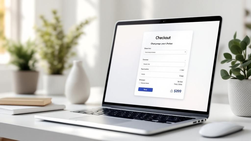
Let's be real – there's nothing more frustrating than watching a full shopping cart get abandoned at the checkout. It's like reaching the final boss in a video game, only to find your controller's dead. Except, unlike a video game, lost sales hit your bottom line. That's where customizing your Shopify checkout page becomes absolutely essential. This isn't just about making things look pretty; it's about creating a smooth, trustworthy experience that actually turns browsers into buyers.
I've seen firsthand how a clunky checkout process can drive customers away. Think about your own online shopping experiences. How many times have you bailed on a purchase because the checkout was too long or just plain confusing? You're not alone. Studies show that roughly one in five customers abandon their carts specifically because the checkout process is too cumbersome. That’s a huge chunk of potential revenue! Mastering your checkout flow is key, so if you want to dig deeper, check out this article on Shopify Checkout Customization. And for even more insights, head over here.
Identifying the Hidden Friction Points
In my experience working with online store owners, one of the biggest mistakes I see is assuming they know why customers abandon their carts. They'll often blame high shipping costs or limited payment options. While those certainly can be contributing factors, the real culprits are often more subtle.
For instance, a cluttered checkout page can easily overwhelm a customer. Or, asking for too much information can feel intrusive, making shoppers hesitate to share their details. Even something like trust badges, when implemented poorly, can actually backfire. Think about it: a checkout page plastered with a dozen security badges can feel desperate, not reassuring. It’s like trying to prove you’re a good driver by showing off a stack of parking tickets.
Turning Frustration into Conversions
The good news is, these issues are usually pretty easy to fix with a little strategic Shopify checkout page customization. By simplifying the layout, streamlining the form fields, and placing trust badges thoughtfully, you can create a checkout experience that actually encourages customers to click that "buy" button.
This isn't about tricking anyone. It's about removing unnecessary roadblocks and building genuine trust in your brand. Think of it as clearing the path for your customers to reach the finish line – and ultimately, boost your sales.
Maximizing Shopify's Built-In Checkout Tools
Before we get into any fancy code, let's talk about the conversion goldmine hiding in plain sight within your Shopify settings. Seriously, I've seen countless store owners completely miss these easy tweaks, and it's like leaving money on the table. It's like owning a Ferrari and only driving it in first gear – you're missing out on the real power! We're going to focus on the truly effective native settings, the ones that actually move the needle for high-converting stores.
Streamlining the Checkout Process
First up, express payments. Just turning them on isn't enough. You need to offer the options your specific customers actually use and trust. Think Shop Pay, PayPal, and even Apple Pay. These are the familiar, friendly faces that make people feel comfortable clicking that buy button. I've personally seen conversion rates get a serious boost just by adding a single trusted express payment option.
Then there's guest checkout. I know, I know, collecting customer data is important. But forcing account creation can be a major roadblock for potential buyers. The good news? Shopify lets you grab email addresses even from guest checkouts, so you're not sacrificing valuable marketing info. It’s about finding that perfect balance. For a deeper dive into this balancing act, check out our guide on ecommerce checkout optimization.
And finally, let's not forget Shopify's one-page checkout. This is a real game-changer. Make absolutely sure it's enabled and optimized. This isn't just about making the checkout shorter, it’s about presenting all the key info clearly and concisely on a single screen.
Visualizing the Impact
This infographic really brings home the impact that even small checkout optimizations can have on your bottom line. It compares the standard Shopify checkout with a customized one, and the difference is pretty stark.
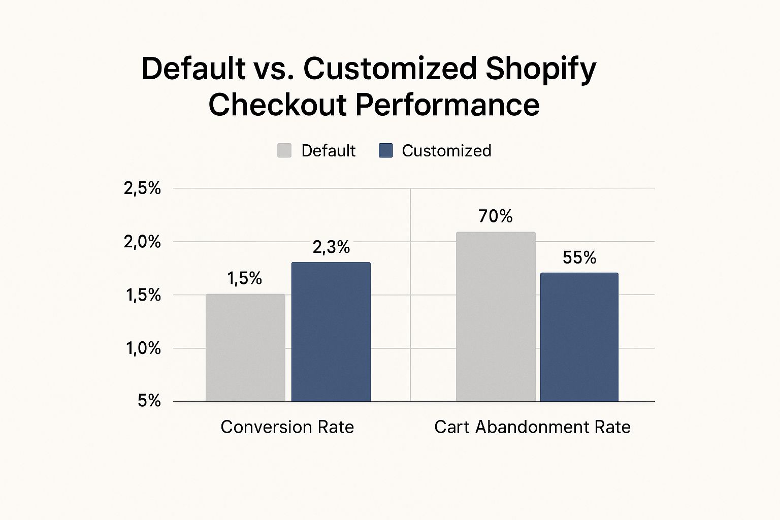
As you can see, optimizing the Shopify checkout page can boost your conversion rate from a baseline of 1.5% to a solid 2.3%, while also dropping cart abandonment from 70% to 55%. These seemingly small tweaks, when combined, can lead to a significant increase in revenue. These are the kinds of quick wins that can seriously transform your business, and the best part is, they don't require any coding wizardry. A few strategic clicks in your Shopify admin panel can unlock significant improvements to your checkout flow, and ultimately, your bottom line.
Let's take a look at what you can do with Shopify right out of the box, depending on your plan:
Native Shopify Checkout Features Comparison
This table breaks down the customization options you have available with Shopify Basic, Shopify Plus, and by using third-party apps. It's a handy guide to see where you might need to invest a little extra to get the checkout experience you want.
| Feature | Shopify Basic | Shopify Plus | Third-party Apps |
|---|---|---|---|
| Express Payments | Limited options | More options | Wide range of integrations |
| Guest Checkout | Yes | Yes | Generally supported through platform integrations |
| One-Page Checkout | Yes | Yes | Usually integrated seamlessly |
| Customizing Checkout Branding (colors, fonts) | Limited | Extensive | Highly customizable, dependent on the app |
| Editing Checkout.liquid | No | Yes | N/A (apps use different methods) |
| Script Editor Access (for advanced functionality) | No | Yes | N/A |
So, as you can see, Shopify Plus gives you the most control natively, but even with Shopify Basic you have a good foundation. Third-party apps can fill the gaps and offer even more specialized features. This comparison should help you figure out the best approach for your store.
Customizations That Actually Boost Conversions
Let's talk Shopify checkout customization. I've worked with some pretty big online stores—seven and eight-figure revenue—and I can tell you, not all customizations are born equal. Some move the needle on your profits, others are just window dressing. The real secret? Focus on changes that tap into buyer psychology and smooth out any bumps in the road. We're not just aiming for pretty; we're aiming for effective.
Building Trust Without Being Pushy
Think about trust badges. Instead of slapping them all over the page like stickers, pick a few key ones that truly speak to your audience. Selling high-ticket items? Security certifications and money-back guarantees can work wonders for easing those pre-purchase jitters. But if you're selling t-shirts? Too much reassurance can actually have the opposite effect and make people suspicious.
Product summaries on the checkout page are another game-changer. Give your customers a quick and easy way to double-check their order. It's a simple tweak that can seriously cut down on abandoned carts and those "oops, I didn't mean to buy that" moments. For even more Shopify optimization tips, check out these Shopify SEO experts. They really know their stuff.
Upsells That Feel Like Helpful Suggestions
Upselling at checkout? Done right, it's a fantastic way to bump up your average order value (AOV). The key is to make it feel like you're helping, not hustling. Forget random product suggestions. Instead, offer complementary items or upgrades that genuinely enhance the original purchase. Someone buying a camera? Offer a lens cleaning kit or an extra battery. These feel like thoughtful recommendations, not pushy sales tactics, benefiting both the customer and your bottom line. Optimizing your checkout is a proven way to boost conversions and keep customers happy. For more on checkout optimization, have a look at this helpful article here.
Mobile Optimization for Thumb-Happy Shoppers
Let's be real, a huge chunk of your customers are shopping on their phones. That means your checkout needs to be designed for thumb navigation on smaller screens. Big, tappable buttons, streamlined forms, and a smooth checkout flow are non-negotiable. A clunky mobile checkout is a recipe for frustration and abandoned carts. The name of the game is frictionless, no matter the device. Mobile optimization isn't a nice-to-have; it's a must-have for maximizing conversions in today's mobile world.
Getting Technical: CSS and Liquid That Works
Ready to get your hands dirty with some code? Customizing your Shopify checkout goes way beyond clicking a few buttons in the theme editor. With some clever CSS and Liquid, you can craft a checkout experience that’s both beautiful and functional. Think of CSS as the stylist for your checkout – it handles all the visual aspects. Liquid, on the other hand, is the brains of the operation, pulling in dynamic data and making sure everything runs smoothly.
CSS Tweaks for Instant Visual Impact
Let’s kick things off with CSS. I'm telling you, even small changes can make a world of difference. Want to tweak that "Buy Now" button to match your brand's vibrant orange? Piece of cake. Here’s a quick example:
.order-summary__cta .btn { background-color: #FF5733; /* Your brand's orange */ }
This little snippet targets the buy button and swaps out the background color. Pro tip: always test your changes on different devices and browsers. I learned this the hard way. Once, I made a change that looked perfect on my desktop, only to discover it completely wrecked the mobile layout. So, yeah, testing is key.
Liquid: Dynamic Content for a Smarter Checkout
Now for the real magic: Liquid. This templating language is incredibly powerful, allowing you to pull in dynamic data and create a personalized checkout experience. Think of Liquid variables like ingredients in a recipe. You can mix and match them to create something truly unique. One of my go-to variables is {{ checkout.total_price }}. This little gem displays the total price, and you can even format it however you like or use it to trigger specific actions based on the cart value.
For instance, let’s say you're offering free shipping on orders over $50. You can use Liquid to display a dynamic message right there at checkout:
{% if checkout.total_price > 5000 %}
This code checks the total cart value and shows a different message depending on the amount. See that | money filter? It’s essential for formatting the price correctly. These small touches can really elevate the customer experience.
Testing and Troubleshooting: Avoiding Checkout Disasters
Before you unleash your code on unsuspecting customers, test, test, and test again! A broken checkout is a nightmare – it's like having your shop doors locked during a big sale. Use the Shopify theme editor preview to see your changes in action and ensure everything is working as it should. If you’re making major changes, I highly recommend duplicating your theme and working on a copy. This lets you experiment without risking your live store. Trust me, this has saved me from countless checkout disasters. With thorough testing and a bit of practice, you’ll be wielding CSS and Liquid like a pro, creating a checkout that’s both visually stunning and super effective. And that translates to a happier customer journey and, of course, a boost in those all-important conversions.
Choosing The Right Apps Without The Bloat
Sometimes, the best Shopify checkout customization isn't about diving headfirst into code. It's about finding that perfect app that already solves your problem. But let's be honest, the Shopify App Store can be a bit of a jungle. So many checkout tools promising the world, but often they just add extra baggage and slow your site down. I've definitely fallen into that trap before. Let's explore how to find the gems that actually deliver.
Evaluating Apps for Performance and Integration
Before you click that install button, consider the impact on your site's speed. A sluggish checkout is a surefire way to lose customers. I've seen stores pile on so many apps that their checkout page takes an eternity to load. The result? Frustrated customers and a pile of abandoned carts. Look for apps that are lean, mean, and well-coded. Browse the reviews – see if anyone's complaining about performance issues. And always, always test the app on your own store before you fully commit.
Integration is another critical piece of the puzzle. Does the app fit seamlessly into your current setup? Or does it cause conflicts and weird glitches? I learned this the hard way once. I installed an upsell app that clashed with my discount code system. Let's just say it wasn't pretty. Make sure any new app plays nicely with your existing theme and other apps. A smooth, integrated experience is key for a happy customer journey.
Exploring Essential App Categories
A few key app categories can really elevate your checkout flow. Checkout upsells, for example, can boost your average order value without feeling pushy. The trick is to offer relevant, complementary products, not just random stuff.
Then there's address validation. These apps can seriously cut down on errors and make checkout faster. I've seen them save store owners countless headaches by catching typos and ensuring accurate delivery info.
Finally, payment expansion apps can open doors to new markets and cater to diverse customer preferences. Adding options like PayPal or Apple Pay can significantly increase conversions, especially on mobile. But don't go overboard. Focus on the payment methods your target customers actually use and trust. Too many options can be overwhelming.
Let’s take a quick look at how some of the popular apps stack up against each other in terms of performance and features:
Top Checkout Customization Apps Performance Comparison
| App Name | Primary Feature | Performance Impact | Pricing | User Rating |
|---|---|---|---|---|
| App A | Upsells/Cross-sells | Low | $19/month | 4.8 stars |
| App B | Address Validation | Minimal | $9/month | 4.5 stars |
| App C | Subscriptions | Medium | $49/month | 4.2 stars |
| App D | Custom Checkout Fields | Low | $29/month | 4.7 stars |
This table provides a snapshot of a few key players. Remember, the “best” app will always depend on your specific needs and context.
Avoiding Conflicts and Choosing Wisely
Not all apps get along. Some combinations can cause conflicts that completely disrupt your checkout flow. I've seen this with upsell apps clashing with discount codes or address validation tools interfering with custom shipping rules. Do your research before adding anything new. Check the app’s documentation for potential compatibility issues. And test everything thoroughly in a staging environment first.
Don't install an app just because it looks shiny or promises instant results. Think about your specific needs and how each app fits into your overall strategy. The goal is to enhance your checkout, not make it more complicated. By choosing wisely and avoiding unnecessary bloat, you can create a streamlined, high-converting checkout experience that turns visitors into loyal customers.
Mobile Checkout Optimization That Actually Converts
https://www.youtube.com/embed/4JCXyHEe_uc
Mobile commerce is booming. If your checkout process isn't optimized for smaller screens and thumb-tapping, you're missing out on sales. It's not enough for your checkout to work on mobile; it needs to be exceptional. I've witnessed firsthand how a clunky mobile checkout can send potential customers running. Let's dive into how to avoid that.
Designing for Thumbs
Consider how people hold their phones. Buttons should be easily tappable with a thumb, and forms should be as concise as possible. No one wants to squint at tiny text boxes or scroll endlessly on a small screen. Trust me, I've abandoned checkouts that felt like I needed a microscope and a whole lot of patience. Make that "Buy Now" button prominent and easy to find. It’s all about minimizing friction and maximizing convenience. For more tips on keeping customers happy through checkout, take a look at these strategies for reducing cart abandonment.
Mobile Payment Integrations
Offering the right mobile payment options is key. Think Apple Pay, Google Pay, and Shop Pay. These options offer speed and security with just a few taps. Integrating them can significantly improve the mobile checkout experience. I've personally seen conversion rates improve simply by adding Apple Pay. It's about adapting to your customers' preferred payment methods.
Building Trust on Smaller Screens
Security concerns can be magnified on mobile. Displaying clear security badges and readily available contact information reassures customers that their information is safe. A simple, well-designed checkout goes a long way in establishing trust. Globally, the trend is toward streamlined, personalized checkout experiences. In fact, as of 2025, Shopify checkout trends emphasize self-service, mobile point-of-sale systems, and efficient processes. These changes reflect the increasing demand for seamless and convenient mobile commerce. Check out more insights on Shopify's evolving checkout landscape.
Eliminating Mobile-Specific Friction
Sometimes, mobile users run into issues that desktop users never experience. Test your checkout thoroughly on different devices and screen sizes. Is the keyboard obscuring important form fields? Are images scaling correctly? These seemingly minor details can dramatically impact the mobile experience. I once encountered a bug where the discount code field was completely hidden by the keyboard on a specific phone model. Catching these problems before your customers do is critical. By addressing these mobile-specific challenges, you can create a smooth and efficient checkout optimized for conversions.
Measuring What Matters and Improving Continuously
So, you've customized your Shopify checkout page. Awesome! But here's the thing: without tracking and analysis, it's like throwing spaghetti at the wall and hoping it sticks. You absolutely need to know what's working, what's not, and more importantly, why. That means setting up analytics that give you genuine insights, not just a mountain of data you don't understand. Think of it like a regular health check for your checkout process.
Setting Up Analytics That Actually Reveal Insights
First off, Google Analytics is your new best friend. Seriously. It's a free powerhouse that can track practically everything happening on your checkout page. Make absolutely sure you're tracking key metrics like conversion rate, average order value, and cart abandonment rate. But don't just stare blankly at the numbers. Dig in. Where are people dropping off? Which traffic sources are converting best? This is pure gold for optimizing your checkout.
This screenshot, for example, shows a sample view from Google Analytics, highlighting the Ecommerce Conversion Rate. This is a crucial metric, showing the percentage of visitors actually completing a purchase. By analyzing this, you can pinpoint areas for improvement, like identifying pages with high drop-off rates.
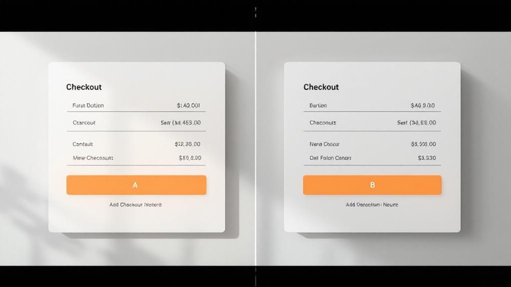
A/B Testing for Actionable Data
Next, let's talk about A/B testing. This is where things get really interesting. Test different versions of your checkout page to see what truly resonates with your customers. Maybe it's a different button color, maybe it's a slightly adjusted layout. I once saw a 15% increase in conversions simply by changing the wording on the "Buy Now" button! Small tweaks, big impact. Just remember, be strategic. Don’t test everything at once. Focus on one element at a time so you can isolate what’s driving the change.
Gathering Meaningful Customer Feedback
Don't forget the power of good old-fashioned customer feedback. And I don't mean generic surveys. Proactively reach out to customers who abandoned their carts and ask them why. What made them hesitate? Was it the shipping cost? Limited payment options? A clunky layout? This kind of direct feedback is pure gold. I once learned that customers were abandoning carts because the checkout form felt too long. Shortening it led to a significant boost in conversions. Sometimes, talking to real people is more valuable than any analytics dashboard.
Prioritizing Improvements Based on Impact vs. Effort
Now that you're armed with all this data, you need a plan of attack. Prioritize improvements based on potential impact and the effort involved. Changing a button color is quick and easy. Overhauling your entire checkout process? Not so much. Focus on the quick wins first. These early successes can build momentum and provide valuable insights for more complex changes later on.
By continuously measuring, testing, and improving, you can turn your Shopify checkout page from a leaky faucet into a well-oiled, conversion-generating machine. Want to take your checkout process to the next level and reclaim those lost sales? Check out Checkout Links. It’s a game-changer for automating abandoned cart recovery and boosting your email marketing efforts, perfect for any Shopify merchant looking to optimize their checkout and maximize revenue.