Add a shoppable collection grid landing page before checkout
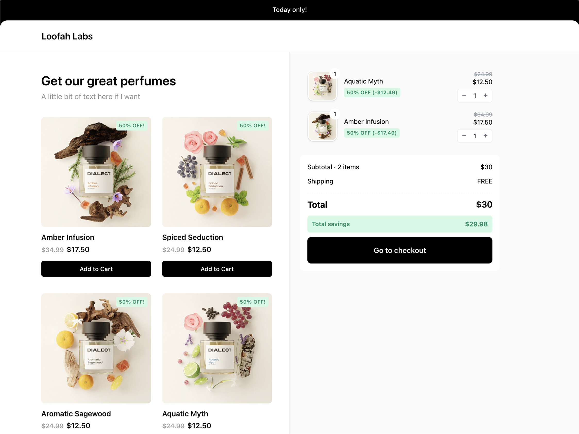
Create a landing page where customers can browse and shop before checkout The Collection Grid extension adds a shoppable product catalog before your link’s final destination. Instead of redirecting customers directly to checkout, they land on an interactive page where they can browse products, view details, select variants or subscriptions, and manage their cart before proceeding to checkout.
Collection Grid is perfect for product bundles, curated collections, subscription offerings, and creating mini-storefronts for influencers or special campaigns.
Key Features
Product Grid
- Product Display: Grid layout with product images, titles, prices, and star ratings
- Discount Badges: Automatically displays discount percentages on products
- Sold Out Badges: Clear indication when products are unavailable
- Quick Add: Single-click add to cart for simple products
- Product Modal: Detailed product view for complex variants and subscriptions
- Free Gifts: All configured free gifts and promotions carry over to the collection grid
Cart
- Dynamic Totals: Real-time price calculations including discounts
- Total Savings: Shows total amount saved from discounts and promotions
- Item Quantity Controls: Increase, decrease, or remove items
- Restore Offer: Allows customers to restore removed pre-configured items
Variant & Subscription Support
- Multi-Variant Products: Full variant selection with option pills
- Selling Plans: Support for subscription products
- Purchase Options: Control whether products offer one-time, subscription, or both
- Price Comparison: Shows original vs. discounted prices
Setup & Configuration
The Collection Grid extension provides a visual configuration interface with live preview:1
Add a Collection Grid extension
In your link editor, add a Collection Grid extension to activate the product catalog.
2
Select your products
Choose which products to display in the grid.
3
Customize appearance
Use the live preview to adjust header image, colors, and layout in real-time.
4
Save and test
Save your configuration and test the full shopping experience on your link.
Options
Visual Configuration
- Header Image: Optional banner image at the top of the page
- Description Text: Introductory text to describe your offer
- Color Scheme: Choose from your theme’s color schemes
- Announcement Bar: Optional top banner with custom text
- Store Logo: Automatically uses your store logo in the header
Product Configuration
- Select Products: Choose specific products to display in the grid
- Ungroup Variants: Option to show each product variant as a separate card in the grid
- Product Discounts: Set discount percentages per product
- Variant Discounts: Set specific discount percentages per variant
- Purchase Options: Control whether products offer one-time purchases, subscriptions, or both options
The live preview lets you see exactly how your collection grid will look before saving, ensuring it matches your design expectations.