Boost Conversions with a pop up for website: Smart Strategies for 2026
Let's be honest: when you hear "website pop-up," you probably think of those annoying, intrusive boxes from the early 2000s. But what if I told you that a strategic pop-up is one of the most powerful conversion tools you’re likely overlooking on your Shopify store?
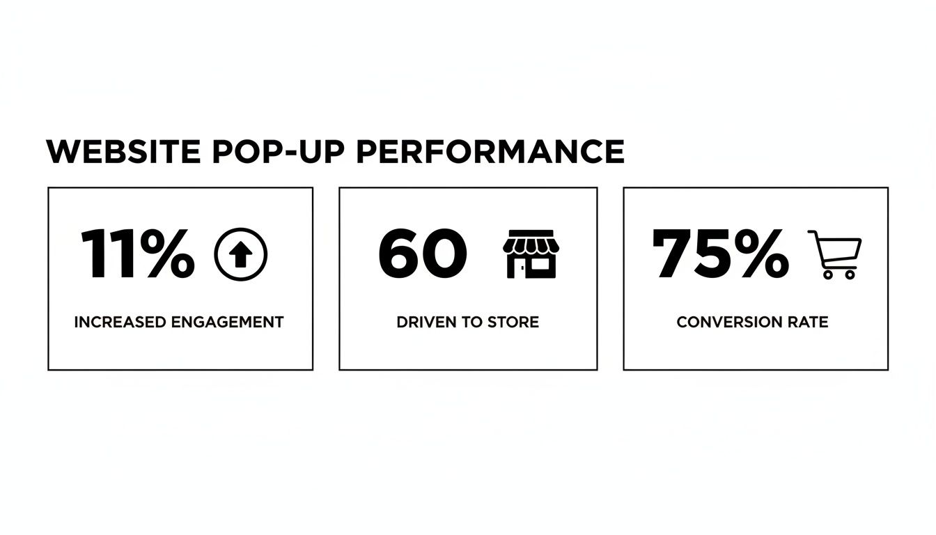
The numbers don't lie. While most stores hover around a 1.4% to 1.8% conversion rate, we've seen well-executed pop-ups push that figure past 11%. That’s not a small bump; it’s a game-changer.
Why Your Store Needs a Pop-Up Strategy
It's surprising how many Shopify stores are still missing out on this. Data shows that only about 39.4% of Shopify merchants are currently using pop-ups. This means the majority are leaving serious money on the table every single day.
Think about it: the average cart abandonment rate is a staggering 75%. A timely, well-crafted pop-up can be the one thing that stops a visitor from leaving, turning a potential lost sale into a loyal customer. As ad costs continue to rise, converting the traffic you already have is non-negotiable.
A Clear Look at the Numbers
For the stores that get pop-ups right, the results are incredible, with average conversion rates hitting a solid 11.09%. It’s a core part of effective website conversion optimization, giving you a direct line to your customers at the most critical moments.
To put this into perspective, let's compare the performance of a typical store to one with a smart pop-up strategy.
Pop Up Performance vs. Standard Conversion Rates
| Metric | Standard Shopify Store | Shopify Store with Optimized Pop-Ups |
|---|---|---|
| Average Conversion Rate | 1.4% - 1.8% | Can exceed 11% |
| Email List Growth | Slow, organic growth | Accelerated lead capture |
| Cart Abandonment | Around 75% | Reduced with exit-intent offers |
| First-Time Buyer Conversion | Relies on site-wide banners | High conversion with welcome offers |
As you can see, the difference isn't minor. Implementing a pop-up strategy is about actively engaging visitors and guiding them toward a purchase, rather than passively hoping they convert.
The data here hammers the point home. A simple, thoughtfully placed pop-up can significantly lift your conversions, giving you an edge that most of your competitors simply don't have.
More Than Just Annoyances
The bad reputation pop-ups earned comes from a history of poor execution. Today's pop-ups are a different breed entirely—they're intelligent, targeted, and designed to add real value to the shopping experience.
Instead of being a generic interruption, a modern pop-up is a tool to:
- Welcome new visitors with an exclusive first-time purchase discount.
- Prevent cart abandonment by offering free shipping just as someone is about to click away.
- Grow your email list by providing early access to sales or valuable content. When you align your pop-up with what the user actually wants, you create a win-win. They get a better deal or a better experience, and you get a conversion. It's that simple.
Defining Clear Goals for Your Website Pop Up

Before you even think about design, copy, or fancy animations, we need to talk about the one thing that will make or break your pop-up's success: its goal. A high-converting pop up for website strategy doesn't happen by accident.
Let's be honest, just saying you want "more sales" is way too broad. It's like heading out on a road trip without a destination. You'll burn a lot of gas and end up nowhere. To make a pop-up that actually moves the needle, you have to get specific about what you want it to achieve.
Aligning Pop Ups with Business Objectives
The best pop-ups I've seen are always directly linked to a specific business goal. This single decision—the why behind your pop-up—will inform everything else you do, from the offer you make to the exact moment it appears on a visitor's screen.
Here are some of the most common, goal-driven use cases for a Shopify store:
- Grow Your Email List: This is the classic. Capture emails to build a loyal audience you can market to directly. It's about playing the long game and building a real brand asset.
- Reduce Cart Abandonment: Catch shoppers right as they're about to leave with items in their cart. A well-timed offer here can be incredibly powerful.
- Announce a Flash Sale: Use urgency to your advantage. A pop-up with a countdown timer is perfect for driving immediate action during a limited-time promotion.
- Promote a New Product: Got something new to show off? A pop-up can put it front and center, generating that crucial initial buzz and sales.
- Guide Visitors: Gently nudge shoppers toward a specific collection, a popular blog post, or a high-value landing page they might otherwise miss. See how each goal requires a totally different playbook? A flash sale pop-up needs to be bold and urgent, while one focused on email capture might offer a free guide. If you're focusing on email, we've got a whole separate guide on building a powerful email list that's worth a read.
Real-World Goal-Oriented Examples
Let’s make this tangible. Imagine you run a fashion boutique on Shopify. A new visitor browses a few pages, adds a dress to their cart, but then gets cold feet. Their mouse starts drifting toward the "X" on the browser tab.
Here's another one. A beauty brand is launching a new skincare line. They could set up a "spin-to-win" wheel that appears after a visitor has been on the site for 15 seconds. The prizes—a discount on the new product, a free sample—all funnel back to two primary goals: capturing an email for future marketing and driving immediate awareness for the new launch.
When you start with a clear objective, your pop up for website strategy immediately becomes more focused and, most importantly, measurable. You're no longer just throwing things at a wall and hoping something sticks. You're executing a calculated plan designed for a specific result.
Of course. Here is the rewritten section, designed to sound completely human-written and natural, following all your requirements.
How to Design Pop-Ups That Convert Without Being Annoying
A high-converting pop-up isn't about being loud; it’s about being smart. The goal is to create something that feels less like a jarring advertisement and more like a helpful, on-brand suggestion. It should blend in with your store's vibe while standing out just enough to get noticed.
The best pop-ups I've seen feel like a natural extension of the shopping experience. This starts with strong imagery that matches your brand’s aesthetic. If you sell minimalist home goods, don't just grab any stock photo. Use a clean, beautiful shot of your actual products. Selling vibrant, trendy fashion? A dynamic lifestyle photo will work wonders.
Once you have the right visuals, your headline does the heavy lifting. It has to be instantly compelling and laser-focused on the benefit to the shopper.
Crafting Compelling Copy That Works
This is where so many brands miss the mark. Your copy needs to be short, punchy, and all about what the visitor gets out of the deal. Forget the corporate jargon and inject some real personality and value. Even tiny tweaks can lead to huge wins.
Here’s a classic example I see all the time:
Before: "Sign Up for Our Newsletter"
- Why it fails: It’s a demand that offers nothing in return. It’s all about you, not them.
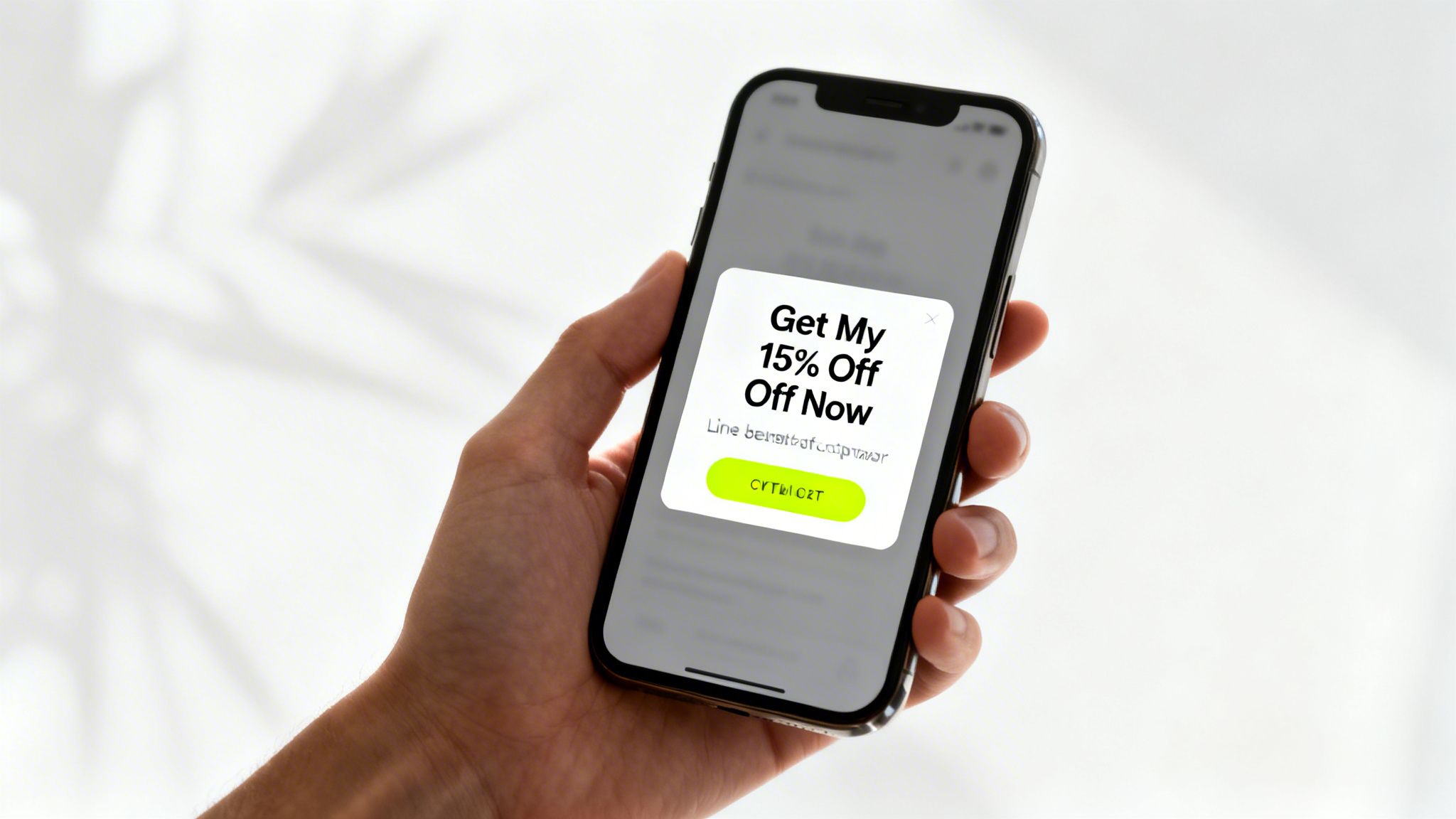
After: "Get 15% Off Your First Order"
- Why it works: It's an immediate, tangible benefit. The value is crystal clear. The same goes for your call-to-action (CTA) button:
Before: "Submit"
- Why it's weak: It’s boring, lifeless, and feels like you're filling out a form at the DMV.
After: "Unlock My Discount!"
- Why it works: This is exciting. It creates a sense of action and frames the discount as a prize to be claimed. Always put yourself in your visitor's shoes. They didn't land on your site hoping to sign up for another email list. They're looking for a product or a solution. Your pop-up has to feel like it’s helping them on that mission.
Prioritizing a Mobile-First Design
It’s shocking how often mobile pop-ups are just a shrunken-down version of the desktop design. With more than half of all web traffic coming from phones, this is a massive, costly mistake. A clunky mobile pop-up that blocks the screen or has an invisible "close" button is a surefire way to lose a customer forever.
Your mobile design can't be an afterthought; it has to be the priority.
Here’s what that looks like in practice:
- Keep it simple. Stick to a single-column layout, use large, readable fonts, and make the CTA button big enough to tap easily.
- Offer an easy exit. The 'X' to close the pop-up needs to be obvious and immediately accessible without having to pinch-and-zoom.
- Test it everywhere. Don’t just check it on your own phone. See how it looks and functions on different screen sizes and operating systems. What’s perfect on an iPhone can be completely broken on an Android. Getting the mobile experience right is where you can really pull ahead of the competition. While average pop-up conversion rates for 2026 hover between 4% and 5%, we've seen finely-tuned e-commerce campaigns hit 11% or even higher, especially on Shopify.
These numbers, which you can explore further in these 2026 popup statistics and benchmarks, prove just how much potential is on the table. A polished, mobile-friendly pop-up is your ticket to capturing a piece of that high-performing pie.
Using Smart Triggers and Targeting Rules
A great design is a fantastic start, but it's only half the story. The real secret to a high-performing pop up for website success isn't just what it says, but when and to whom it appears. This is where you get to play puppet master with smart triggers and targeting rules, turning a potentially annoying interruption into a perfectly timed, helpful nudge.
Instead of blasting the same generic message at every single visitor, you can craft an experience that feels personal and almost clairvoyant. This level of control is what separates pop-ups that get angrily closed from those that genuinely convert. Let’s get into the nitty-gritty of setting up these intelligent rules for your Shopify store.
Choosing the Right Activation Trigger
The trigger is simply the action a user takes that makes your pop-up appear. Timing is everything here. Choosing the right trigger means delivering your message right at that peak moment of interest or, just as importantly, hesitation.
Here are the common triggers you should absolutely be using:
- Exit-Intent: This one is a non-negotiable for e-commerce. The tech is clever—it detects when a visitor’s mouse zips toward the back button or to close the tab. It’s your last-ditch effort to make an offer, and it's incredibly effective for rescuing would-be abandoned carts.
- Time on Page: Set your pop-up to appear after someone has been on a page for a specific amount of time, like 15 or 30 seconds. This is a great way to ensure you're engaging someone who is genuinely interested, not a visitor who landed on your site by mistake and is about to bounce.
- Scroll Depth: This trigger fires when a visitor scrolls a certain percentage down the page, say 50% or 75%. It's a fantastic indicator of engagement. If they've read that far, they’re clearly invested in your content and more likely to be receptive to an offer.
- On-Click: This is a user-initiated trigger. The pop-up appears only when a shopper clicks a specific link or button. It’s a clean, effective way to offer more details (like a size guide) or a special discount without cluttering up your main page design.
Getting Specific with Audience Targeting
Once you've decided when the pop-up will show, the next crucial step is defining who sees it. This is where you can make your offers feel incredibly relevant and personal. Your pop-up app should give you the power to slice and dice your audience based on all sorts of conditions.
Think about these powerful targeting scenarios you can set up:
- New vs. Returning Visitors: It’s a classic for a reason. Greet first-timers with a "Welcome! Get 10% Off Your First Order" pop-up. For your loyal returning customers, you could offer something more exclusive, like early access to a new product drop.
- Traffic Source: Imagine a visitor comes to your site from a specific Facebook ad you're running for a new sneaker collection. You can show them a pop-up with a special offer just for those sneakers. This creates a beautifully seamless journey from the ad right to the checkout.
- Cart Contents: This is a fantastic way to increase your Average Order Value (AOV). If a shopper has over $100 worth of items in their cart, you could trigger a pop-up offering free shipping to push them over the finish line. When you start combining these rules, the magic really happens. You could create a hyper-targeted pop up for website experience by, for example, configuring an exit-intent pop-up that only triggers on product pages for first-time visitors who came from an Instagram story.
This kind of precision makes your offer feel less like a random ad and more like a personalized assist, which will always boost your chances of success.
Driving Sales with Pop-Ups and Checkout Links
https://www.youtube.com/embed/ARRmiSNjIYw
Building an email list is a great long-term play, but let's be honest—sometimes you need to close the deal right now. This is where your pop-up strategy can pivot from just collecting leads to becoming a powerful, on-the-spot sales tool. The trick is to remove every single bit of friction between your offer and the checkout.
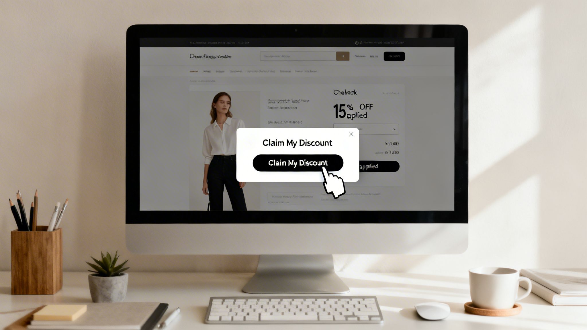
The most direct way I've found to do this is by embedding a Checkout Link right into your pop-up's call-to-action button. Instead of bouncing a customer back to their cart to fumble with a discount code, you send them straight to a checkout page that's already filled out, with the discount applied.
Create a Seamless Path to Purchase
Picture this all-too-common scene: a visitor has loaded up their cart with $150 worth of your products, but they're hesitating. You see their mouse drift toward the 'X' to close the tab. Suddenly, an exit-intent pop-up slides into view, offering them a can't-miss 15% off to finish their purchase.
When they click that "Claim My Discount!" button, they aren't just closing a pop-up. They're instantly taken to the Shopify checkout. Their cart is pre-loaded, their info might be filled in, and most importantly, that 15% discount is clearly visible. The path to purchase couldn't be simpler.
This one tactic can have a massive impact on reducing cart abandonment and giving you an immediate sales bump. You're essentially cutting out all the extra steps—and distractions—that give a shopper a chance to have second thoughts. If you're new to this idea, our guide on how to send links that go directly to checkout is a great place to start.
Advanced Strategies with Checkout Links
This isn't just for standard discounts, either. You can get really creative with these direct links to build exclusivity and run some seriously targeted campaigns.
Think about trying some of these more advanced plays:
- VIP Offers: Set up a pop-up that only shows to returning customers or newsletter subscribers. The CTA button could link to a checkout page with a unique product bundle or a steeper discount that nobody else sees.
- Passcode-Protected Sales: For a truly exclusive flash sale, generate a passcode-protected Checkout Link. Your pop-up can tease the "secret sale," and once a visitor enters their email, they get the passcode to unlock the special offer. It's a brilliant way to make customers feel like insiders. Here's a quick look at just how simple it is to generate these powerful links right inside the Checkout Links app.
The screenshot shows just how intuitive it is—you can add products and apply discounts in a few clicks. This simplicity means you can spin up a hyper-specific, sales-driving link for any pop-up campaign you can dream up.
Measuring Pop Up Performance and A/B Testing
Putting a pop up on your website is the easy part. The real work—and the real results—comes from paying attention to how people interact with it. If you just "set it and forget it," you're leaving money on the table. You have to know your numbers to make smart decisions.
Fortunately, most modern pop-up tools, including Checkout Links, have analytics baked right in. Instead of getting overwhelmed by data, let's zero in on the few metrics that actually tell you what's working.
Key Metrics to Track
To get a clear picture of your pop-up’s health, there are a handful of KPIs you should be watching. These numbers tell a story about how your visitors are responding to your offer.
Here’s what I always look at first:
- View Rate (or Impression Rate): This tells you what percentage of eligible visitors actually saw your pop-up. If this number is surprisingly low, your trigger rules might be too specific or your pop-up isn't firing correctly.
- Conversion Rate: This is the big one. It's the percentage of people who saw the pop-up and then did what you asked them to do, whether that's entering an email or clicking through to use a discount.
- Impact on Sales: For offers designed to drive immediate purchases, you need to connect the dots to revenue. How many sales did the pop-up directly contribute to?
Running Meaningful A/B Tests
Once you have a baseline for your key metrics, it's time to start experimenting. This is where A/B testing comes in, and it's how you turn a good pop-up into a great one. The concept is simple: you test one version (A) against a slightly different version (B) to see which one performs better.
The golden rule of A/B testing is to change only one thing at a time. If you change the headline and the discount, you'll never know which change made the difference.
For example, you could test two different offers to see what truly motivates your shoppers.
A/B Test Example: Offer Comparison
| Variable | Version A | Version B | Goal |
|---|---|---|---|
| Offer | 15% Off Your Entire Order | Free Shipping on All Orders | Higher checkout completion rate |
In a test like this, you'd show each pop-up to 50% of your audience. After running it long enough to get a reliable amount of data, you might discover that free shipping converts better, even if the 15% discount has a higher dollar value. Why? Because it removes a major psychological barrier to completing a purchase.
You can A/B test virtually any part of your pop-up. Some of the most impactful tests I've run have involved:
- Headlines: "Unlock Your Discount" vs. "Get 15% Off Now"
- Visuals: A clean product shot vs. a more candid lifestyle photo
- CTA Button Copy: "Claim Offer" vs. "Shop Now"
- Triggers: An exit-intent trigger vs. a time-based trigger (e.g., appears after 15 seconds) By constantly testing and refining, your pop-up strategy will evolve from a simple list-building tool into a powerful, automated sales driver for your Shopify store.
Frequently Asked Questions About Website Pop Ups
Even with a solid plan, you're bound to have a few questions when you start experimenting with pop-ups. It’s completely normal. Getting those nagging uncertainties out of the way is the best way to move forward with confidence.
Let's tackle some of the most common questions I hear from fellow Shopify merchants.
Will a Pop Up Hurt My Website SEO Ranking?
This is easily the biggest concern for most store owners, so let's clear it up. The short answer is no, as long as you’re smart about it.
Google's main issue is with what they call “intrusive interstitials”—basically, any pop-up that immediately blocks the main content for a visitor coming from mobile search results. Think of it from their perspective: they don't want to send users to a page that's immediately unusable.
As long as your pop-up is easy to close and appears after a short delay or is triggered by a user's action (like an exit-intent), you’ll be fine. Well-timed pop-ups are considered perfectly safe for both your search rankings and your user experience.
What Is the Best Offer for a Pop Up?
While the "best" offer always depends on your specific customers, two types consistently knock it out of the park for e-commerce stores.
- Percentage-based discounts: An offer for 10-15% off is a simple but incredibly powerful nudge for someone on the fence about their first purchase.
- Free shipping: This is a massive psychological win for shoppers. For many, the idea of free shipping feels more valuable than a discount of the same monetary value. If your main goal is building an email list, you might also test out exclusive content, like a free styling guide or a downloadable lookbook, in exchange for their email.
How Many Pop Ups Are Too Many?
This one’s simple: one well-targeted pop-up per user session is the golden rule. Nothing sends a visitor clicking the "back" button faster than being bombarded with multiple interruptions.
Use the frequency settings in your pop-up tool to control this. For example, you can set it so that once a visitor closes a pop-up or signs up, they won’t see that same offer again for at least 14 or even 30 days. Respect their space, and they’ll be more likely to return.
Ready to turn your website visitors into loyal customers? With a tool like Checkout Links, you can create these high-converting pop-ups with direct checkout links in just a few minutes. Start a free trial and see for yourself how easy it is to start boosting your sales today.